Multiple data points in one R ggplot2 plot
 https://stackoverflow.com/questions/1545302
 italiano
 english
 français
 española
 中国
中国 日本の
日本の العربية
 Deutsch
 한국어
한국어 Português
 Russian
Question
I have two sets of data points that both relate to the same primary axis, but who differ in secondary axis. Is there some way to plot them on top of each other in R using ggplot2?
What I am looking for is basically something that looks like this:
4+           |
 | x       . + 220
3+     . .   |
 |   x       |
2+   .       + 210
 |     x     |
1+ .     x x |
 |           + 200
0+-+-+-+-+-+-+
     time

   . temperatur
   x car sale
(This is just a example of possible data)
Solution
I'm not an expert on this, but it's my understanding that this is possible with lattice, but not with ggplot2. See this leanr blog post for an example of a secondary axis plot. Also see Hadley's response to this question.
Here's an example of how to do it in lattice (from Gabor Grothendieck):
library(lattice)
library(grid)  # needed for grid.text

# data

Lines.raw <- "Date  Fo  Co
6/27/2007  57.1  13.9
6/28/2007  57.7  14.3
6/29/2007  57.8  14.3
6/30/2007  57  13.9
7/1/2007  57.1  13.9
7/2/2007  57.2  14.0
7/3/2007  57.3  14.1
7/4/2007  57.6  14.2
7/5/2007  58  14.4
7/6/2007  58.1  14.5
7/7/2007  58.2  14.6
7/8/2007  58.4  14.7
7/9/2007    58.7 14.8
"

# in reality next stmt would be DF <- read.table("myfile.dat", header = TRUE)
DF <- read.table(textConnection(Lines.raw), header = TRUE)
DF$Date <- as.Date(DF$Date, "%m/%d/%Y")

par.settings <- list(
        layout.widths = list(left.padding = 10, right.padding = 10),
        layout.heights = list(bottom.padding = 10, top.padding = 10)
)

xyplot(Co ~ Date, DF, default.scales = list(y = list(relation = "free")),
        ylab = "C", par.settings = par.settings)

trellis.focus("panel", 1, 1, clip.off = TRUE)
  pr <- pretty(DF$Fo)
  at <- 5/9 * (pr - 32)
  panel.axis("right", at = at, lab = pr, outside = TRUE)
  grid.text("F", x = 1.1, rot = 90) # right y axis label
trellis.unfocus()
OTHER TIPS
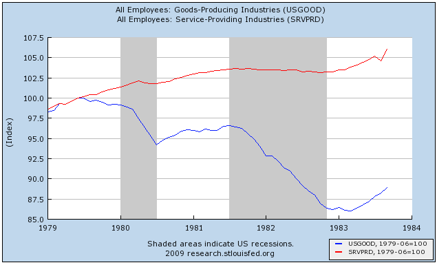
Shane's answer, "you can't in ggplot2," is correct, if incomplete. Arguably, it's not something you want to do. How do you decide how to scale the Y axis? Do you want the means of the lines to be the same? The range? There's no principled way of doing it, and it's too easy to make the results look like anything you want them to look like. Instead, what you might want to do, especially in a time-series like that, is to norm the two lines of data so that at a particular value of t, often min(t), Y1 = Y2 = 100. Here's an example I pulled off of the Bonddad Blog (not using ggplot2, which is why it's ugly!) But you can cleanly tell the relative increase and decrease of the two lines, which have completely different underlying scales.