How to make this button is CSS with Angled , Drop shadow, Inset shadow with flexibility in width
 https://stackoverflow.com/questions/10726013
-
10-06-2021 - |
 italiano
 english
 français
 española
 中国
中国 日本の
日本の العربية
 Deutsch
 한국어
한국어 Português
 Russian
Question
How to make this button is CSS with Angled , Drop shadow, Inset shadow with flexibility in width?

I've tried to make it here http://jsfiddle.net/jitendravyas/6RsnN/ but don't how to give angle to it and how to create cut-out border around it.
And button should be flexible in width.
I'm only making this for iphone so full CSS3 is allowed.
Solution
The final result is:
pure css blue button http://img832.imageshack.us/img832/8258/664d7b5656434db68cbee8b.png
Demonstration of flexibility:
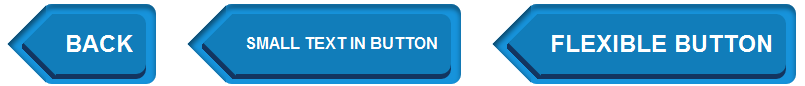 Although I tried to make a button like in the picture, but some parts may not be the same. Would consider it a proof of concept.
This button can be pure CSS only with a lot of extra markup with this markup:
<a class="btn">
    <span class="triangle"></span>
    <span class="btn_inner">
        <span class="triangle"></span>
        Back
    </span>
</a>
The main trick for creating triangles with box-shadow includes several steps:
Step 1. Create element '.triangle' - it will be a wrap for real triangle.
Step 2. Apply
position: absolute;, fix itswidthandheight:
red background-color is onle for demo

Step 3. Create big square element '.triangle::before' — it will be 'real' triangle after step 6
Step 4. Turn it 45 degrees (
transform: rotate(45deg)).Step 5. Add box-shadow.
The result after step 3 is:

Step 6. Add
overflow: hidden;Ta-dum!

On .tag_inner use the same trick, but box-shadow should be not inset but normal.
Notice, that if you will use this trick always check what vendor prefixes must be used and place property without prefix on the last place.
Update: Make markup more semantic — only one element for triangle trick.
OTHER TIPS
Here's your angle, but since it is already a border, you can't put a border on it:
body {padding:40px; background-color: #1693da;}
.input {
    display:block;
    text-decoration:none;
    padding:10px 60px;
    background:#117ebb;
    font-size:60px;
    color:#fff;
    border-radius: 20px;
    box-shadow: 0px 10px 0px #003355;
    position:relative;
}

.input:after {
    position:absolute;
    top:0;
    left:-32px;
    content:" ";
    width: 0;
    height: 0px;
    border-top: 45px solid transparent;
    border-bottom: 45px solid transparent;
    border-right:45px solid #117ebb;
}
