New Google Now and Google+ card interface
 https://stackoverflow.com/questions/11639991
-
22-06-2021 - |
 italiano
 english
 français
 española
 中国
中国 日本の
日本の العربية
 Deutsch
 한국어
한국어 Português
 Russian
Question
Google Now and Google+ (Android) both make use of a card-like interface.
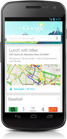
I was wondering if anyone had any idea how this interface can be replicated on Android.
They both have quite interesting animations for displaying new cards too; any thoughts would be great.
Solution
I have posted a tutorial on how to replicate / create Google Cards style layout here.
Key steps
- Create a custom layout
- Add observer for drawing children
- Animate alternating cards
Heres a code snippet
@Override
public void onGlobalLayout() {
    getViewTreeObserver().removeGlobalOnLayoutListener(this);

    final int heightPx = getContext().getResources().getDisplayMetrics().heightPixels;

    boolean inversed = false;
    final int childCount = getChildCount();

    for (int i = 0; i < childCount; i++) {
        View child = getChildAt(i);

        int[] location = new int[2];

        child.getLocationOnScreen(location);

        if (location[1] > heightPx) {
            break;
        }

        if (!inversed) {
            child.startAnimation(AnimationUtils.loadAnimation(getContext(),
                    R.anim.slide_up_left));
        } else {
            child.startAnimation(AnimationUtils.loadAnimation(getContext(),
                    R.anim.slide_up_right));
        }

        inversed = !inversed;
    }

}
OTHER TIPS
Take a look at http://ryanharter.com/blog/2013/01/31/how-to-make-an-android-card-list/
Copy of the example:
/res/drawable/bg_card.xml:
<?xml version="1.0" encoding="utf-8"?>
<layer-list xmlns:android="http://schemas.android.com/apk/res/android">
    <item>
        <shape android:shape="rectangle"
            android:dither="true">

            <corners android:radius="2dp"/>

            <solid android:color="#ccc" />

        </shape>
    </item>

    <item android:bottom="2dp">
        <shape android:shape="rectangle"
            android:dither="true">

            <corners android:radius="2dp" />

            <solid android:color="@android:color/white" />

            <padding android:bottom="8dp"
                android:left="8dp"
                android:right="8dp"
                android:top="8dp" />
        </shape>
    </item>
</layer-list>
Use it as the background of your layout:
<?xml version="1.0" encoding="utf-8"?>
<FrameLayout xmlns:android="http://schemas.android.com/apk/res/android"
    android:layout_width="match_parent"
    android:layout_height="?android:attr/listPreferredItemHeight"
    android:padding="12dp">

    <LinearLayout
        android:layout_width="match_parent"
        android:layout_height="match_parent"
        android:layout_marginLeft="6dp"
        android:layout_marginRight="6dp"
        android:layout_marginTop="4dp"
        android:layout_marginBottom="4dp"
        android:background="@drawable/bg_card">

        <!-- Card Contents go here -->

    </LinearLayout>

</FrameLayout>
==== Start update 2014-09-29 ====
Use the CardView from the Google Compatibility library (from Android 2.1+):
<!-- A CardView that contains a TextView -->
<android.support.v7.widget.CardView
    xmlns:card_view="http://schemas.android.com/apk/res-auto"
    android:id="@+id/card_view"
    android:layout_gravity="center"
    android:layout_width="200dp"
    android:layout_height="200dp"
    card_view:cardCornerRadius="4dp">

    <TextView
        android:id="@+id/info_text"
        android:layout_width="match_parent"
        android:layout_height="match_parent" />
</android.support.v7.widget.CardView>
See https://developer.android.com/preview/material/ui-widgets.html
==== End update ====
(at least) two options:
or
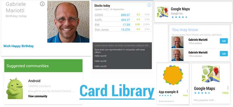
- https://github.com/afollestad/Cards-UI is a UI library for showing Cards.
See https://github.com/afollestad/Cards-UI/wiki/2.-Intro-Tutorial for an simple introduction.
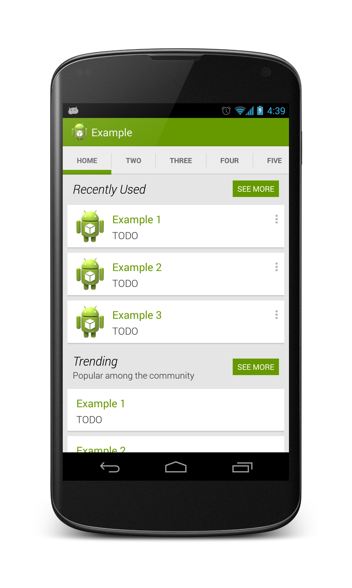
I made a very similar Layout you can look at here https://github.com/Nammari/GooglePlusLayout and for a video demo here http://youtu.be/jvfDuJz4fw4 for the animation that get applied to children , for more details look here http://nammari.tumblr.com/post/41893669349/goolge-plus-layout for a blog post that clarify every thing .
The card look and feel shouldn't be hard. You just need a ListView without dividers and your list view items should have a margin.
Like this:
<?xml version="1.0" encoding="utf-8"?>
<LinearLayout
    xmlns:android="http://schemas.android.com/apk/res/android"
    android:orientation="vertical"
    android:layout_width="fill_parent"
    android:layout_margin="16dp"
    android:layout_height="wrap_content"
    android:background="@android:color/background_light">

     <TextView
             android:layout_width="fill_parent"
             android:layout_height="wrap_content"
             android:paddingTop="16dp"
             android:paddingRight="16dp"
             android:paddingLeft="16dp"
             android:text="Title"
             android:textSize="18dp"
             android:textColor="@android:color/primary_text_holo_light"
             />

     <TextView
             android:layout_width="fill_parent"
             android:layout_height="wrap_content"
             android:paddingRight="16dp"
             android:paddingLeft="16dp"
             android:text="Subtitle"
             android:textSize="14dp"
             android:textColor="@android:color/primary_text_holo_light"
             />

     <ImageView android:layout_marginTop="16dp"
              android:layout_marginBottom="16dp"
              android:layout_width="fill_parent"
              android:layout_height="wrap_content"
              android:background="@drawable/background"/>
</LinearLayout>
Have the same need, and have started investigating a bit. I've been looking at the apktool output I've been able to get from the com.google.android.googlequicksearchbox apk. (no sources only the res xmls)
This layout (at_place_card.xml) is used for displaying a location. It has three text lines and two actions buttons (details and checkin) on the right and an image on the left.
Unfortunately, I am not able to get any style information out from the apk, so the font size, dimensions and colors are just guesses.
<?xml version="1.0" encoding="utf-8"?>
<LinearLayout android:orientation="horizontal" android:background="@drawable/card_background" android:layout_width="fill_parent" android:layout_height="wrap_content"
  xmlns:android="http://schemas.android.com/apk/res/android"
  xmlns:thegoogle="http://schemas.android.com/apk/res/com.google.android.googlequicksearchbox">
    <LinearLayout android:orientation="vertical" android:layout_width="0.0dip" android:layout_height="fill_parent" android:baselineAligned="false" android:layout_weight="1.0">
        <FrameLayout android:layout_width="fill_parent" android:layout_height="wrap_content">
            <LinearLayout android:orientation="vertical" android:layout_width="fill_parent" android:layout_height="wrap_content" style="@style/CardTextBlock">
                <TextView android:id="@id/entry_title" android:layout_width="wrap_content" android:layout_height="wrap_content" style="@style/CardTitle" />
                <TextView android:id="@id/open_hours" android:visibility="gone" android:layout_width="wrap_content" android:layout_height="wrap_content" style="@style/CardText" />
                <TextView android:textColor="@color/card_light_text" android:id="@id/known_for_terms" android:paddingBottom="4.0dip" android:visibility="gone" android:layout_width="wrap_content" android:layout_height="wrap_content" android:maxLines="4" style="@style/CardText" />
            </LinearLayout>
            <ImageButton android:layout_gravity="top|right|center" android:id="@id/card_menu_button" android:layout_width="@dimen/card_action_button_height" android:layout_height="@dimen/card_action_button_height" android:contentDescription="@string/accessibility_menu_button" style="@style/CardMenuButton" />
        </FrameLayout>
        <Space android:layout_width="fill_parent" android:layout_height="0.0dip" android:layout_weight="1.0" />
        <Button android:id="@id/details_button" android:visibility="gone" android:layout_width="fill_parent" android:layout_height="@dimen/card_action_button_height" android:text="@string/more_details" android:drawableLeft="@drawable/ic_action_pin" style="@style/CardActionButtonWithIcon" />
        <Button android:id="@id/checkin_button" android:layout_width="fill_parent" android:layout_height="@dimen/card_action_button_height" android:text="@string/check_in" android:drawableLeft="@drawable/ic_action_check_in" style="@style/CardActionButtonWithIcon" />
    </LinearLayout>
    <com.google.android.velvet.ui.CrossfadingWebImageView android:id="@id/place_photo" android:visibility="gone" android:layout_width="0.0dip" android:layout_height="fill_parent" android:scaleType="centerCrop" android:adjustViewBounds="true" android:baselineAligned="false" android:minHeight="@dimen/at_place_card_content_height" android:layout_weight="1.0" android:contentDescription="@string/at_place_card_image_desc" thegoogle:crossfadeDuration="@integer/image_crossfade_duration" />
</LinearLayout>
Update: Was able to get some style information also now. If you're interested here is a zip file with the information I have currently (some resource files from google now). https://dl.dropbox.com/u/4379928/android/googlenow2.zip
