How to achieve a “mini” select style using Bootstrap (or straight CSS)?
 https://stackoverflow.com/questions/12149164
-
28-06-2021 - |
 italiano
 english
 français
 española
 中国
中国 日本の
日本の العربية
 Deutsch
 한국어
한국어 Português
 Russian
Question
I'm using Bootstrap's btn-mini class for "mini" buttons and am looking for something analogous to create a "mini" select element, where the select button (i.e. the part you click to show the list of options, not the list of options itself) is the same size and style as a mini button.
When I apply the btn-mini class to a select element, the font style of the select button is the same size as a mini button, but the size of the select button itself is unchanged from the default size.
Is there a different Bootstrap class I should use? Or another way to do it?
P.S. I'm working on OS X Chrome, but naturally hope there is a cross-browser compatible solution.
Solution
HTML
<select class="btn btn-mini">
    <!-- options -->
</select>
<span class="caret"></span>
CSS
select.btn-mini {
    height: auto;
    line-height: 14px;
}

/* this is optional (see below) */
select.btn {
    -webkit-appearance: button;
       -moz-appearance: button;
            appearance: button;
    padding-right: 16px;
}

select.btn-mini + .caret {
    margin-left: -20px;
    margin-top: 9px;
}
The last 2 rules are optional, it will make <select> look like <button>, I've also added a caret to it. See this fiddle.
OTHER TIPS
Just in case any Bootstrap 3 users come across this old question, here's the BS3 way:
<select class="form-control input-lg"></select>
<select class="form-control"></select>
<select class="form-control input-sm"></select>

<input class="form-control input-lg">
<input class="form-control">
<input class="form-control input-sm">
There is no input-xs, though, so you'd have to make that yourself if you wanted smaller.
.input-xs, select.input-xs {
  height: 20px;
  line-height: 20px;
}
For Bootstrap 4, to set height we can use form-control-sm class with form-control.
<select class="form-control form-control-lg">
  <option>Large select</option>
</select>
<select class="form-control">
  <option>Default select</option>
</select>
<select class="form-control form-control-sm">
  <option>Small select</option>
</select>

And to set width of these we have to use grid column classes like .col-sm-*, .col-md-*, .col-lg-*, etc.
So put the select code in:
<div class="row">
  <div class="col-md-3">
    ... select tag code ...
  </div>
</div>
and it will look like this:
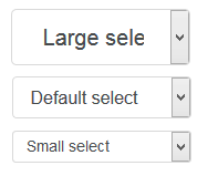
You can call the last one a "mini" select element.
This is not a final answer, but I wanted to share what I've gotten so far for anyone else curious about doing this.
As suggested by jackwanders, I've gone ahead and created a custom CSS class:
.select-mini {
  font-size: 11px;
  height: 20px;
  width: 100px;
}
This font-size and height rules more or less get the select box to be the same size as a mini button, but the text isn't quite aligned in the same way (it's slightly shifted up). Note you need to use height not line-height to override a height rule for select elements that Bootstrap sets elsewhere. (The width rule is just to change the widget and can be whatever you want.)
My CSS-fu isn't good enough to quickly make the mini select look fully consistent with the mini buttons, and from what I can see select's behave oddly when it comes to CSS anyhow, but hopefully this will be helpful as a start to others. Meanwhile, still open to better answers!
Based on btn-xs class I've prepared this:
.input-xs{
    height: 20px;
    line-height: 1.5;
    font-size: 12px;
    padding: 1px 5px;
    border-radius: 3px;
}
Note that width is not limited!
Please check this fiddle to see it in action.
Pavlo answer is better. But when mouse cursor is over caret click doenst` work. Just one thing must be added into caret class to fix it:
select.btn-mini + .caret {
    margin-left: -14px;
    margin-top: 19px;
	pointer-events: none;
}