Sentence Spacing [closed]
 https://stackoverflow.com/questions/1972887
-
21-09-2019 - |
 italiano
 english
 français
 española
 中国
中国 日本の
日本の العربية
 Deutsch
 한국어
한국어 Português
 Russian
Question
What is the best way to present the additional spacing that should come between sentences (using [X]HTML+CSS)?
<p>Lorem ipsum.  Dolor sit amet.</p>
               ^^ wider than word spacing
Since HTML and XML both require whitespace folding, the above two spaces must behave as a single space.
What options are there? There are a few obvious ones below, what others exist? (Anything in CSS3?) What drawbacks, if any, exist for the these, including across different browsers? (How do the non-breaking spaces below interact with line wrapping?)
..ipsum. Dolor....ipsum. Dolor....ipsum. Dolor..
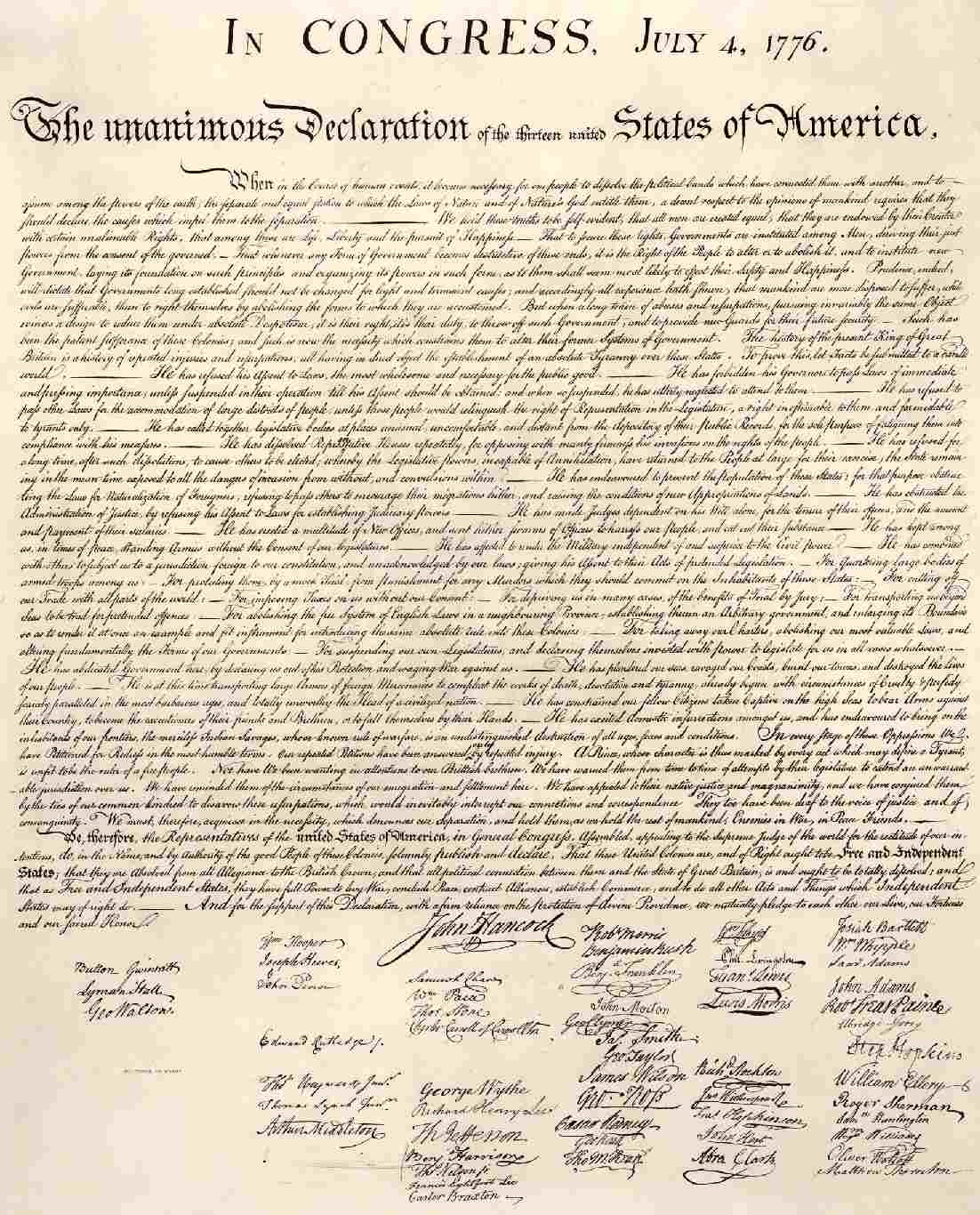
There's a lot of FUD on the net which claims this was invented for typewriters, but you can see it in documents such as the U.S. Declaration of Independence. (And yes, I realize you shouldn't follow all the conventions from over two hundred years ago, the DoI is merely a handy example showing this predates typewriters and monospaced fonts.) Or a typographer claiming that the additional space is distracting—after changing the background color so the example cannot be anything else!
To put it bluntly, while I appreciate opinions and discussion on whether additional spacing should be used or not (which isn't programming related), that is not what I'm asking. Assume this a requirement, what is the best way to implement it?
Solution
Wrap each sentence in a span, and style the span perhaps. (Not a great solution).
OTHER TIPS
You can use white-space: pre-wrap to preserve sequences of spaces, while still wrapping text:
<p style="white-space: pre-wrap;">Lorem ipsum. Dolor sit amet.</p>
This is not supported in IE until IE 8 in IE 8 mode, nor in Firefox until 3.0.
You could also use   or   for spaces one em or one en wide. I do not know how widespread support of these is, but they seem to work on the latest WebKit and Firefox on Mac OS X.
A sequence of two characters will prevent line breaks in that space; that's what means, non-breaking space. The sequence A sentence. Another. causes the to appear on the second line, indenting text slightly, which is probably undesireable. The sequence A sentence. Another. works fine, with line breaking and not adding any extra indentation, though if you use it in justified text, with the at the end of the line, it will prevent that line from being properly justified. is intended for the case of writing someone's name, like Mr. Torvalds, or an abbreviation ending with a ., in which typographical convention says that you shouldn't split it across lines in order to avoid people being confused and thinking the sentence has ended.
So, using sequences of is undesirable. Since this is a stylistic effect, I'd recommend using white-space: pre-wrap, and accepting that the style will be a bit less than ideal on platforms that don't support it.
edit: As pointed out in the comments, white-space: pre-wrap does not work with text-align: justify. However, I've tested out a sampler of different entities using BrowserShots (obnoxious ads, and somewhat flaky and slow, but it's a pretty useful service for the price, which is free). It looks like a pretty wide variety of browsers, on a pretty wide variety of platforms, support   and  , a few that don't still use spaces so the rendering isn't too bad, and only IE 6 on Windows 2000 actually renders them broken, as boxes. BrowserShots doesn't let me choose the exact browser/OS combos I want, so I can't choose IE 6 on XP to see if that's any different. So, that's a plausible answer as long as you can live with IE 6 on Win2K (and maybe XP) broken.
Another possible solution would be to find (or create) a font that has a kerning pair for the ". " combination of characters, to kern them more widely apart. With @font-face support in all of the major browsers at this point, including IE back to IE 5.5 (though IE uses a different format than the other browsers), using your own font is actually becoming reasonable, and falling back to the users default font if not supported would not break anything.
A final possibility might be to talk the CSS committee into adding a style feature that would allow you to specify that you want wider spacing at the end of sentences (which would be determined by a period followed by a space; acronyms and abbreviations would need an in order to avoid getting the wider space). The CSS committee is currently discussing adding more advanced typography support, so now might be a good time to start discussing such a feature.
For all you 'antiquated' and 'mono-space-only' naysayers - Read a book. Professional publishers have used a single   between sentences for time immemorial, and THAT is where the monospace two-space standard came from. Learn from history instead of spouting rhetoric with no basis in fact. I have to admit, though, that an   looks better in most browsers:   is just too wide. What do you think of the readability of this paragraph? Stackoverflow's editor allows some HTML, and I'm using   between all sentences.
Just wanted to throw out there that if your goal is to override the default browser whitespace implementation to provide "proper" sentence spacing, there is actually some debate as to what constitutes proper spacing. It seems that the double-space "standard" is most likely just a carryover from when typewriters used monospace fonts. Money quote:
The Bottomline: Professional typesetters, designers, and desktop publishers should use one space only. Save the double spaces for typewriting, email, term papers (if prescribed by the style guide you are using), or personal correspondence. For everyone else, do whatever makes you feel good.
Unless you have this as a strict requirement, it does not seem worth the effort to try and "fix." (I realize this is not an answer to your stated question per se, but wanted to make sure that you are aware of this info as it might influence your decision to spend a lot of time on it.)
isn't the correct character to use, semantically speaking. It's a non-breaking space: a space which won't be used as a line break. Perhaps use a space an a   or a single  , or (my personal recommendation) don't bother with the antiquated double-space style on your page.
is the worst possible method, as it disrupts justification. Pre-wrap as suggested gives coarse control but can't be justified. There are other space entities like &thinspace; and &nspace;, as well as a bunch of Unicode space characters that should give somewhat better control and should not break justification. These entities are the best non-CSS solution in my opinion.
For better control you need a CSS solution. You can either span the sentences, the obvious choice, or you can span the space between sentences. The latter to me seems more incorrect, but it is easier to achieve, especially if you have the common two-space typing habit - you can simply search and replace all period-space-space with a span around a space. I have some javascript that does this on the fly for blogger.
Don't use the box model (padding-right) as it will break the right margin of fully justified text (and even if not fully justified, causes lines to wrap "early"). If you are spanning the space between sentences you can just alter the word-spacing on these elements. If you are wrapping sentences, you can set your paragraph or other container to have bigger word-spacing, and the set the sentences back to normal, or you can do it in one step with the after selector:
.your_sentence_class:after { content:" "; word-spacing:0.5em; }
