Responsive, transparent CSS image caption with graceful degradation?
 https://stackoverflow.com/questions/13114069
-
14-07-2021 - |
 italiano
 english
 français
 española
 中国
中国 日本の
日本の العربية
 Deutsch
 한국어
한국어 Português
 Russian
Question
What is the proper way to create responsive, transparent CSS captions over images — with graceful degradation in older browsers?
I am trying to achieve:
- Centered vertical column of images
- Images are equal heights and widths
- Each image has a caption which should be centered
- Caption should have a see-through background
- Would be nice if the background became black in older browsers that don't support transparency
If you take a look at this Fiddle example, there's clearly a lot wrong with it.
The basic premise for HTML5 is:
<section>
    <figure>
        <img src="1.jpg">
        <figcaption>Caption 1</figcaption>
    </figure>

    <figure>
        <img src="2.jpg">
        <figcaption>Caption 2</figcaption>
    </figure>

    <figure>
        <img src="3.jpg">
        <figcaption>Caption 3</figcaption>
    </figure>
</section>
But the CSS3 code is where we get some problems. Is it the right approach even? I got it to work with some fine-tuning (not included), but the fine-tuning doesn't seem to make semantic sense to me anyway.
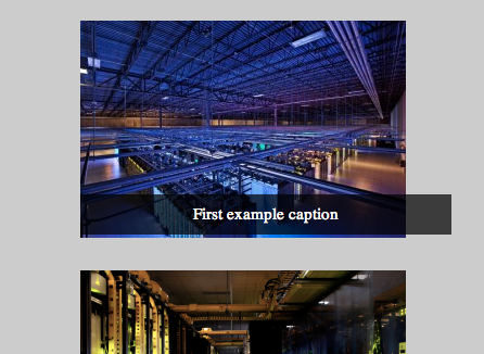
For example, this is the result:
I have a feeling the CSS is wrong on many levels (pun intended).
Solution
I modified your CSS slightly. The main changes were adding position: relative; to the parent element and position: absolute; to the caption.
CSS:
section {
    overflow: auto;
}

section figure {
    float: left;
    clear: both;

    position: relative;
    overflow: auto;

    margin: 0 auto;
    padding: 30px 0 0 0;
    font-size: 15px;
}

section figure img {
    vertical-align: bottom;
}

section figure figcaption {
    position: absolute;
    bottom: 0;
    left: 0;
    right: 0;

    background: rgba(0,0,0,0.7);
    text-align: center;
    color: #fff;
    padding: 10px;
}


section {
    padding-bottom: 30px;
    background: #ccc;

}
Licensed under: CC-BY-SA with attribution
Not affiliated with StackOverflow
