Question

My CSS looks like this:

div.SOMECLASS {
  position: absolute;
  max-height: 300px
  height: auto;
  width: auto;
  overflow: auto;
  ...
}

The div height and width scale automatically. The height has fixed a maximum though: as soon as this value is reached vertical scrollbars appear. This works all pretty swell.

Now the issue:
If the vertical scrollbars appear, they use up around 10px of horizontal space, as the scrollbars will be placed inside the div.
However, the width is not autoscaled to allow for these additional 10-something pixels used up by the vertical scrollbars. As the horizontal width before the adding the vertical scrollbars was just exactly right for the content (as expected from the width:auto setting), the div now also displays horizontal scrollbars - to allow for the missing 10 pixels. This is silly.

  • How can I avoid having these horizontal scrollbars and just autoscale the width of the div to make the vertical scrollbars fit?

If possible I am looking for a solution which does not rely on just completely disabling horizontal scrolling, as this will probably be needed at some point (i.e. for certain inputs).

Was it helpful?

Solution 2

I found a solution which is working but far from perfect:

I added a padding-right : 15px to my div, to automatically grow the entire div. Now if the vertical scrollbars appear, they fit within the padding so the horizontal width is still ok.

Regretfully the padding of course also shows up when no vertical scrolling is needed, making my div just a tiny bit wider than it would have to be... :/ Well, in my eyes this is still preferable to unneeded horizontal scrollbars.

OTHER TIPS

Just figured out a pretty passable solution (at least for my version of this problem).

I assume the issue with width: auto is that it behaves similarly to width: 100vw; the problem is that when the vertical scrollbar appears, the viewport width remains the same (despite the ~10px scrollbar), but the viewable area (as I'm calling it) is reduced by 10px.

Apparently defining width by percentage defines it in terms of this "viewable area", so changing your code to:

div.SOMECLASS {
  position: absolute;
  max-height: 300px
  height: auto;
  width: 100%;
  overflow: auto;
  ...
}

should allow the content to rescale properly!

p.s. You can also instead add overflow-x: hidden, which will stop the horizontal scrollbar from appearing, instead simply cutting ~10px off of the right side of your div when the vertical scrollbar appears.

Often setting 100vw is the problem. Just remove it and your width will be 100%, which will be what you want anyways.

Number 1 search result on Google for my problem (similar to OP, but not the same).

Here is a common scenario for seemingly unnecessary-horizontal-scrollbar:

You have an element, say, a table, which uses auto-sizing. If the auto-sizing is done before all the rows are added, then it will not calculate enough room for a vertical-scrollbar. Doing the resize after adding rows fixed my issue -- even then, I needed a timeout

this.http.get('someEndPoint').subscribe(rows => {
  this.rowData = rows;
  setTimeout(()=>{sizeColumnsToFit()}, 50);
});

This bug (specific to Firefox) occurs even when not setting a fixed width.

For instance, if you have a vertically scrollable container div (overflow: auto;) inside a flexible wrapper div (display: inline-block;), then when you resize the window to be smaller than the content can wrap, first, a horizontal scrollbar will appear in your container div, and only after that, the flexible wrapper div will grow or eventually a secondary horizontal scrollbar will appear in your window.

The result is a useless horizontal scrollbar, that only can scroll the width of the vertical scrollbar:

Screenshot of the example code showing the problem and a solution

In order to get rid of this issue, you could use the javascript-code from this example (tested in Firefox and Chromium):

<!DOCTYPE html>
<html>
<body>
    <style type="text/css">
    .page {height: 200px;width: 400px;overflow: auto;background-color: #ccc;border: 5px solid #000;margin: 5px;}
    .wrapper {display: inline-block;min-width: 100%;margin: 20px;}
    .scroller {overflow: auto;max-height: 100px;background-color: #f00;}
    .content {min-height: 500px;min-width: 400px;background-color: #cfc;}
    </style>
    <div class="page">
        <div class="wrapper">
            <div class="scroller">
                <div class="content">
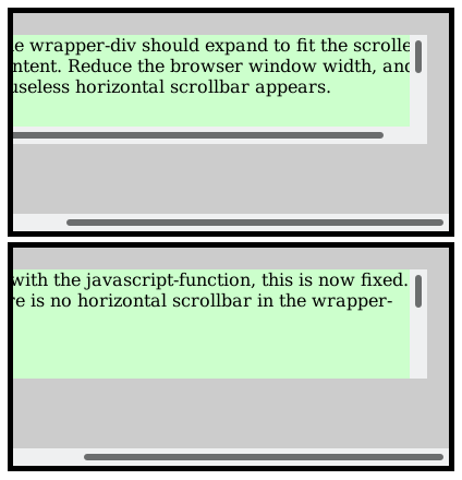
                    The wrapper-div should expand to fit the scroller content.
                    Reduce the browser window width, and a useless horizontal scrollbar appears.
                </div>
            </div>
        </div>
    </div>
    <div class="page">
        <div class="wrapper">
            <div class="scroller ensure-scrollbar-width-padding">
                <div class="content">
                    But with the javascript-function, this is now fixed.
                    There is no horizontal scrollbar in the wrapper-div.
                </div>
            </div>
        </div>
    </div>
    <script>
    var ensureScrollbarWidthPadding = function(elem)
    {
        if(!parseInt(elem.scrollWidth) || !parseInt(elem.clientWidth) || !parseInt(elem.offsetWidth))
        {
            return; // no browser-support for this trick
        }

        var update = function()
        {
            // reset to as if not having any right-padding
            elem.style.paddingRight = '0px';

            // check if horizontal scrollbar appeared only because of the vertical scrollbar
            if(elem.scrollWidth !== elem.clientWidth)
            {
                elem.style.paddingRight = (elem.offsetWidth - elem.clientWidth) + 'px';
            }
            else
            {
                elem.style.paddingRight = '0px';
            }
        };

        window.addEventListener('resize', update, false);
        window.addEventListener('load', update, false);

        update();

        return update;
    };

    (function()
    {
        var elems = document.getElementsByClassName('ensure-scrollbar-width-padding');
        for(var i=0;i<elems.length;++i)
        {
            ensureScrollbarWidthPadding(elems[i]);
        }
    })();
    </script>
</body>
</html>

The javascript function ensureScrollbarWidthPadding dynamically adds a padding-right to the vertically scrollable container, to ensure that the horizontal scrollbar will never appear.

Licensed under: CC-BY-SA with attribution
Not affiliated with StackOverflow
scroll top