Question

I need something like this:

How can achieve this with css? I know that one way is use background image, but can I achieve this only with css without any image?

Was it helpful?

Solution

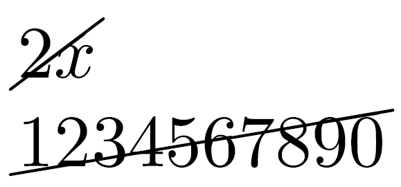
There is a hacky way to do this, using the :before pseudo element. You give the :before a border, then rotate it with a CSS transform. Doing it this way adds no extra elements to the DOM, and adding/removing the strikethrough is a simple as adding/removing the class.

Here's a demo

Caveats

  • This will only work down to IE8. IE7 does not support :before, however will degrade gracefully in browsers that do support :before but don't support CSS transforms.
  • The angle of rotation is fixed. If the text is longer, the line will not touch the corners of the text. Be mindful of this.

CSS

.strikethrough {
  position: relative;
}
.strikethrough:before {
  position: absolute;
  content: "";
  left: 0;
  top: 50%;
  right: 0;
  border-top: 1px solid;
  border-color: inherit;
  
  -webkit-transform:rotate(-5deg);
  -moz-transform:rotate(-5deg);
  -ms-transform:rotate(-5deg);
  -o-transform:rotate(-5deg);
  transform:rotate(-5deg);
}

HTML

<span class="strikethrough">Deleted text</span>

OTHER TIPS

You can use background linear-gradient with currentColor to avoid hardcoding font color:

.strikediag {
  background: linear-gradient(to left top, transparent 47.75%, currentColor 49.5%, currentColor 50.5%, transparent 52.25%);
}
.withpadding {
  padding: 0 0.15em;
}
The value is <span class="strikediag">2x</span> 3x<br>
The number is <span class="strikediag">1234567890</span>.
<p>
The value is <span class="strikediag withpadding">2x</span>3x<br>
The number is <span class="strikediag withpadding">1234567890</span>.

If you don't need the element to be fully inline, you can use a pseudo element to place the line on top of the element. This way the angle can be adjusted by changing the pseudo element's size:

.strikediag {
  display: inline-block;
  position: relative;
}
.strikediag::before {
  content: '';
  position: absolute;
  left: -0.1em;
  right: -0.1em;
  top: 0.38em;
  bottom: 0.38em;
  background: linear-gradient(to left top, transparent 45.5%, currentColor 47.5%, currentColor 52.5%, transparent 54.5%);
  pointer-events: none;
}
The value is <span class="strikediag">2x</span> 3x<br>
The number is <span class="strikediag">1234567890</span>.

del {
  position:relative;
  text-decoration:none;
}
del::after {
  content:"";
  position:absolute;
  top:50%; left:0; width:100%; height:1px; 
  background:black;
  transform:rotate(-7deg);
}

I think you could probably apply a rotation effect to a horizontal rule. Something like:

<html>
  <body>
    <hr />
    123456
  </body>
</html>

With the CSS:

hr
{
  width: 50px;
  position: absolute;
  background-color: #000000;
  color: #000000;
  border-color: #000000;
  transform:rotate(-7deg);
  -ms-transform:rotate(-7deg);
  -moz-transform:rotate(-7deg);
  -webkit-transform:rotate(-7deg);
  -o-transform:rotate(-7deg);
} 

Fiddle

Your mileage may vary depending on browser and version though, so I'm not sure if I'd resort to this. You might have to pull off some funky VML code to support older versions of IE, for example.

Enhancing Bojangles answer from above:

.strike-diagonal-price {
position: relative;
background-color: black;
color: white;
}
.strike-diagonal-price:before {
position: absolute;
content: "";
left: 0;
top: 45%;
right: 0;
border-top: 2px solid;
border-color: red;
-webkit-transform: rotate(-25deg);
-moz-transform: rotate(-25deg);
-ms-transform: rotate(-25deg);
-o-transform: rotate(-25deg);
transform: rotate(-25deg);
}

Now I get the affect I needed: enter image description here

CSS3 gradient

background-image: linear-gradient(left bottom, rgb(234,20,136) 0%, rgb(255,46,164) 50%, rgb(255,74,197) 0%);
background-image: -o-linear-gradient(left bottom, rgb(234,20,136) 0%, rgb(255,46,164) 50%, rgb(255,74,197) 0%);
background-image: -moz-linear-gradient(left bottom, rgb(234,20,136) 0%, rgb(255,46,164) 50%, rgb(255,74,197) 0%);
background-image: -webkit-linear-gradient(left bottom, rgb(234,20,136) 0%, rgb(255,46,164) 50%, rgb(255,74,197) 0%);
background-image: -ms-linear-gradient(left bottom, rgb(234,20,136) 0%, rgb(255,46,164) 50%, rgb(255,74,197) 0%);

background-image: -webkit-gradient( linear, left bottom,right top,color-stop(0, rgb(234,20,136)), color-stop(0.5, rgb(255,46,164)), color-stop(0, rgb(255,74,197)) );

My example won't fill your needs perfectly but, for more info and funny tweaks, see http://gradients.glrzad.com/.

What you have to do is create a background-gradient of white-black-white and position your opacity at something like 48% 50% 52%.

This is an old question but as an alternative you can use CSS3 Linear Gradients for example (http://codepen.io/yusuf-azer/pen/ojJLoG).

For extensive explaining and a LESS Solution check

http://www.yusufazer.com/tutorials-how-to/how-to-make-a-diagonal-line-through-with-css3/

span.price--line-through {
  background-color: transparent;
  background-image: -webkit-gradient(linear, 19.1% -7.9%, 81% 107.9%, color-stop(0, #fff), color-stop(.475, #fff), color-stop(.5, #000), color-stop(.515, #fff), color-stop(1, #fff));
  background-image: -webkit-repeating-linear-gradient(287deg, #fff 0%, #fff 47.5%, #000 50%, #fff 51.5%, #fff 100%);
  background-image: repeating-linear-gradient(163deg, #fff 0%, #fff 47.5%, #000 50%, #fff 51.5%, #fff 100%);
  background-image: -ms-repeating-linear-gradient(287deg, #fff 0%, #fff 47.5%, #000 50%, #fff 51.5%, #fff 100%);
} 

I don't think there is a sustainable css solution to this.

My pure CSS solution would be to place another element of text behind your first element of text that is identical in number of characters (characters being ' '), a text-decleration of line-through, and a transform of rotate.

Something like:

<html>
  <head>
    <style>
      .strike{
       text-decoration: line-through;
      -webkit-transform: rotate(344deg);
      -moz-transform: rotate(344deg);
      -o-transform: rotate(344deg);}
    </style>
  </head>
  <body>
    <p>Text to display</p>
    <p class='strike'></p>
  </body>
</html>

Text Rotation example

I am looking forward to seeing better answers from other users.

I did it this way using an SVG in the HTM with a CSS class:

HTML:

<ul>
<li>Regular Price: <div class="zIndex-10a">$4.50</div><div class="zIndex-10b"><svg height="16" width="5"><line x1="0" y1="20" x2="40" y2="0" class="Strike-01a"></svg></div></li>
</ul>

CSS:

/* -- CONTAINS TEXT TO STRIKE ---- */ .zIndex-10a { display: inline-block; position: relative;  left:  0px; z-index: 10; }
/* -- CONTAINS SVG LINE IN HTML -- */ .zIndex-10b { display: inline-block; position: relative; right: 40px; z-index: 11; }
/* -- SVG STROKE PROPERTIES ------ */ .Strike-01a { stroke: rgb(255,0,0); stroke-width:2; }

There might be simpler easier ways by now. I just cooked this up in a pinch for my product detail special offer page. Hope it helps someone.

Try

.mydiv {
    background-color: #990000;
    color: #FFFF00;
    font-size: 2em;
    padding-top: 10px;
    padding-bottom: 10px;
    border-radius: 15px;
    max-width: 300px;
    width: 100%;
}
.strikethrough-100p, .strikethrough-50p{
  position: relative;
 text-align: center;
}
.strikethrough-100p:before {
  position: absolute;
  content: "";
  left: 0;
  top: 50%;
  right: 0;
  border-top: 3px solid;
  border-color: inherit;

  -webkit-transform:rotate(-5deg);
  -moz-transform:rotate(-5deg);
  -ms-transform:rotate(-5deg);
  -o-transform:rotate(-5deg);
  transform:rotate(-5deg);
}
.strikethrough-50p:before {
  position: absolute;
  content: "";
  width:50%;
  left: 25%;
  top: 50%;
  right: 0;
  border-top: 3px solid;
  border-color: inherit;

  -webkit-transform:rotate(-5deg);
  -moz-transform:rotate(-5deg);
  -ms-transform:rotate(-5deg);
  -o-transform:rotate(-5deg);
  transform:rotate(-5deg);
}
<div class="mydiv">
<div class="strikethrough-100p">123456</div>
</div>
<br>
<div class="mydiv">
<div class="strikethrough-50p">123456</div>
</div>

And here's a fancy version:

background:none repeat scroll 0 0 rgba(255, 0, 0, 0.5);
-moz-border-radius:20px 0;
-webkit-border-radius:20px 0;
border-radius:20px 0;
content: "";
height:5px; left:-5%;
position:absolute;
top:30%;
-moz-transform:rotate(-7deg);
-webkit-transform:rotate(-7deg);
transform:rotate(-7deg);
transform-origin:50% 50% 0;
width:110%;
Licensed under: CC-BY-SA with attribution
Not affiliated with StackOverflow
scroll top