 https://stackoverflow.com/questions/15905572
 italiano
 english
 français
 española
 中国
中国 日本の
日本の العربية
 Deutsch
 한국어
한국어 Português
 Russian
It should work if you specify a max-width for td.ellipsis.
How can I use ellipses in a fluid width table without making each column the same size?
-
03-04-2022 - |
Question
Let's say my columns in a table are id, name, description, and phone. The description column is 1-255 characters, but the id is only max 3 characters.
I'd like the columns to be appropriately sized rather than each column being the same size. And I'd like the description column to overflow to an ellipsis when the window is too small to fit the contents in its entirety.
table-layout:fixed; is the standard way to make text-overflow: ellipsis; work, but it resizes all the columns to the same size. I'd prefer to keep the widths auto rather than fixed.
Can you help?
Here's my jsFiddle: http://jsfiddle.net/RQhkk/1/
Here's a screenshot of what I'm dealing with:
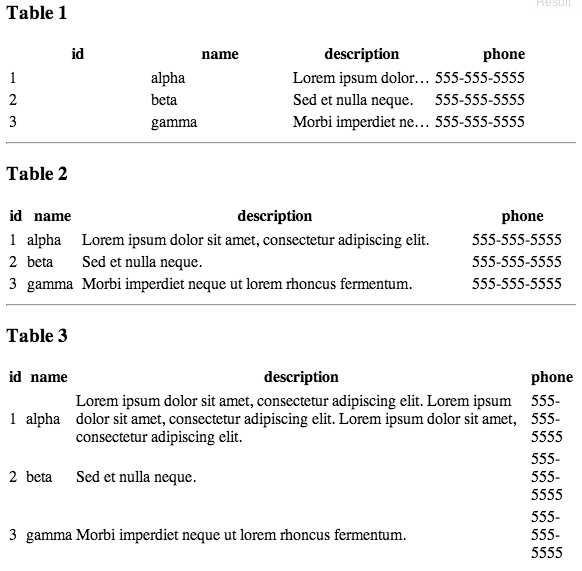
Notice how Table 1 makes all columns the same size? That's awful.
Notice how Table 2 sizes the columns based on content? That's good. Except when the content is too long: Table 3. Then it doesn't fit. In that case I'd like it to overflow to an ellipsis.
And here's my html table and css code:
<div id="t1">
<table>
    <thead>
        <tr>
            <th>id</th>
            <th>name</th>
            <th class="ellipsis">description</th>
            <th>phone</th>
        </tr>
    </thead>
    <tbody>
        <tr>
            <td>1</td>
            <td>alpha</td>
            <td class="ellipsis">Lorem ipsum dolor sit amet, consectetur adipiscing elit.</td>
            <td>555-555-5555</td>
        </tr>
        <tr>
            <td>2</td>
            <td>beta</td>
            <td class="ellipsis">Sed et nulla neque.</td>
            <td>555-555-5555</td>
        </tr>
        <tr>
            <td>3</td>
            <td>gamma</td>
            <td class="ellipsis">Morbi imperdiet neque ut lorem rhoncus fermentum.</td>
            <td>555-555-5555</td>
        </tr>
    </tbody>
</table>
</div>

<style>
#t1 table {
    table-layout:fixed;
    width:100%;
}
#t1 td {
    white-space: nowrap;
}
#t1 td.ellipsis {
    overflow: hidden;
    white-space: nowrap;
    text-overflow: ellipsis;
    word-break: break-all;
    word-wrap: break-word;
}
</style>
If I remove the table-layout: fixed; the column widths are what you'd expect - sized to the content. Unfortunately I just can't get the ellipsis to work without the fixed layout. Where am I going wrong?
Solution 2
OTHER TIPS
The solution I found is to style your cells as follows:
td{
    white-space: nowrap;
}

td.description{
    overflow: hidden;
    text-overflow: ellipsis;
    max-width: 1px;
    width: 100%;
}
The first part will force each column to contract as much as possible and ellipsize any clipped text in any cell. However, they will not contract to 1px, because you can use your table-headers to provide a min width. It also prevents line-wrapping within the table.
The second part ensures that all spare space is taken up by the description column, rather than being spread evenly between all columns.
Finally, if you want to impose a true minimum width on the description column, do so by putting the minimum width on the column header rather than on the column cells, as, the max-width aside, the cells cannot contract to be thinner than the header.
See http://jsfiddle.net/BCZTB/ for an implementation.
My solution is to use jquery to get the max width of the text within the column and assign them to the contents width, except for the ellipsis column which will be the maximum size.
My jsfiddle example can be found here http://jsfiddle.net/qt7eQ/1/
<script type="text/javascript">
$(function() {
    //add a innerParagraph block element to all columns except for the one that has the class ellipsis
    $( "#t3 tr td:not(.ellipsis)" ).wrapInner(function() {
          return "<p class='innerParagraph'></p>";
    });

    //get the first column and assign it the width of the elements in the first column
    $( "#t3 tr th:nth-child(1)" ).width( getMaxWidthOf( "#t3 tr>td:nth-child(1) p" ) );
    $( "#t3 tr td:nth-child(1)" ).width( getMaxWidthOf( "#t3 tr>td:nth-child(1) p" ) );

    //get the second column and assign it the width of the elements in the second column
    $( "#t3 tr th:nth-child(2)" ).width( getMaxWidthOf( "#t3 tr>td:nth-child(2) p" ) );
    $( "#t3 tr td:nth-child(2)" ).width( getMaxWidthOf( "#t3 tr>td:nth-child(2) p" ) );

    //get the fourth column and assign it the width of the elements in the forth column
    $( "#t3 tr th:nth-child(4)" ).width( getMaxWidthOf( "#t3 tr>td:nth-child(4) p" ) );
    $( "#t3 tr td:nth-child(4)" ).width( getMaxWidthOf( "#t3 tr>td:nth-child(4) p" ) );
});


function getMaxWidthOf(selector){
    var maxWidth = 0;
    //go through each paragraph in the right column and find the widest value.
    $(selector).each(function() {
        if(maxWidth < $(this).width()){
            maxWidth = $(this).width();
        }
    });
    // assign max width to column
    return maxWidth;
}
</script>

<!-- add this style -->
<style type="text/css">
#t3 table {
    table-layout:fixed;
{
.innerParagraph {
    margin:0;
    display:inline-block;
}
</style>
Licensed under: CC-BY-SA with attribution
Not affiliated with StackOverflow
