How is font size calculated?
 https://stackoverflow.com/questions/3495872
-
29-09-2019 - |
 italiano
 english
 français
 española
 中国
中国 日本の
日本の العربية
 Deutsch
 한국어
한국어 Português
 Russian
Question
I have a complex js function with an equation in which I actually need to understand how much space in pixels font sizes take up.
I have noticed that some font's sizes are different depending on the font.
How is a font's size calculated? If its set to 12px, in css, what does the 12px mean? Is that 12px wide? High? Or is it a diagonal pixel measurement?
Solution
See the spec:
The font size corresponds to the em square, a concept used in typography.
Note that certain glyphs may bleed outside their em squares.
OTHER TIPS
Height is the Standard Measure
Font height is measured or specified by the height of a line, which is the full height required to display the gamut of characters, including those that dip below the line, like j, and raised elements (accents on capitals, for instance) like Ê.

(source: banzaimonkey.net)
Fonts in order of appearance: Times New Roman, Courier New, Calibri, Consolas.
Width
Width of glyphs varies between fonts, as you can see in the image above. There is also an important distinction between proportional and fixed-width fonts. For fixed-width fonts, the space each character takes up on the line is exactly the same (though the characters themselves may not quite be the same size as one-another. For proportional fonts, the space each character uses is more in line with its shape, relative to other characters, so i, j, and l are vary narrow, while w, m, and o are typically wider.
Fonts
Fonts themselves render glyphs in different ways (obviously, since fonts look different), and this means that a particular character will not necessarily render the same height across fonts. It also means that there's no standard way to figure out how tall a certain character might be at any given size, aside from rendering the font.
It's probably not obvious to most, but if you examine the licensing terms for fonts you'll notice that they're licensed as font software. Essentially, each font contains a set of algorithms that determine how the font should be rendered in a given context (various sizes, bold, italics, etc.).
Consequently, the best way to figure out how a font will render in a given context is to render it and see.
Sizing Issues
There are some caveats for font sizes when you're dealing with things on the web.
For the Web
As any good web designer knows, no things are equal. There are countless variables that come into play when rendering a page that may result in differences between users, such as browser, default fonts, zoom, smoothing, hinting, browser scaling, operating system scaling, etc.
A List Apart (before they jumped the shark) has some good articles on standardizing font sizes and helping you get some level of similarity between browsers:
While you can do your due diligence, you'll just have to accept that the web medium involves a certain level of variability that you can't control.
Print vs. Pixels
Because pixels are not typically a natural scale for fonts (different measurements are used for printing), the hinting algorithms may render fonts off by a pixel or two, particularly at small sizes, in order to retain the shape of the characters.
In fact, the hinting algorithm is often completely different at small sizes, and in professional work you'd probably use a different font entirely for sizes below 12pt.
Pixels are also relative to the display size, so 12px will be a different physical size on these displays:
- 20" monitor at 1680x1050
- 22" monitor at 1680x1050
- iPhone screen
- Blackberry screen
- etc.
TL;DR
So in summary, it's complicated. font-size refers to the height needed to display the gamut of characters, but in the wild and woolly internet, there are always exceptions.
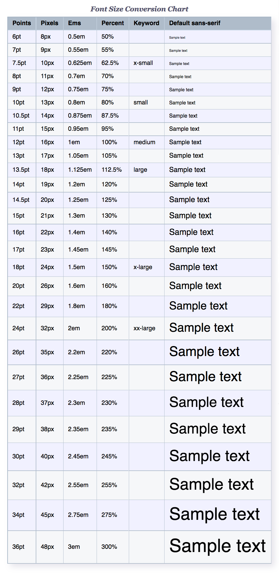
This is a supplemental answer. I found the chart from this site very useful for getting a big picture understanding.
Per the spec (http://www.w3.org/TR/CSS2/fonts.html)
The font size corresponds to the em square, a concept used in typography. Note that certain glyphs may bleed outside their em squares.
The size of the em square explained: http://www.emdpi.com/emsquare.html
You should use .getClientRects() if you need to know how much space a run of text is/will take to display on the screen.
The actual interaction between what you set and what size you'll get is somewhat complicated. The CSS3 spec puts it more clearly than the CSS2 spec quoted in other answers:
This property indicates the desired height of glyphs from the font. For scalable fonts, the font-size is a scale factor applied to the EM unit of the font.
Basically, you can control the size of the "em square". The font shapes are defined relative to this, but certainly can stray outside/within this box (sometimes significantly).
And that's just for starters! Even if you assume a font that is matched very closely to this em-square — are you just going to multiply the string length by this size? Unless it's monospaced and your text is ASCII-only, you have a lot to worry about: varying character widths, kerning and ligatures, wrapping behaviour, and of course other even simpler "string length" caveats like tabs, Unicode combining characters and control codes.
