Question

I'm new to HTML & CSS and one of my first steps is creating a normal layout like

/----------------\
|     Header     |
|----------------|
| N  |           |
| a  |   Content |
| v  |           |
|----------------|
|   Foot         |
\----------------/

In order to be flexible, Navs width shouldn't be fixed and the Content should never float around it. In other words, Nav and Content should behave like table columns just that the use of tables for formatting are a big no no in HTML. My current code looks like this:

<!DOCTYPE html>
<html>
    <head>
      <title>Todo list</title>
        <style type="text/css">
        nav {
            float: left;
            padding-right: 5px;
            margin-right: 5px;
            background: yellow;
            height: auto;       /* auto | inherit | 100% */
            width: auto;
        }

        #content {
             margin: 5px;
             padding-left: 5px;
        }

        header {
            background: blue;
        }

        footer {
            clear: both;
            background: #ccc;
        }

        .clearfix:after {
                content: ".";
                display: block;
                clear: both;
                visibility: hidden;
                line-height: 0;
                height: 0;
                }
        </style>
    </head> 


  <body>
    <header>
        Head
    </header>

    <nav id="main_nav">
        <ul>
            <li><a href="/">Home</a></li>
            <li><a href="/contact">Contact (p)</a></li> 
            <li><a href="/temp">Temp</a></li>   
        </ul>
    </nav>

    <div id="content" class="clearfix">
        <h1>Test</h1>
        <h2>A</h2><h2>C</h2><h2>D</h2>
    </div>

    <footer>
        <p>[Copyright bumf]</p>
    </footer>
  </body>
</html>

Which results in

uglyNav

Most solutions I found used either a fixed width for Nav or for the Content margin, which isn't a clean. It seems that CSS Multi-column Layout Module or CSS Flexible Box Layout Module could help, but they are both "Candidate Recommendation" so I can't use them safely. What's the proper way to solve my problem?

Was it helpful?

Solution

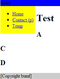
There were some serious issues with your markup, the body tag should wrap all of the page elements, the basic markup should follow:

<!DOCTYPE html>
<html>
    <head>
        <!-- meta tags etc -->
    </head> 
    <body>
        <!-- page content -->
    </body>
</html>

As for the style issue, the #content div just needs floated to the left as well. There are other ways, but this will probably suffice.

<!DOCTYPE html>
<html>
    <head>
      <title>Todo list</title>
        <style type="text/css">
        nav {
            float: left;
            padding-right: 5px;
            margin-right: 5px;
            background: yellow;
            height: auto;       /* auto | inherit | 100% */
            width: auto;
        }

        #content {
             margin: 5px;
             padding-left: 5px;
             float: left;
        }

        header {
            background: blue;
        }

        footer {
            clear: both;
            background: #ccc;
        }
        </style>
    </head> 
<body>
    <header>
        Head
    </header>

    <nav id="main_nav">
        <ul>
            <li><a href="/">Home</a></li>
            <li><a href="/contact">Contact (p)</a></li> 
            <li><a href="/temp">Temp</a></li>   
        </ul>
    </nav>


        <div id="content">
    <h1>Test</h1>
    <h2>A</h2><h2>C</h2><h2>D</h2>
    </div>
    <footer>
    <p>[Copyright bumf]</p>
    </footer>

  </body>
</html>

OTHER TIPS

Nav and Content should behave like table columns

If you meant this literally, you could use the table layout model (as mentioned by Holf).

See this jsFiddle or the following code:

nav {
    display: table-cell;
    padding-right: 5px;
    background: yellow;
    white-space: nowrap; /* Prevent nav from ever inserting line breaks between words (like before "(p)"). */
}

#content {
    display: table-cell;
    padding-left: 5px;
    width: 100%; /* Because of table layout, this will shrink nav to the smallest width its content can handle (similarly to how float widths work). */
}

header {
    background: blue;
}

#main {
    display: table;
    width: 100%;
}

footer {
    background: #ccc;
}
<header>
    Head
</header>

<div id="main">
    <nav id="main_nav">
        <ul>
            <li><a href="/">Home</a></li>
            <li><a href="/contact">Contact (p)</a></li> 
            <li><a href="/temp">Temp</a></li>   
        </ul>
    </nav>

    <div id="content" class="clearfix">
        <h1>Test</h1>
        <h2>A</h2><h2>C</h2><h2>D</h2>
    </div>
</div>

<footer>
    <p>[Copyright bumf]</p>
</footer>

It is now possible in CSS3 to do the equivalent of HTML-based table layouts using pure CSS alone. (see comment).

Pure CSS equivalents for HTML-based table layouts have been in the CSS spec since version 2.1. They are now supported well in most browsers. Here is a good article on this.

Support for IE7 and below is limited.

This is how I would do it:

Example: jsFiddle

HTML:

<div id="header">Header</div>
<div id="main">
  <div id="nav">
    <div class="wrapper">Nav</div>
  </div>
  <div id="content">
    <div class="wrapper">Content</div>
  </div>
</div>
<div id="footer">Footer</div>

CSS:

<style>
html, body{height:100%; margin:0; padding: 0; background:#ccc;}
#header{ background: #0cc; height:50px; position: absolute; width:100%;}
#main, #content, #nav{ width:100%; height:100%;}
#content{ background: #555; width:75%; float:left;}
#nav{ background: transparent; width:25%; float:left;}
.wrapper{padding: 50px 15px;}
#footer{background: #fcc;  height: 50px; position: fixed; bottom: 0; width: 100%;}
</style>

Well you need a better understanding of <div> tags and the three positioning schemes - relative, absolute and fixed.

I have taken the liberty of editing your code my style, although it does not include the positioning.

<!DOCTYPE HTML PUBLIC "-//W3C//DTD HTML 4.01//EN"
        "http://www.w3.org/TR/html4/strict.dtd">
<html lang="en">
<head>
    <meta http-equiv="Content-Type" content="text/html; charset=utf-8">

    <style type="text/css">
    body,
    html {
        margin:0;
        padding:0;
        color:#000;
        background:#a7a09a;
    }
    #wrap {
        width:750px;
        margin:0 auto;
        background:#99c;
    }
    #header {
        padding:5px 10px;
        background:#ddd;
    }
    h1 {
        margin:0;
    }
    #nav {
        padding:5px 10px;
        background:grey;
    }
    #nav ul {
        margin:0;
        padding:0;
        list-style:none;
    }
    #nav li {
        display:inline;
        margin:0;
        padding:0;
    }
    #sidebar {
        float:left;
        width:230px;
        padding:10px;
        background:yellow;
        height:100%;
    }
    h2 {
        margin:0 0 1em;
    }
    #main {
        float:right;
        width:480px;
        padding:10px;
        background:red;
    }
    #footer {
        clear:both;
        padding:5px 10px;
        background:#cc9;
    }
    #footer p {
        margin:0;
    }
    * html #footer {
        height:1px;
    }
    </style>
</head>
<body>
<div id="wrap">
    <div id="header"><h1>header goes here</h1></div>
    <div id="nav">
        <ul>
            <li><a href="/">Options</a></li>

        </ul>
    </div>
    <div id="sidebar">
        <h2>Siidebar</h2>
        <p><a href="/">Home</a></p>
        <p><a href="/">Content</a></p>
        <p><a href="/">Content</a></p>
        <p><a href="/">Content</a></p></div>

    <div id="main">
        <h2>Main Content</h2>
        <p>Hello</p>
        <ul>
            <li><a href="/">Link 1</a></li>
            <li><a href="/">Link 2</a></li>
            <li><a href="/">Link 3</a></li>

        </ul>
    </div>
    <div id="footer">
        <p>Footer</p>
    </div>
</div>
</body>
</html>

Check out this page i think it will solve your problem.

http://www.tutorialrepublic.com/html-tutorial/html-layout.php

Licensed under: CC-BY-SA with attribution
Not affiliated with StackOverflow
scroll top