Question

I've been searching for days how to get this layout working, I need a little help

I just want my images to be aligned to the baseline of the tallest image, per line, and the captions below that line. I see you have a lot of experience with building layouts with images and jquery, If you could point me in the right direction I think I could solve it.

Here is the jsfiddle for what Ive got, but I think I might have to ditch masonry as my client just wants a nice baseline.. but with a responsive wrap of course.. http://jsfiddle.net/perrodeagua/SeXDu/embedded/result/

Here's my current css, I ain't married to it though

.thePics {
padding:5px;
font-family: Geneva, Arial, Helvetica, sans-serif;
font-size: 14px;
line-height: 24px;
float: left;
 width:200px;
 height:auto;
 border:1px;
 text-align:left;


}

#PICS {
 width:auto;
}

And here is mockup of what I need http://postimg.org/image/sygkducs5/

Thanks!

Was it helpful?

Solution 2

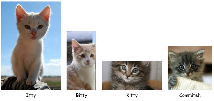
If your captions are all of uneven lengths as well, then Flexbox is your best pure CSS option.

http://codepen.io/cimmanon/pen/vJeDk

<div class="gallery">
  <figure>
    <img src="http://placehold.it/100x200" />
    <figcaption>My caption here, this one is a really long one. Oh boy, so long.</figcaption>
  </figure>

  <figure>
    <img src="http://placehold.it/100x150" />
    <figcaption>My caption here</figcaption>
  </figure>
</div>

The CSS:

.gallery {
  display: -webkit-box;
  display: -moz-box;
  display: -ms-flexbox;
  display: -webkit-flex;
  display: flex;
  -ms-flex-align: baseline;
  -webkit-align-items: baseline;
  align-items: baseline;
  -webkit-box-align: baseline;
  -moz-box-align: baseline;
}

.gallery figure {
  /* optional */
  -webkit-box-flex: 1;
  -moz-box-flex: 1;
  -webkit-flex: 1;
  -ms-flex: 1;
  flex: 1;
  text-align: center;
}

/* optional */
.gallery {
  -webkit-flex-wrap: wrap;
  -ms-flex-wrap: wrap;
  flex-wrap: wrap;
}

If your elements need to wrap, then browser support is limited to Opera, Chrome, and IE10. http://caniuse.com/flexbox

OTHER TIPS

You mean, like this? http://jsfiddle.net/LeBen/yFEc6/

Expected result

Actually tested in Chrome, Safari & Firefox and images are aligned to the baseline by default using <figure>.

EDIT -- Le Ben's answer is cooler than mine if you can use HTML5, but if you need to support IE 8, this should work

If your images are aligning like this:

---- ---- ----
|  | |  | |  |
---- |  | ----
     ----

And you want them like this:

     ----
---- |  | ----
|  | |  | |  |
---- ---- ----

Just use some CSS:

<style type="text/css">
    .captioned-img { display: inline-block; vertical-align: bottom; }
    .caption       { text-align: center; }
</style>

<div class="captioned-img">
    <img />
    <p class="caption">Fig 1</p>
</div>
<div class="captioned-img">
    <img />
    <p class="caption">Fig 2</p>
</div>
<div class="captioned-img">
    <img />
    <p class="caption">Fig 3</p>
</div>

http://jsfiddle.net/YTaVr/

Licensed under: CC-BY-SA with attribution
Not affiliated with StackOverflow
scroll top