Question

How can I set for <table> 100% width and put only inside <tbody> vertical scroll for some height?

vertical scroll inside tbody

table {
    width: 100%;
    display:block;
}
thead {
    display: inline-block;
    width: 100%;
    height: 20px;
}
tbody {
    height: 200px;
    display: inline-block;
    width: 100%;
    overflow: auto;
}
  
<table>
  <thead>
    <tr>
    	<th>Head 1</th>
    	<th>Head 2</th>
    	<th>Head 3</th>
    	<th>Head 4</th>
    	<th>Head 5</th>
    </tr>
  </thead>
  <tbody>
    <tr>
    	<td>Content 1</td>
    	<td>Content 2</td>
    	<td>Content 3</td>
    	<td>Content 4</td>
    	<td>Content 5</td>
    </tr>
  </tbody>
</table>

I want to avoid adding some additional div, all I want is simple table like this and when I trying to change display, table-layout, position and much more things in CSS table not working good with 100% width only with fixed width in px.

Was it helpful?

Solution

In order to make <tbody> element scrollable, we need to change the way it's displayed on the page i.e. using display: block; to display that as a block level element.

Since we change the display property of tbody, we should change that property for thead element as well to prevent from breaking the table layout.

So we have:

thead, tbody { display: block; }

tbody {
    height: 100px;       /* Just for the demo          */
    overflow-y: auto;    /* Trigger vertical scroll    */
    overflow-x: hidden;  /* Hide the horizontal scroll */
}

Web browsers display the thead and tbody elements as row-group (table-header-group and table-row-group) by default.

Once we change that, the inside tr elements doesn't fill the entire space of their container.

In order to fix that, we have to calculate the width of tbody columns and apply the corresponding value to the thead columns via JavaScript.

Auto Width Columns

Here is the jQuery version of above logic:

// Change the selector if needed
var $table = $('table'),
    $bodyCells = $table.find('tbody tr:first').children(),
    colWidth;

// Get the tbody columns width array
colWidth = $bodyCells.map(function() {
    return $(this).width();
}).get();

// Set the width of thead columns
$table.find('thead tr').children().each(function(i, v) {
    $(v).width(colWidth[i]);
});    

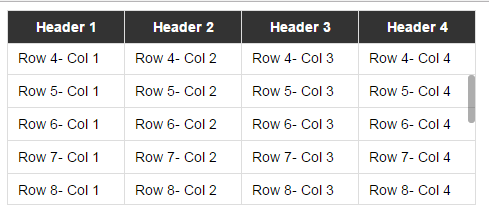
And here is the output (on Windows 7 Chrome 32):

vertical scroll inside tbody

WORKING DEMO.

Full Width Table, Relative Width Columns

As the Original Poster needed, we could expand the table to 100% of width of its container, and then using a relative (Percentage) width for each columns of the table.

table {
    width: 100%; /* Optional */
}

tbody td, thead th {
    width: 20%;  /* Optional */
}

Since the table has a (sort of) fluid layout, we should adjust the width of thead columns when the container resizes.

Hence we should set the columns' widths once the window is resized:

// Adjust the width of thead cells when *window* resizes
$(window).resize(function() {
    /* Same as before */ 
}).resize(); // Trigger the resize handler once the script runs

The output would be:

Fluid Table with vertical scroll inside tbody

WORKING DEMO.


Browser Support and Alternatives

I've tested the two above methods on Windows 7 via the new versions of major Web Browsers (including IE10+) and it worked.

However, it doesn't work properly on IE9 and below.

That's because in a table layout, all elements should follow the same structural properties.

By using display: block; for the <thead> and <tbody> elements, we've broken the table structure.

Redesign layout via JavaScript

One approach is to redesign the (entire) table layout. Using JavaScript to create a new layout on the fly and handle and/or adjust the widths/heights of the cells dynamically.

For instance, take a look at the following examples:

Nesting tables

This approach uses two nested tables with a containing div. The first table has only one cell which has a div, and the second table is placed inside that div element.

Check the Vertical scrolling tables at CSS Play.

This works on most of web browsers. We can also do the above logic dynamically via JavaScript.

Table with fixed header on scroll

Since the purpose of adding vertical scroll bar to the <tbody> is displaying the table header at the top of each row, we could position the thead element to stay fixed at the top of the screen instead.

Here is a Working Demo of this approach performed by Julien.
It has a promising web browser support.

And here a pure CSS implementation by Willem Van Bockstal.


The Pure CSS Solution

Here is the old answer. Of course I've added a new method and refined the CSS declarations.

Table with Fixed Width

In this case, the table should have a fixed width (including the sum of columns' widths and the width of vertical scroll-bar).

Each column should have a specific width and the last column of thead element needs a greater width which equals to the others' width + the width of vertical scroll-bar.

Therefore, the CSS would be:

table {
    width: 716px; /* 140px * 5 column + 16px scrollbar width */
    border-spacing: 0;
}

tbody, thead tr { display: block; }

tbody {
    height: 100px;
    overflow-y: auto;
    overflow-x: hidden;
}

tbody td, thead th {
    width: 140px;
}

thead th:last-child {
    width: 156px; /* 140px + 16px scrollbar width */
}

Here is the output:

Table with Fixed Width

WORKING DEMO.

Table with 100% Width

In this approach, the table has a width of 100% and for each th and td, the value of width property should be less than 100% / number of cols.

Also, we need to reduce the width of thead as value of the width of vertical scroll-bar.

In order to do that, we need to use CSS3 calc() function, as follows:

table {
    width: 100%;
    border-spacing: 0;
}

thead, tbody, tr, th, td { display: block; }

thead tr {
    /* fallback */
    width: 97%;
    /* minus scroll bar width */
    width: -webkit-calc(100% - 16px);
    width:    -moz-calc(100% - 16px);
    width:         calc(100% - 16px);
}

tr:after {  /* clearing float */
    content: ' ';
    display: block;
    visibility: hidden;
    clear: both;
}

tbody {
    height: 100px;
    overflow-y: auto;
    overflow-x: hidden;
}

tbody td, thead th {
    width: 19%;  /* 19% is less than (100% / 5 cols) = 20% */
    float: left;
}

Here is the Online Demo.

Note: This approach will fail if the content of each column breaks the line, i.e. the content of each cell should be short enough.


In the following, there are two simple example of pure CSS solution which I created at the time I answered this question.

Here is the jsFiddle Demo v2.

Old version: jsFiddle Demo v1

OTHER TIPS

In following solution, table occupies 100% of the parent container, no absolute sizes required. It's pure CSS, flex layout is used.

Here is how it looks: enter image description here

Possible disadvantages:

  • vertical scrollbar is always visible, regardless of whether it's required;
  • table layout is fixed - columns do not resize according to the content width (you still can set whatever column width you want explicitly);
  • there is one absolute size - the width of the scrollbar, which is about 0.9em for the browsers I was able to check.

HTML (shortened):

<div class="table-container">
    <table>
        <thead>
            <tr>
                <th>head1</th>
                <th>head2</th>
                <th>head3</th>
                <th>head4</th>
            </tr>
        </thead>
        <tbody>
            <tr>
                <td>content1</td>
                <td>content2</td>
                <td>content3</td>
                <td>content4</td>
            </tr>
            <tr>
                <td>content1</td>
                <td>content2</td>
                <td>content3</td>
                <td>content4</td>
            </tr>
            ...
        </tbody>
    </table>
</div>

CSS, with some decorations omitted for clarity:

.table-container {
    height: 10em;
}
table {
    display: flex;
    flex-flow: column;
    height: 100%;
    width: 100%;
}
table thead {
    /* head takes the height it requires, 
    and it's not scaled when table is resized */
    flex: 0 0 auto;
    width: calc(100% - 0.9em);
}
table tbody {
    /* body takes all the remaining available space */
    flex: 1 1 auto;
    display: block;
    overflow-y: scroll;
}
table tbody tr {
    width: 100%;
}
table thead, table tbody tr {
    display: table;
    table-layout: fixed;
}

full code on jsfiddle

Same code in LESS so you can mix it in:

.table-scrollable() {
  @scrollbar-width: 0.9em;
  display: flex;
  flex-flow: column;

  thead,
  tbody tr {
    display: table;
    table-layout: fixed;
  }

  thead {
    flex: 0 0 auto;
    width: ~"calc(100% - @{scrollbar-width})";
  }

  tbody {
    display: block;
    flex: 1 1 auto;
    overflow-y: scroll;

    tr {
      width: 100%;
    }
  }
}

In modern browsers, you can simply use css:

th {
  position: sticky;
  top: 0;
  z-index: 2;
}

CSS-only

for Chrome, Firefox, Edge (and other evergreen browsers)

Simply position: sticky; top: 0; your th elements:

/* Fix table head */
.tableFixHead    { overflow: auto; height: 100px; }
.tableFixHead th { position: sticky; top: 0; }

/* Just common table stuff. */
table  { border-collapse: collapse; width: 100%; }
th, td { padding: 8px 16px; }
th     { background:#eee; }
<div class="tableFixHead">
  <table>
    <thead>
      <tr><th>TH 1</th><th>TH 2</th></tr>
    </thead>
    <tbody>
      <tr><td>A1</td><td>A2</td></tr>
      <tr><td>B1</td><td>B2</td></tr>
      <tr><td>C1</td><td>C2</td></tr>
      <tr><td>D1</td><td>D2</td></tr>
      <tr><td>E1</td><td>E2</td></tr>
    </tbody>
  </table>
</div>

PS: if you need borders for TH elements th {box-shadow: 1px 1px 0 #000; border-top: 0;} will help (since the default borders are not painted correctly on scroll).

For a variant of the above that uses just a bit of JS in order to accommodate for IE11 see this answer Table fixed header and scrollable body

I'm using display:block for thead and tbody. Because of that the width of the thead columns is different from the width of the tbody columns.

table {
    margin:0 auto; 
    border-collapse:collapse;
}
thead {
    background:#CCCCCC;
    display:block
}
tbody {
    height:10em;overflow-y:scroll;
    display:block
}

To fix this I use small jQuery code but it can be done in JavaScript only.

var colNumber=3 //number of table columns    

for (var i=0; i<colNumber; i++) {
  var thWidth=$("#myTable").find("th:eq("+i+")").width();
  var tdWidth=$("#myTable").find("td:eq("+i+")").width();      
  if (thWidth<tdWidth)                    
      $("#myTable").find("th:eq("+i+")").width(tdWidth);
  else
      $("#myTable").find("td:eq("+i+")").width(thWidth);           
}  

Here is my working demo: http://jsfiddle.net/gavroche/N7LEF/

Does not work in IE 8

var colNumber=3 //number of table columns


for (var i=0; i<colNumber; i++)
  {
      var thWidth=$("#myTable").find("th:eq("+i+")").width();
      var tdWidth=$("#myTable").find("td:eq("+i+")").width();      
      if (thWidth<tdWidth)                    
          $("#myTable").find("th:eq("+i+")").width(tdWidth);
      else
          $("#myTable").find("td:eq("+i+")").width(thWidth);           
  }  
 table {margin:0 auto; border-collapse:separate;}
 thead {background:#CCCCCC;display:block}
 tbody {height:10em;overflow-y:scroll;display:block}
<script src="https://ajax.googleapis.com/ajax/libs/jquery/1.11.1/jquery.min.js"></script>
<table id="myTable" border="1">
    <thead>
        <tr>
            <th>A really Very Long Header Text</th>
            <th>Normal Header</th>
            <th>Short</th>            
        </tr>    
    </thead>
    <tbody>
        <tr>
            <td>
                Text shorter than header
            </td>
            <td>
                Text is longer than header
            </td>
            <td>
                Exact
            </td>
        </tr>
        <tr>
            <td>
                Text shorter than header
            </td>
            <td>
                Text is longer than header
            </td>
            <td>
                Exact
            </td>
        </tr>
        <tr>
            <td>
                Text shorter than header
            </td>
            <td>
                Text is longer than header
            </td>
            <td>
                Exact
            </td>
        </tr>
        <tr>
            <td>
                Text shorter than header
            </td>
            <td>
                Text is longer than header
            </td>
            <td>
                Exact
            </td>
        </tr>
        <tr>
            <td>
                Text shorter than header
            </td>
            <td>
                Text is longer than header
            </td>
            <td>
                Exact
            </td>
        </tr>
        <tr>
            <td>
                Text shorter than header
            </td>
            <td>
                Text is longer than header
            </td>
            <td>
                Exact
            </td>
        </tr>
        <tr>
            <td>
                Text shorter than header
            </td>
            <td>
                Text is longer than header
            </td>
            <td>
                Exact
            </td>
        </tr>
        <tr>
            <td>
                Text shorter than header
            </td>
            <td>
                Text is longer than header
            </td>
            <td>
                Exact
            </td>
        </tr>
        <tr>
            <td>
                Text shorter than header
            </td>
            <td>
                Text is longer than header
            </td>
            <td>
                Exact
            </td>
        </tr>
        <tr>
            <td>
                Text shorter than header
            </td>
            <td>
                Text is longer than header
            </td>
            <td>
                Exact
            </td>
        </tr>
        <tr>
            <td>
                Text shorter than header
            </td>
            <td>
                Text is longer than header
            </td>
            <td>
                Exact
            </td>
        </tr>
    </tbody>
</table>

Create two tables one after other, put second table in a div of fixed height and set the overflow property to auto. Also keep all the td's inside thead in second table empty.

<div>
    <table>
        <thead>
            <tr>
                <th>Head 1</th>
                <th>Head 2</th>
                <th>Head 3</th>
                <th>Head 4</th>
                <th>Head 5</th>
            </tr>
        </thead>
    </table>
</div>

<div style="max-height:500px;overflow:auto;">
    <table>
        <thead>
            <tr>
                <th></th>
                <th></th>
                <th></th>
                <th></th>
                <th></th>
            </tr>
        </thead>
        <tbody>
        <tr>
            <td>Content 1</td>
            <td>Content 2</td>
            <td>Content 3</td>
            <td>Content 4</td>
            <td>Content 5</td>
        </tr>
        </tbody>
    </table>    
</div>

I got it finally right with pure CSS by following these instructions:

http://tjvantoll.com/2012/11/10/creating-cross-browser-scrollable-tbody/

The first step is to set the <tbody> to display: block so an overflow and height can be applied. From there the rows in the <thead> need to be set to position: relative and display: block so that they’ll sit on top of the now scrollable <tbody>.

tbody, thead { display: block; overflow-y: auto; }

Because the <thead> is relatively positioned each table cell needs an explicit width

td:nth-child(1), th:nth-child(1) { width: 100px; }
td:nth-child(2), th:nth-child(2) { width: 100px; }
td:nth-child(3), th:nth-child(3) { width: 100px; }

But unfortunately that is not enough. When a scrollbar is present browsers allocate space for it, therefore, the <tbody> ends up having less space available than the <thead>. Notice the slight misalignment this creates...

The only workaround I could come up with was to set a min-width on all columns except the last one.

td:nth-child(1), th:nth-child(1) { min-width: 100px; }
td:nth-child(2), th:nth-child(2) { min-width: 100px; }
td:nth-child(3), th:nth-child(3) { width: 100px; }

Whole codepen example below:

CSS:

.fixed_headers {
  width: 750px;
  table-layout: fixed;
  border-collapse: collapse;
}
.fixed_headers th {
  text-decoration: underline;
}
.fixed_headers th,
.fixed_headers td {
  padding: 5px;
  text-align: left;
}
.fixed_headers td:nth-child(1),
.fixed_headers th:nth-child(1) {
  min-width: 200px;
}
.fixed_headers td:nth-child(2),
.fixed_headers th:nth-child(2) {
  min-width: 200px;
}
.fixed_headers td:nth-child(3),
.fixed_headers th:nth-child(3) {
  width: 350px;
}
.fixed_headers thead {
  background-color: #333333;
  color: #fdfdfd;
}
.fixed_headers thead tr {
  display: block;
  position: relative;
}
.fixed_headers tbody {
  display: block;
  overflow: auto;
  width: 100%;
  height: 300px;
}
.fixed_headers tbody tr:nth-child(even) {
  background-color: #dddddd;
}
.old_ie_wrapper {
  height: 300px;
  width: 750px;
  overflow-x: hidden;
  overflow-y: auto;
}
.old_ie_wrapper tbody {
  height: auto;
}

Html:

<!-- IE < 10 does not like giving a tbody a height.  The workaround here applies the scrolling to a wrapped <div>. -->
<!--[if lte IE 9]>
<div class="old_ie_wrapper">
<!--<![endif]-->

<table class="fixed_headers">
  <thead>
    <tr>
      <th>Name</th>
      <th>Color</th>
      <th>Description</th>
    </tr>
  </thead>
  <tbody>
    <tr>
      <td>Apple</td>
      <td>Red</td>
      <td>These are red.</td>
    </tr>
    <tr>
      <td>Pear</td>
      <td>Green</td>
      <td>These are green.</td>
    </tr>
    <tr>
      <td>Grape</td>
      <td>Purple / Green</td>
      <td>These are purple and green.</td>
    </tr>
    <tr>
      <td>Orange</td>
      <td>Orange</td>
      <td>These are orange.</td>
    </tr>
    <tr>
      <td>Banana</td>
      <td>Yellow</td>
      <td>These are yellow.</td>
    </tr>
    <tr>
      <td>Kiwi</td>
      <td>Green</td>
      <td>These are green.</td>
    </tr>
    <tr>
      <td>Plum</td>
      <td>Purple</td>
      <td>These are Purple</td>
    </tr>
    <tr>
      <td>Watermelon</td>
      <td>Red</td>
      <td>These are red.</td>
    </tr>
    <tr>
      <td>Tomato</td>
      <td>Red</td>
      <td>These are red.</td>
    </tr>
    <tr>
      <td>Cherry</td>
      <td>Red</td>
      <td>These are red.</td>
    </tr>
    <tr>
      <td>Cantelope</td>
      <td>Orange</td>
      <td>These are orange inside.</td>
    </tr>
    <tr>
      <td>Honeydew</td>
      <td>Green</td>
      <td>These are green inside.</td>
    </tr>
    <tr>
      <td>Papaya</td>
      <td>Green</td>
      <td>These are green.</td>
    </tr>
    <tr>
      <td>Raspberry</td>
      <td>Red</td>
      <td>These are red.</td>
    </tr>
    <tr>
      <td>Blueberry</td>
      <td>Blue</td>
      <td>These are blue.</td>
    </tr>
    <tr>
      <td>Mango</td>
      <td>Orange</td>
      <td>These are orange.</td>
    </tr>
    <tr>
      <td>Passion Fruit</td>
      <td>Green</td>
      <td>These are green.</td>
    </tr>
  </tbody>
</table>

<!--[if lte IE 9]>
</div>
<!--<![endif]-->

EDIT: Alternative solution for table width 100% (above actually is for fixed width and didn't answer the question):

HTML:

<table>
  <thead>
    <tr>
      <th>Name</th>
      <th>Color</th>
      <th>Description</th>
    </tr>
  </thead>
  <tbody>
    <tr>
      <td>Apple</td>
      <td>Red</td>
      <td>These are red.</td>
    </tr>
    <tr>
      <td>Pear</td>
      <td>Green</td>
      <td>These are green.</td>
    </tr>
    <tr>
      <td>Grape</td>
      <td>Purple / Green</td>
      <td>These are purple and green.</td>
    </tr>
    <tr>
      <td>Orange</td>
      <td>Orange</td>
      <td>These are orange.</td>
    </tr>
    <tr>
      <td>Banana</td>
      <td>Yellow</td>
      <td>These are yellow.</td>
    </tr>
    <tr>
      <td>Kiwi</td>
      <td>Green</td>
      <td>These are green.</td>
    </tr>
  </tbody>
</table>

CSS:

table {
  width: 100%;
  text-align: left;
  min-width: 610px;
}
tr {
  height: 30px;
  padding-top: 10px
}
tbody { 
  height: 150px; 
  overflow-y: auto;
  overflow-x: hidden;
}
th,td,tr,thead,tbody { display: block; }
td,th { float: left; }
td:nth-child(1),
th:nth-child(1) {
  width: 20%;
}
td:nth-child(2),
th:nth-child(2) {
  width: 20%;
  float: left;
}
td:nth-child(3),
th:nth-child(3) {
  width: 59%;
  float: left;
}
/* some colors */
thead {
  background-color: #333333;
  color: #fdfdfd;
}
table tbody tr:nth-child(even) {
  background-color: #dddddd;
}

Demo: http://codepen.io/anon/pen/bNJeLO

Adding a fixed width to td,th after making tbody & thead display block works perfectly and also we can use slimscroll plugin to make the scroll bar beautiful.

enter image description here

<!DOCTYPE html>
<html>

<head>
    <title> Scrollable table </title>
    <style>
        body {
            font-family: sans-serif;
            font-size: 0.9em;
        }
        table {
            border-collapse: collapse;
            border-bottom: 1px solid #ddd;
        }
        thead {
            background-color: #333;
            color: #fff;
        }
        thead,tbody {
            display: block;
        }
        th,td {
            padding: 8px 10px;
            border: 1px solid #ddd;
            width: 117px;
            box-sizing: border-box;
        }
        tbody {
            height: 160px;
            overflow-y: scroll
        }
    </style>
</head>

<body>

    <table class="example-table">
        <thead>
            <tr>
                <th> Header 1 </th>
                <th> Header 2 </th>
                <th> Header 3 </th>
                <th> Header 4 </th>
            </tr>
        </thead>
        <tbody>
            <tr>
                <td> Row 1- Col 1 </td>
                <td> Row 1- Col 2 </td>
                <td> Row 1- Col 3 </td>
                <td> Row 1- Col 4 </td>
            </tr>
            <tr>
                <td> Row 2- Col 1 </td>
                <td> Row 2- Col 2 </td>
                <td> Row 2- Col 3 </td>
                <td> Row 2- Col 4 </td>
            </tr>
            <tr>
                <td> Row 3- Col 1 </td>
                <td> Row 3- Col 2 </td>
                <td> Row 3- Col 3 </td>
                <td> Row 3- Col 4 </td>
            </tr>
            <tr>
                <td> Row 4- Col 1 </td>
                <td> Row 4- Col 2 </td>
                <td> Row 4- Col 3 </td>
                <td> Row 4- Col 4 </td>
            </tr>
            <tr>
                <td> Row 5- Col 1 </td>
                <td> Row 5- Col 2 </td>
                <td> Row 5- Col 3 </td>
                <td> Row 5- Col 4 </td>
            </tr>
            <tr>
                <td> Row 6- Col 1 </td>
                <td> Row 6- Col 2 </td>
                <td> Row 6- Col 3 </td>
                <td> Row 6- Col 4 </td>
            </tr>
            <tr>
                <td> Row 7- Col 1 </td>
                <td> Row 7- Col 2 </td>
                <td> Row 7- Col 3 </td>
                <td> Row 7- Col 4 </td>
            </tr>
            <tr>
                <td> Row 8- Col 1 </td>
                <td> Row 8- Col 2 </td>
                <td> Row 8- Col 3 </td>
                <td> Row 8- Col 4 </td>
            </tr>
            <tr>
                <td> Row 9- Col 1 </td>
                <td> Row 9- Col 2 </td>
                <td> Row 9- Col 3 </td>
                <td> Row 9- Col 4 </td>
            </tr>
            <tr>
                <td> Row 10- Col 1 </td>
                <td> Row 10- Col 2 </td>
                <td> Row 10- Col 3 </td>
                <td> Row 10- Col 4 </td>
            </tr>
            <tr>
                <td> Row 11- Col 1 </td>
                <td> Row 11- Col 2 </td>
                <td> Row 11- Col 3 </td>
                <td> Row 11- Col 4 </td>
            </tr>
            <tr>
                <td> Row 12- Col 1 </td>
                <td> Row 12- Col 2 </td>
                <td> Row 12- Col 3 </td>
                <td> Row 12- Col 4 </td>
            </tr>
            <tr>
                <td> Row 13- Col 1 </td>
                <td> Row 13- Col 2 </td>
                <td> Row 13- Col 3 </td>
                <td> Row 13- Col 4 </td>
            </tr>
            <tr>
                <td> Row 14- Col 1 </td>
                <td> Row 14- Col 2 </td>
                <td> Row 14- Col 3 </td>
                <td> Row 14- Col 4 </td>
            </tr>
            <tr>
                <td> Row 15- Col 1 </td>
                <td> Row 15- Col 2 </td>
                <td> Row 15- Col 3 </td>
                <td> Row 15- Col 4 </td>
            </tr>
            <tr>
                <td> Row 16- Col 1 </td>
                <td> Row 16- Col 2 </td>
                <td> Row 16- Col 3 </td>
                <td> Row 16- Col 4 </td>
            </tr>
        </tbody>
    </table>


    <script src="https://cdnjs.cloudflare.com/ajax/libs/jquery/3.2.1/jquery.min.js"></script>
    <script src="https://cdnjs.cloudflare.com/ajax/libs/jQuery-slimScroll/1.3.8/jquery.slimscroll.min.js"></script>
    <script>
        $('.example-table tbody').slimscroll({
            height: '160px',
            alwaysVisible: true,
            color: '#333'
        })
    </script>
</body>

</html>

Css workaround for forcing columns to display correctly with a 'block' tbody

This solution still requires the th widths to be calculated and set by jQuery

table.scroll tbody,
table.scroll thead { display: block; }

table.scroll tbody {
    overflow-y: auto;
    overflow-x: hidden;
    max-height: 300px;
}

table.scroll tr {
    display: flex;
}

table.scroll tr > td {
    flex-grow: 1;
    flex-basis: 0;
}

And the Jquery / Javascript

var $table = $('#the_table_element'),
    $bodyCells = $table.find('tbody tr:first').children(),
    colWidth;

$table.addClass('scroll');

// Adjust the width of thead cells when window resizes
$(window).resize(function () {

    // Get the tbody columns width array
    colWidth = $bodyCells.map(function () {
        return $(this).width();
    }).get();

    // Set the width of thead columns
    $table.find('thead tr').children().each(function (i, v) {
        $(v).width(colWidth[i]);
    });

}).resize(); // Trigger resize handler

try below approach, very simple easy to implement

Below is the jsfiddle link

http://jsfiddle.net/v2t2k8ke/2/

HTML:

<table border='1' id='tbl_cnt'>
<thead><tr></tr></thead><tbody></tbody>

CSS:

 #tbl_cnt{
 border-collapse: collapse; width: 100%;word-break:break-all;
 }
 #tbl_cnt thead, #tbl_cnt tbody{
 display: block;
 }
 #tbl_cnt thead tr{
 background-color: #8C8787; text-align: center;width:100%;display:block;
 }
 #tbl_cnt tbody {
 height: 100px;overflow-y: auto;overflow-x: hidden;
 }

Jquery:

 var data = [
    {
    "status":"moving","vehno":"tr544","loc":"bng","dri":"ttt"
    }, {
    "status":"stop","vehno":"tr54","loc":"che", "dri":"ttt"
    },{    "status":"idle","vehno":"yy5499999999999994","loc":"bng","dri":"ttt"
    },{
    "status":"moving","vehno":"tr544","loc":"bng", "dri":"ttt"
    }, {
    "status":"stop","vehno":"tr54","loc":"che","dri":"ttt"
    },{
    "status":"idle","vehno":"yy544","loc":"bng","dri":"ttt"
    }
    ];
   var sth = '';
   $.each(data[0], function (key, value) {
     sth += '<td>' + key + '</td>';
   });
   var stb = '';        
   $.each(data, function (key, value) {
       stb += '<tr>';
       $.each(value, function (key, value) {
       stb += '<td>' + value + '</td>';
       });
       stb += '</tr>';
    });
      $('#tbl_cnt thead tr').append(sth);
      $('#tbl_cnt tbody').append(stb);
      setTimeout(function () {
      var col_cnt=0 
      $.each(data[0], function (key, value) {col_cnt++;});    
      $('#tbl_cnt thead tr').css('width', ($("#tbl_cnt tbody") [0].scrollWidth)+ 'px');
      $('#tbl_cnt thead tr td,#tbl_cnt tbody tr td').css('width',  ($('#tbl_cnt thead tr ').width()/Number(col_cnt)) + 'px');}, 100)

Try this jsfiddle. This is using jQuery and made from Hashem Qolami's answer. At first, make a regular table then make it scrollable.

const makeScrollableTable = function (tableSelector, tbodyHeight) {
  let $table = $(tableSelector);
  let $bodyCells = $table.find('tbody tr:first').children();
  let $headCells = $table.find('thead tr:first').children();
  let headColWidth = 0;
  let bodyColWidth = 0;
  
  headColWidth = $headCells.map(function () {
    return $(this).outerWidth();
  }).get();
  bodyColWidth = $bodyCells.map(function () {
    return $(this).outerWidth();
  }).get();

  $table.find('thead tr').children().each(function (i, v) {
    $(v).css("width", headColWidth[i]+"px");
    $(v).css("min-width", headColWidth[i]+"px");
    $(v).css("max-width", headColWidth[i]+"px");
  });
  $table.find('tbody tr').children().each(function (i, v) {
    $(v).css("width", bodyColWidth[i]+"px");
    $(v).css("min-width", bodyColWidth[i]+"px");
    $(v).css("max-width", bodyColWidth[i]+"px");
  });

  $table.find('thead').css("display", "block");
  $table.find('tbody').css("display", "block");

  $table.find('tbody').css("height", tbodyHeight+"px");
  $table.find('tbody').css("overflow-y", "auto");
  $table.find('tbody').css("overflow-x", "hidden");
  
};

Then you can use this function as follows:

makeScrollableTable('#test-table', 250);

This is the code that works for me to create a sticky thead on a table with a scrollable tbody:

table ,tr td{
    border:1px solid red
}
tbody {
    display:block;
    height:50px;
    overflow:auto;
}
thead, tbody tr {
    display:table;
    width:100%;
    table-layout:fixed;/* even columns width , fix width of table too*/
}
thead {
    width: calc( 100% - 1em )/* scrollbar is average 1em/16px width, remove it from thead width */
}
table {
    width:400px;
}

For using "overflow: scroll" you must set "display:block" on thead and tbody. And that messes up column widths between them. But then you can clone the thead row with Javascript and paste it in the tbody as a hidden row to keep the exact col widths.

$('.myTable thead > tr')
    .clone()
    .appendTo('.myTable tbody')
    .addClass('hidden-to-set-col-widths')
;

http://jsfiddle.net/Julesezaar/mup0c5hk/

    <table class="myTable">
        <thead>
            <tr>
                <td>Problem</td>
                <td>Solution</td>
                <td>blah</td>
                <td>derp</td>
            </tr>
        </thead>
        <tbody></tbody>
    </table>
    <p>
      Some text to here
    </p>

The css:


    table {
      background-color: #aaa;
      width: 100%;
    }
    
    thead,
    tbody {
      display: block; // Necessary to use overflow: scroll
    }
    
    tbody {
      background-color: #ddd;
      height: 150px;
      overflow-y: scroll;
    }
    
    tbody tr.hidden-to-set-col-widths,
    tbody tr.hidden-to-set-col-widths td {
      visibility: hidden;
      height: 0;
      line-height: 0;
      padding-top: 0;
      padding-bottom: 0;
    }
    
    td {
      padding: 3px 10px;
    }
Licensed under: CC-BY-SA with attribution
Not affiliated with StackOverflow
scroll top