Question

The SVG I'm working with has a drop shadow via feGaussianBlur filter.

The shadow itself is displayed properly, but gets cut off on top and bottom edges.

Like so:

image of cutoff shadow

The SVG in question is:

<?xml version="1.0" standalone="no" ?>
<!DOCTYPE svg
  PUBLIC '-//W3C//DTD SVG 1.1//EN'
  'http://www.w3.org/Graphics/SVG/1.1/DTD/svg11.dtd'>
<svg height="600" version="1.1" width="700" xml:space="preserve" xmlns="http://www.w3.org/2000/svg" xmlns:xlink="http://www.w3.org/1999/xlink">
  <defs/>
  <filter id="SVGID_0">
    <feGaussianBlur in="SourceGraphic" stdDeviation="6.6"/>
    <feOffset dx="0" dy="0"/>
    <feMerge>
      <feMergeNode/>
      <feMergeNode in="SourceGraphic"/>
    </feMerge>
  </filter>
  <path d="M 0 83 Q 0 83 0 83 Q 0 83 6 79.5 Q 12 76 17 71 Q 22 66 30.5 57.5 Q 39 49 54 36 Q 69 23 82.5 16.5 Q 96 10 120 4.5 Q 144 -1 170.5 0 Q 197 1 218 16.5 Q 239 32 253.5 51 Q 268 70 278 83.5 Q 288 97 299 110 Q 310 123 320 129.5 Q 330 136 338 136.5 Q 346 137 355 129.5 L 364 122" stroke-linecap="round" style="stroke: #005e7a; stroke-width: 30; fill: none; filter: url(#SVGID_0);" transform="translate(50 50)" />
</svg>

The cropping seems to happen consistently in Chrome (30), Firefox (25), and Opera (12).

I can see that it's not a viewbox limitation, as it's set to 600x700.

I can also see in devtools inspector the bounding box of <path> element, and it's almost as if that's what cuts off the shadow:

path bounding box

If that's the case:

  1. Why is the shadow only cut off vertically and not horizontally?
  2. How to work around it, so that it's not clipped like this?

If it's not the bounding box, what causes this and how to avoid this clipping?

Was it helpful?

Solution

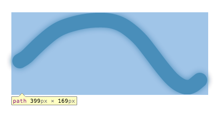
You need to increase the size of the filter region.

<filter id="SVGID_0" y="-40%" height="180%">

works just fine. The silent defaults for the filter region are: x="-10%" y="-10%" width="120%" height="120%" - large blurs usually get clipped. (Your shadow isn't getting clipped horizontally because your width is about 2.5x your height - so that 10% results in a wider horizontal filter region). Also, the y filter region seems to be calculated as if the path had a zero pixel stroke, so it's ignoring the stroke width. (Different browsers have different behavior wrt whether they consider the stroke to be part of the bounding box for purposes of filter region calculation.)

(Update: Moving up observations from comments) Please note that if your particular shape is either zero width or zero height (e.g. a horizontal or vertical line), then you must specify filterUnits="userSpaceOnUse" as part of the filter declaration and explicitly specify a filter region (x,y,width height) in userSpaceUnits (usually pixels) that creates enough room to display a shadow.

OTHER TIPS

Add an attribute to the filter shadow svg tag:

filterUnits="userSpaceOnUse"

Final Output:

<filter id="dropshadow" filterUnits="userSpaceOnUse" height="800" width="1600">

Which makes the shadow absolutely positioned and visible outside of its container.

If you're using it inside an HTML, you can simply use CSS properties to fix this issue.

svg {
  overflow: visible !important;
}

I haven't checked other browsers, but chrome has the overflow: hidden by default on svg tags.

A bit late, but I hope it's helpful.

Licensed under: CC-BY-SA with attribution
Not affiliated with StackOverflow
scroll top