Question

I wanted to restyle my buttons to be more flat so I have created two styles; first for ToggleButton that derives from ToolBar.ToggleButtonStyleKey and second for Buttonthat derives from ToolBar.ButtonStyleKey.

It worked great - the buttons are now toolbar-like and flat. Second thing I wanted is to have Background property to be transparent when user hovers the cursor over the control. So to achieve that I defined a simple trigger that sets the Background to Transparent on IsMouseOver event. It worked for ToggleButton, however, the same trigger didn't work for Button(the background was not affected at all).

Does anyone know why this trigger works great for ToggleButton and does not work for Button? I did expect the same behavior since both styles are from the same family.

Below is the full code.

<Window x:Class="WpfButtonsTest.MainWindow"
    xmlns="http://schemas.microsoft.com/winfx/2006/xaml/presentation"
    xmlns:x="http://schemas.microsoft.com/winfx/2006/xaml"
    Title="MainWindow" Height="350" Width="525">
  <Window.Resources>
<Style x:Key="FlatToggleButton"  TargetType="ToggleButton" 
BasedOn="{StaticResource {x:Static ToolBar.ToggleButtonStyleKey}}">
  <Setter Property="BorderThickness" Value="0"/>
  <Setter Property="Focusable" Value="False"/>
  <Setter Property="Background" Value="Transparent"/>
  <Style.Triggers>
    <Trigger Property="IsMouseOver" Value="True">
      <Setter Property="Background" Value="Transparent"/>
    </Trigger>
  </Style.Triggers>
</Style>

<Style x:Key="FlatButton"  TargetType="Button" 
BasedOn="{StaticResource {x:Static ToolBar.ButtonStyleKey}}">
  <Setter Property="BorderThickness" Value="0"/>
  <Setter Property="Focusable" Value="False"/>
  <Setter Property="Background" Value="Transparent"/>
  <Style.Triggers>
    <Trigger Property="IsMouseOver" Value="True">
      <Setter Property="Background" Value="Transparent"/>
    </Trigger>
  </Style.Triggers>
</Style>
 </Window.Resources>
 <Grid>
<StackPanel>
  <ToggleButton Style="{StaticResource FlatToggleButton}">
    I am Toggle Button
  </ToggleButton>

  <Button Style="{StaticResource FlatButton}">
    I am Button
  </Button>
</StackPanel>
  </Grid>
</Window>
Was it helpful?

Solution

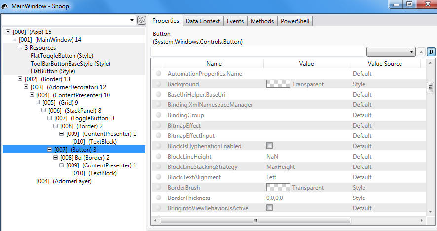
I had a look using Snoop (a very handy program for inspecting WPF ) and it looks like the template which you're using as a basis, ToolBar.ButtonStyleKey, has a trigger which selects a solid Brush for the background of a Border element within the Button (in thise case when IsMouseOver is true).

Your local style trigger is successfully setting the background of the Button element to transparent (or rather, keeping it transparent), but the Border background is unaffected, so you'll still see the highlighting behaviour.

Border Background: Border Background

Button Background: Button Background

I think you'll have to define a ControlTemplate to get the button you're after, I've grabbed this from one of the ToolBar samples included in Kaxaml (a nice XAML editor). It's a reasonable facsimile of the Toolbar bas button style, with a few bits removed, it may behave as you want, or you might need to tweak it depending on your desired behaviour.

I've left the IsPressed trigger in place, you may want to remove it, or add additional triggers.

<Style x:Key="ToolBarButtonBaseStyle" TargetType="{x:Type ButtonBase}">
    <Setter Property="SnapsToDevicePixels" Value="true"/>
    <Setter Property="OverridesDefaultStyle" Value="true"/>
    <Setter Property="Template">
        <Setter.Value>
            <ControlTemplate TargetType="{x:Type ButtonBase}">
                <Border 
                    x:Name="Border"  
                    BorderThickness="1"
                    Background="Transparent"
                    BorderBrush="Transparent">
                    <ContentPresenter 
                        Margin="2"
                        HorizontalAlignment="Center"
                        VerticalAlignment="Center"
                        RecognizesAccessKey="True"/>
                </Border>
                <ControlTemplate.Triggers>
                    <!-- Additional triggers removed, e.g "IsMouseOver" -->
                    <!-- You may not want any at all -->
                    <Trigger Property="IsPressed" Value="true">
                        <Setter TargetName="Border" Property="Background" Value="#E0E0E0" />
                        <Setter TargetName="Border" Property="BorderBrush" Value="#606060" />
                    </Trigger>
                </ControlTemplate.Triggers>
            </ControlTemplate>
        </Setter.Value>
    </Setter>
</Style>

OTHER TIPS

I see that the both FlatToggleButton and FlatButton styles already have Background as Transparent

<Setter Property="Background" Value="Transparent"/>

When the triggers is fired on IsMouseOver and set the Background again to Transparent you will not see any difference

So what you need to do is one of these options :

  • Change both styles so that the Background is something else than Transparent
  • Change the trigger so it sets the Background to something else than Transparent
Licensed under: CC-BY-SA with attribution
Not affiliated with StackOverflow
scroll top