Pregunta

This is a little tricky to explain, but: I want a responsive-height div (height: 100%) that will scale the width proportional to the height (not vice versa).

I know of this method utilising a padding-top hack to make the height proportional to the width, but I need it to work the other way around. Having said that, I'm not hugely keen on the additional requirement of absolutely-positioned elements for the content in that method, so I realise I may well be asking for the moon on a stick here.

To help visualise, here is an image:

Visual representation of desired effect

...and here is a jsFiddle, illustrating pretty much the same thing.

It is worth noting that I am already using the :before and :after pseudo-elements to vertically-align the content of the box I want to scale proportionally.

I would really enjoy not having to revert to jQuery, just because there's going to be an inherent requirement for resize handlers and generally more debugging all round... but if that's my only choice, then fiat.

¿Fue útil?

Solución

I've been wondering about a pure-css solution to this problem for a while. I finally came up with a solution using ems, which can be progressively enhanced using vws:

See codepen link for full working demo and explanation:

http://codepen.io/patrickkunka/pen/yxugb

Simplified version:

.parent {
  font-size: 250px; // height of container
  height: 1em;
}

.child {
  height: 100%;
  width: 1em; // 100% of height
}

Otros consejos

Oh,you could probably use that "padding-top" trick.

width: 50%;
height: 0;
padding-bottom: 50%;

http://absolide.tumblr.com/post/7317210512/full-css-fluid-squares

Or:

.square-box{
    position: relative;
    width: 50%;
    overflow: hidden;
    background: #4679BD;
}
.square-box:before{
    content: "";
    display: block;
    padding-top: 100%;
}

http://codeitdown.com/css-square-rectangle/

The vertical padding in CSS is related to the width of the element, not the height.

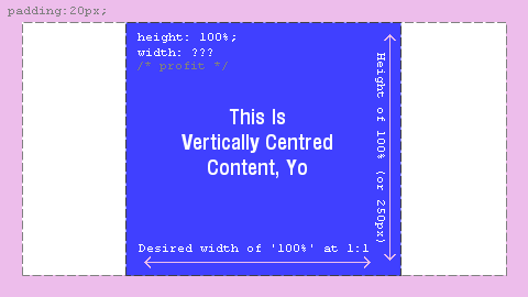
The font solution requires that the height is known. I have found a solution for making an element proportional inside a parent div with unknown widths and heights. Here is a demo.

The trick I'm using is to have an image used as a spacer. The code explained:

<div class="heightLimit">
 <img width="2048" height="2048" class="spacer"
  src="data:image/gif;base64,R0lGODlhAQABAIAAAAAAA
       P///yH5BAEAAAAALAAAAAABAAEAAAIBRAA7">
 <div class="filler">
  <div class="proportional">
  </div>
 </div>
</div>

So it is not the prettiest with two extra divs and a useless image. But it could be worse. The image element needs to have width and height with the desired dimensions. Width and height need to be as large as the maximum size allowed (a feature!).

The css:

.heightLimit {
 position: absolute;
 top: 0;
 left: 0;
 height: 100%;
 width: auto;
 max-width: 100%;
 overflow: hidden;
}

This element is to limit the height, but to expand horizontally (width: auto) although never beyond the parent (max-width). Overflow needs to be hidden because some children will protrude outside the div.

.spacer {
 width: auto;
 max-height: 100%;
 visibility: hidden;
}

This image is invisible and scaled proportionally to the height, while the width is adjusted and forces the width of the parent to also be adjusted.

.filler {
 position: absolute;
 top: 0;
 left: 0;
 bottom: 0;
 right: 0;
}

This element is required to fill the space with an absolutely positioned container.

.proportional {
 position: relative;
 width: 100%;
 height: 0;
 padding-bottom: 100%;
}

And here our proportional element gets a height proportional to the width with the familiar padding-bottom trick.

Unfortunately, there is a bug in Chrome and IE so if you modify the parent element using Javascript, such as in my demo, the dimensions will not be updated. There is a hack that can be applied to solve that, as shown in my demo.

You can use view height (vh) as the unity for the width.

Here is an example with the 20px margin you asked for.

 .parent {
   margin : 20px;
}
.child {
   width: calc(100vh - 40px);
   height : calc(100vh - 40px);
   margin:0 auto;
   background: red;
   box-sizing:border-box;
   padding:10px;
}

See the fiddle : https://jsfiddle.net/svobczp4/

Based off of @kunkalabs's answer (which is really smart) I've come up with a solution that lets you preserve the inherited font-size.

HTML:

<div id='rect'>
    <div id='content'>Text</div>
</div>

CSS:

#rect {
    font-size: 1000%;
    height: 1em;
    width: 1em;
    position: relative;
}

#content {
    font-size: 10%;
}

So basically the font-size of #content is (100 / $rectFontSize) * 100 percent of the rectangle. If you need a definite pixel size for the rectangle, you can set the #rect's parent's font-size…otherwise just adjust the font-size until it's about where you want it to be (and enrage your designer in the process).

You can achieve that by using SVG.

It depends on a case, but in some it is really usefull. As an example - you can set background-image without setting fixed height or use it to embed <iframe> with ratio 16:9 and position:absolute.

For 3:2 ratio set viewBox="0 0 3 2" and so on.

Example:

div{width:35%;background-color:red}
svg{width:100%;display:block;visibility:hidden}
<div>
  <svg viewBox="0 0 3 2"></svg>
</div>

On newer browsers, we can use aspect-ratio with a fixed height, and the width will be calculated accordingly.

img {
    aspect-ratio: 1.2;
    height: 250px;
    max-width: 500px;
}

But the browser support for aspect-ratio is not good enough. I liked the SVG solution proposed by @Jakub Muda, except for the fact that it requires modifying the markup. I have moved the SVG to CSS by including it using content property. On newer browsers, it disables the SVG hack and switches to aspect-ratio property.

document.querySelector('.nav').addEventListener('click', function(e) {
  var index = parseInt(e.target.dataset.index);
  if (!index) {
    return;
  }

  var elements = document.querySelectorAll('.box');
  for (var i = elements.length; i > 0; i--) {
    elements[i - 1].classList.toggle('hide', i !== index);
  }

});
.wrapper {
  max-width: 500px;
  margin: 0 auto;
  width: 100%;
  height: 250px;
  text-align: center;
  background: green;
}

.box {
  display: inline-flex;
  position: relative;
  max-width: 100%;
}


/* SVG Hack */

.box::before {
  display: block;
  line-height: 0;
  max-width: 100%;
  content: 'test';
}

[data-aspect-ratio="1"]::before {
  content: url("data:image/svg+xml,<svg xmlns='http://www.w3.org/2000/svg' viewBox='0 0 1 1' height='250'></svg>");
}

[data-aspect-ratio="2"]::before {
  content: url("data:image/svg+xml,<svg xmlns='http://www.w3.org/2000/svg' viewBox='0 0 2 1' height='250'></svg>");
}

[data-aspect-ratio="3"]::before {
  content: url("data:image/svg+xml,<svg xmlns='http://www.w3.org/2000/svg' viewBox='0 0 3 1' height='250'></svg>");
}

@supports (aspect-ratio: 1) {
  /* Modern browsers */
  .box {
    height: 100%;
    background: green;
  }
  .box::before {
    display: none;
  }
  [data-aspect-ratio="1"] {
    aspect-ratio: 1;
  }
  [data-aspect-ratio="2"] {
    aspect-ratio: 2;
  }
  [data-aspect-ratio="3"] {
    aspect-ratio: 2;
  }
}

.content {
  position: absolute;
  left: 0;
  top: 0;
  width: 100%;
  height: 100%;
}

.content>svg {
  display: block;
  width: 100%;
  position: absolute;
  top: 50%;
  left: 50%;
  height: auto;
  transform: translate(-50%, -50%);
}

.nav {
  text-align: center;
}

.hide {
  display: none;
}
<!doctype html>
<html lang="en">

<head>
  <title>Width proportional to height in CSS</title>
</head>

<body>
  <div class="wrapper">
    <div class="box" data-aspect-ratio="1">
      <div class="content">
        <svg viewBox="0 0 100 100" width="100" height="100" xmlns="http://www.w3.org/2000/svg"><rect x="2" y="2" width="96" height="96" style="fill:#DEDEDE;stroke:#555555;stroke-width:2"/><text x="50%" y="50%" font-size="18" text-anchor="middle" alignment-baseline="middle" font-family="monospace, sans-serif" fill="#555555">100&#215;100</text></svg>
      </div>
    </div>
    <div class="box hide" data-aspect-ratio="2">
      <div class="content">
        <svg viewBox="0 0 200 100" width="200" height="100" xmlns="http://www.w3.org/2000/svg"><rect x="2" y="2" width="196" height="96" style="fill:#DEDEDE;stroke:#555555;stroke-width:2"/><text x="50%" y="50%" font-size="18" text-anchor="middle" alignment-baseline="middle" font-family="monospace, sans-serif" fill="#555555">200&#215;100</text></svg>
      </div>
    </div>
    <div class="box hide" data-aspect-ratio="3">
      <div class="content">
        <svg viewBox="0 0 300 100" width="300" height="100" xmlns="http://www.w3.org/2000/svg"><rect x="2" y="2" width="296" height="96" style="fill:#DEDEDE;stroke:#555555;stroke-width:2"/><text x="50%" y="50%" font-size="18" text-anchor="middle" alignment-baseline="middle" font-family="monospace, sans-serif" fill="#555555">300&#215;100</text></svg>
      </div>
    </div>
  </div>

  <div class="nav">
    <button data-index="1">1</button>
    <button data-index="2">2</button>
    <button data-index="3">3</button>
  </div>
</body>

</html>

Make the parent DIV behave like a table cell and align the child element vertically. No need to do any padding tricks.

HTML

<div class="parent">
<img src="foo.jpg" />
</div>

CSS

.parent { width:300px; height:300px; display:table-cell; vertical-align:middle; }
Licenciado bajo: CC-BY-SA con atribución
No afiliado a StackOverflow
scroll top