 https://stackoverflow.com/questions/22848328
 italiano
 english
 français
 española
 中国
中国 日本の
日本の العربية
 Deutsch
 한국어
한국어 Português
 Russian
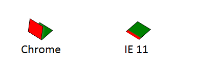
IE doesn't support transform-style: preserve-3d yet.
You have to remove the transform from #header-cube and apply it to each of the figure children. Unfortunately IE already uses the non-prefixed properties, so you either can't use transform-3d at all or have to define the prefixed properties last.
From the IE transforms documentation:
At this time, Internet Explorer 10 does not support the preserve-3d keyword. You can work around this by manually applying the parent element's transform to each of the child elements in addition to the child element's normal transform.
JSFiddle: http://jsfiddle.net/TTDH7/17/
#header-cube {
    transform-style: preserve-3d;
    transform: rotateX(43deg) rotateZ(130deg);
}
figure:nth-child(1) {
    transform: translateZ(-16px);
}
figure:nth-child(2) {
    transform: rotateY(-100deg) translateZ(-16px);
}
becomes:
#header-cube {
    transform-style: preserve-3d;
    -ms-transform-style: none;
    transform: rotateX(43deg) rotateZ(130deg);
    -ms-transform: none;
}
figure:nth-child(1) {
    transform: translateZ(-16px);
    -ms-transform: rotateX(43deg) rotateZ(130deg)
                   translateZ(-16px);
}
figure:nth-child(2) {
    transform: rotateY(-100deg) translateZ(-16px);
    -ms-transform: rotateX(43deg) rotateZ(130deg)
                   rotateY(-100deg) translateZ(-16px);
}
