Pregunta

That's my basic style

#logo {
    position: absolute;
    background: url('imgs/logo.png');
    width: 739px;
    height: 195px;
    margin: -291px 0 0 133px;
    z-index: 5;
    pointer-events: none;
}

And I want to change the margin-left to something else based on the media. For example width 100px but it doesn't work.

http://i.imgur.com/ho1oqzu.png

@media (min-width: 1440px) {

    .bc {
        padding: 0;
        margin: 0 auto;
        width: 1150px;
    }

    .content_table {
        width: 1150px;
    }

    #logo {
        position: absolute;
        background: url('imgs/logo.png');
        width: 739px;
        height: 195px;
        margin: -291px 0 0 233px;
        z-index: 5;
        pointer-events: none;
    }
}
¿Fue útil?

Solución

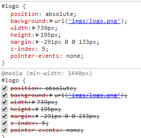
Out of your comment the first rule (the one with the margin 133px) is after the rule in the @media block.

As both have the same selector for the rule only the order in the css file matters.

Thats why the last rule (the one with the 133px) always overwrites the one in the @media block.

You should place all rules that are not in a @media block at the beginning of your css file and add the @media blocks after those rules.

Otros consejos

@media screen and (min-width: 1440px) {
    #logo {
    }
}

min-width: 1440px is a lot. are you sure you are not trying to check max-width?

Licenciado bajo: CC-BY-SA con atribución
No afiliado a StackOverflow
scroll top