SVG drop shadow using css3
 https://stackoverflow.com/questions/6088409
-
09-09-2020 - |
 italiano
 english
 français
 española
 中国
中国 日本の
日本の العربية
 Deutsch
 한국어
한국어 Português
 Russian
Pregunta
Is it possible to set drop shadow for an svg element using css3 , something like
box-shadow: -5px -5px 5px #888;
-webkit-box-shadow: -5px -5px 5px #888;
I saw some remarks on creating shadow using filter effects. Is there an example of using css alone. Below is a working code where the cusor style is correctly applied, but no shadow effect. Please help me to get the shadow effect with least bit of code.
svg .shadow {
  cursor:crosshair;
  -moz-box-shadow: -5px -5px 5px #888;
  -webkit-box-shadow: -5px -5px 5px #888;
  box-shadow: -5px -5px 5px #888;
}
<svg xmlns="http://www.w3.org/2000/svg" xmlns:xlink="http://www.w3.org/1999/xlink" version="1.1" baseProfile="full" viewBox="0 0 120 70">
<rect class="shadow" x="10" y="10" width="100" height="50" fill="#c66" />
</svg>Solución
Here's an example of applying dropshadow to some svg using the 'filter' property. If you want to control the opacity of the dropshadow have a look at this example. The slope attribute controls how much opacity to give to the dropshadow.
Relevant bits from the example:
<filter id="dropshadow" height="130%">
  <feGaussianBlur in="SourceAlpha" stdDeviation="3"/> <!-- stdDeviation is how much to blur -->
  <feOffset dx="2" dy="2" result="offsetblur"/> <!-- how much to offset -->
  <feComponentTransfer>
    <feFuncA type="linear" slope="0.5"/> <!-- slope is the opacity of the shadow -->
  </feComponentTransfer>
  <feMerge>
    <feMergeNode/> <!-- this contains the offset blurred image -->
    <feMergeNode in="SourceGraphic"/> <!-- this contains the element that the filter is applied to -->
  </feMerge>
</filter>
<circle r="10" style="filter:url(#dropshadow)"/>
Box-shadow is defined to work on CSS boxes (read: rectangles), while svg is a bit more expressive than just rectangles. Read the SVG Primer to learn a bit more about what you can do with SVG filters.
Otros consejos
Use the new CSS filter property.
Supported by webkit browsers, Firefox 34+ and Edge.
You can use this polyfill that will support FF < 34, IE6+.
You would use it like so:
/* Use -webkit- only if supporting: Chrome < 54, iOS < 9.3, Android < 4.4.4 */

.shadow {
  -webkit-filter: drop-shadow( 3px 3px 2px rgba(0, 0, 0, .7));
  filter: drop-shadow( 3px 3px 2px rgba(0, 0, 0, .7));
  /* Similar syntax to box-shadow */
}
<img src="https://upload.wikimedia.org/wikipedia/commons/c/ce/Star_wars2.svg" alt="" class="shadow" width="200">
<!-- Or -->
<svg class="shadow" ...>
<rect x="10" y="10" width="200" height="100" fill="#bada55" />
</svg>This approach differs from the box-shadow effect in that it accounts for opacity and does not apply the drop shadow effect to the box but rather to the corners of the svg element itself.
Please Note: This approach only works when the class is placed on the <svg> element alone. You can NOT use this on an inline svg element such as <rect>.
<!-- This will NOT work! -->
<svg><rect class="shadow" ... /></svg>
Read more about css filters on html5rocks.
You can easily add a drop-shadow effect to an svg-element using the drop-shadow() CSS function and rgba color values. By using rgba color values you can change the opacity of your shadow.
img.light-shadow{
  filter: drop-shadow(0px 3px 3px rgba(0, 0, 0, 0.4));
}

img.dark-shadow{
  filter: drop-shadow(0px 3px 3px rgba(0, 0, 0, 1));
}
<img class="light-shadow" src="https://cdn.sstatic.net/Sites/stackoverflow/company/img/logos/so/so-logo.svg" />
<img class="dark-shadow" src="https://cdn.sstatic.net/Sites/stackoverflow/company/img/logos/so/so-logo.svg" />Easiest way I've found is with feDropShadow. I will never go back to using those incredibly esoteric filter tag names that I don't understand.
<filter id="shadow" x="0" y="0" width="200%" height="200%">
  <feDropShadow dx="40" dy="40" stdDeviation="35" flood-color="#ff0000" flood-opacity="1" />
</filter>
I'm not aware of a CSS-only solution.
As you mentioned, filters are the canonical approach to creating drop shadow effects in SVG. The SVG specification includes an example of this.
Black text with white shadow
Another way, I used for white shadow (on text): create a clone for shadow:
Note: This require xmlns:xlink="http://www.w3.org/1999/xlink" at SVG declaration.
Real text value is located in <defs> section, with position and style, but without a fill definition.
The text is cloned two times: first for shadow and second for the text itself.
<svg xmlns="http://www.w3.org/2000/svg" width="640" height="70"
    xmlns:xlink="http://www.w3.org/1999/xlink">
  <defs>
  <filter id="Blur"><feGaussianBlur stdDeviation="0.8" /></filter>
  <text style="font-family:sans,helvetica;font-weight:bold;font-size:12pt"
      id="Text"><tspan x="12" y="19">
        Black text with white shadow
    </tspan></text>
  </defs>
  <rect style="fill:#8AB" width="640" height="70" />
  <use style="fill:white;" filter="url(#Blur)" xlink:href="#Text"
      transform="translate(1.8,.9)"/>
  <use style="fill:black;" xlink:href="#Text"/>
</svg>
More distant shadow with biggest value as blur deviation:
<svg xmlns="http://www.w3.org/2000/svg" width="640" height="70"
    xmlns:xlink="http://www.w3.org/1999/xlink">
  <defs>
  <filter id="Blur"><feGaussianBlur stdDeviation="3" /></filter>
  <text style="font-family:sans,helvetica;font-weight:bold;font-size:12pt"
      id="Text"><tspan x="12" y="19">
        Black text with white shadow
    </tspan></text>
  </defs>
  <rect style="fill:#8AB" width="640" height="70" />
  <use style="fill:white;" filter="url(#Blur)" xlink:href="#Text"
      transform="translate(7,5)"/>
  <use style="fill:black;" xlink:href="#Text"/>
</svg>
You can use this same approach with regular SVG objects.
With same requirement: No fill definition at <defs> section!
<svg xmlns="http://www.w3.org/2000/svg" width="364" height="172"
    xmlns:xlink="http://www.w3.org/1999/xlink">
  <defs>
    <filter id="Blur"><feGaussianBlur stdDeviation="0.8" /></filter>
    <g transform="matrix(.7,0,0,.7,-117.450795,-335.320895)" id="Img">
        <g transform="matrix(12.997776,0,0,-12.997776,389.30313,662.04015)">
            <path d="m 0,0 -1.107,0 c -0.039,0 -0.067,0.044 -0.067,0.086 0,0.015 0.589,1.914 0.589,1.914 0.021,0.071 0.023,0.073 0.031,0.073 l 0.001,0 c 0.009,0 0.01,-0.002 0.031,-0.073 0,0 0.589,-1.899 0.589,-1.914 C 0.067,0.044 0.037,0 0,0 M 1.493,4.345 C 1.482,4.383 1.448,4.411 1.408,4.414 l -4.065,0 C -2.698,4.41 -2.731,4.383 -2.742,4.346 c 0,0 -2.247,-7.418 -2.247,-7.432 0,-0.037 0.029,-0.067 0.067,-0.067 l 2.687,0 c 0.021,0.008 0.037,0.028 0.042,0.051 l 0.313,1 c 0.01,0.025 0.033,0.042 0.061,0.043 l 2.479,0.002 c 0.027,-0.002 0.051,-0.021 0.061,-0.045 l 0.32,-1 c 0.005,-0.023 0.021,-0.044 0.042,-0.052 0,0 2.642,10e-4 2.644,10e-4 0.037,0 0.068,0.028 0.068,0.065 0,0.013 -2.302,7.433 -2.302,7.433" />
        </g>
        <g transform="matrix(12.997776,0,0,-12.997776,508.27177,644.93113)">
            <path d="m 0,0 -1.651,-0.001 c 0,0 -0.044,0.013 -0.044,0.063 l -10e-4,0.833 c 0,0.05 0.044,0.063 0.044,0.063 l 1.514,0 C 0.038,0.958 0.394,0.87 0.394,0.463 0.394,0.056 0,0 0,0 m 7.916,0.645 3.741,0 0,2.453 -4.81,0 C 6.397,3.098 5.764,2.866 5.401,2.597 5.038,2.328 4.513,1.715 4.513,0.87 c 0,-0.845 0.513,-1.502 0.513,-1.502 0.263,-0.326 0.925,-1.005 0.925,-1.005 0.015,-0.016 0.024,-0.037 0.024,-0.061 0,-0.051 -0.041,-0.092 -0.092,-0.092 l -3.705,0 c -0.451,0.002 -0.482,0.181 -0.482,0.207 0,0.046 0.056,0.075 0.056,0.075 0.169,0.081 0.514,0.35 0.514,0.35 0.732,0.57 0.82,1.352 0.82,1.771 0,0.42 -0.063,1.163 -0.814,1.814 C 1.521,3.078 0.57,3.096 0.57,3.096 l -5.287,0 c 0,0 0,-7.52 0,-7.522 0,-0.024 0.022,-0.043 0.046,-0.043 l 2.943,0 0,2.11 c 0,0.037 0.057,0 0.057,0 l 1.533,-1.54 c 0.545,-0.551 1.446,-0.57 1.446,-0.57 l 5.796,0.001 c 0.989,0 1.539,0.538 1.69,0.688 0.15,0.151 0.651,0.714 0.651,1.647 0,0.932 -0.426,1.409 -0.608,1.628 C 8.675,-0.309 8.029,0.375 7.894,0.517 7.878,0.53 7.868,0.55 7.868,0.572 c 0,0.033 0.019,0.064 0.048,0.073" />
        </g>
        <g transform="matrix(12.997776,0,0,-12.997776,306.99861,703.01559)">
            <path d="m 0,0 c 0.02,0 0.034,0.014 0.04,0.036 0,0 2.277,7.479 2.277,7.486 0,0.02 -0.012,0.042 -0.031,0.044 0,0 -2.805,0 -2.807,0 -0.014,0 -0.023,-0.011 -0.026,-0.026 0,-0.001 -0.581,-1.945 -0.581,-1.946 -0.004,-0.016 -0.012,-0.026 -0.026,-0.026 -0.014,0 -0.026,0.014 -0.028,0.026 L -1.79,7.541 c -0.002,0.013 -0.012,0.025 -0.026,0.025 -10e-4,0 -3.1,0.001 -3.1,0.001 -0.009,-0.002 -0.017,-0.01 -0.02,-0.018 0,0 -0.545,-1.954 -0.545,-1.954 -0.003,-0.017 -0.012,-0.027 -0.027,-0.027 -0.013,0 -0.024,0.01 -0.026,0.023 l -0.578,1.952 c -0.001,0.012 -0.011,0.022 -0.023,0.024 l -2.992,0 c -0.024,0 -0.044,-0.02 -0.044,-0.045 0,-0.004 10e-4,-0.012 10e-4,-0.012 0,0 2.31,-7.471 2.311,-7.474 C -6.853,0.014 -6.839,0 -6.819,0 c 0.003,0 2.485,-0.001 2.485,-0.001 0.015,0.002 0.03,0.019 0.034,0.037 10e-4,0 0.865,2.781 0.865,2.781 0.005,0.017 0.012,0.027 0.026,0.027 0.015,0 0.023,-0.012 0.027,-0.026 L -2.539,0.024 C -2.534,0.01 -2.521,0 -2.505,0 -2.503,0 0,0 0,0" />
        </g>
        <g transform="matrix(12.997776,0,0,-12.997776,278.90126,499.03369)">
            <path d="m 0,0 c -0.451,0 -1.083,-0.232 -1.446,-0.501 -0.363,-0.269 -0.888,-0.882 -0.888,-1.727 0,-0.845 0.513,-1.502 0.513,-1.502 0.263,-0.326 0.925,-1.01 0.925,-1.01 0.015,-0.016 0.024,-0.037 0.024,-0.06 0,-0.051 -0.041,-0.093 -0.092,-0.093 -0.008,0 -6.046,0 -6.046,0 l 0,-2.674 7.267,0 c 0.988,0 1.539,0.538 1.69,0.689 0.15,0.15 0.65,0.713 0.65,1.646 0,0.932 -0.425,1.414 -0.607,1.633 -0.162,0.196 -0.808,0.876 -0.943,1.017 -0.016,0.014 -0.026,0.034 -0.026,0.056 0,0.033 0.019,0.063 0.048,0.073 l 3.5,0 0,-5.114 2.691,0 0,5.101 3.267,0 0,2.466 L 0,0 Z" />
        </g>
        <g transform="matrix(12.997776,0,0,-12.997776,583.96822,539.30215)">
            <path d="m 0,0 -1.651,-0.001 c 0,0 -0.044,0.013 -0.044,0.063 l -10e-4,0.833 c 0,0.05 0.044,0.063 0.044,0.063 l 1.514,0 C 0.038,0.958 0.394,0.87 0.394,0.463 0.394,0.056 0,0 0,0 m 2.178,-1.79 c -0.45,0.002 -0.482,0.181 -0.482,0.207 0,0.046 0.056,0.075 0.056,0.075 0.169,0.081 0.514,0.35 0.514,0.35 0.732,0.57 0.82,1.352 0.82,1.771 0,0.42 -0.063,1.163 -0.814,1.814 C 1.521,3.078 0.57,3.098 0.57,3.098 l -5.287,0 c 0,0 0,-7.522 0,-7.524 0,-0.024 0.022,-0.043 0.046,-0.043 0.005,0 2.943,0 2.943,0 l 0,2.109 c 0,0.038 0.057,0 0.057,0 l 1.533,-1.539 c 0.545,-0.551 1.446,-0.57 1.446,-0.57 l 4.525,0 0,2.679 -3.655,0 z" />
        </g>
        <g transform="matrix(12.997776,0,0,-12.997776,466.86346,556.40203)">
            <path d="m 0,0 -1.107,0 c -0.041,0 -0.067,0.044 -0.067,0.086 0,0.016 0.589,1.914 0.589,1.914 0.021,0.071 0.027,0.073 0.031,0.073 l 0.001,0 c 0.004,0 0.01,-0.002 0.031,-0.073 0,0 0.589,-1.898 0.589,-1.914 C 0.067,0.044 0.04,0 0,0 M 1.49,4.347 C 1.479,4.385 1.446,4.412 1.405,4.414 l -4.065,0 C -2.7,4.412 -2.734,4.385 -2.745,4.348 c 0,0 -2.245,-7.42 -2.245,-7.434 0,-0.037 0.03,-0.067 0.067,-0.067 l 2.687,0 c 0.022,0.007 0.038,0.028 0.043,0.051 l 0.313,1.001 c 0.01,0.024 0.033,0.041 0.061,0.042 l 2.478,0 C 0.687,-2.061 0.71,-2.078 0.721,-2.102 l 0.32,-1 c 0.005,-0.023 0.021,-0.044 0.042,-0.052 0,0 2.642,10e-4 2.644,10e-4 0.037,0 0.067,0.028 0.067,0.066 0,0.012 -2.304,7.434 -2.304,7.434" />
        </g>
    </g>
  </defs>
  <rect style="fill:#8AB" width="364" height="172" />
  <use style="fill:white;" filter="url(#Blur)" xlink:href="#Img"
    transform="translate(1.8,.9)"/>
  <use style="fill:black;" xlink:href="#Img"/>
</svg>
Probably an evolution, it appears that inline css filters works nicely on elements, in a certain way.
Declaring a drop-shadow css filter, in an svg element, in both a class or inline does NOT works, as specified earlier.
But, at least in Firefox, with the following wizardry:
Appending the filter declaration inline, with javascript, after DOM load.
// Does not works, with regular dynamic css styling:

shadow0.onchange = () => {
  rect1.style.filter = "filter:drop-shadow(0 0 " + shadow0.value + "rem black);"
}

// Okay! Inline styling, appending.

shadow1.onchange = () => {
  rect1.style += " ;filter:drop-shadow(0 0 " + shadow1.value + "rem black);"
  rect2.style += " ;filter:drop-shadow(0 0 " + shadow1.value + "rem black);"
}
<h4>
Does not works!
<input id="shadow0" type="number" min="0" max="100" step="0.1">
| Okay!
<input id="shadow1" type="number" min="0" max="100" step="0.1">
<svg viewBox="0 0 120 70">
<rect id="rect1" x="10" y="10" width="100" height="50" fill="#c66" />
<!-- Inline style declaration does NOT works at svg level, no shadow at loading: -->
<rect id="rect2" x="40" y="30" width="10" height="10" fill="#aaa" style="filter:drop-shadow(0 0 20rem black)" />
</svg>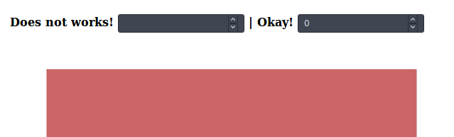
