How to reverse the X-axis labels of scatterplot created by using ggplot2 in R?
-
10-09-2020 - |
 italiano
 english
 français
 española
 中国
中国 日本の
日本の العربية
 Deutsch
 한국어
한국어 Português
 Russian
Pregunta
How to reverse the X-axis labels of scatterplot created by using ggplot2 in R?
Example
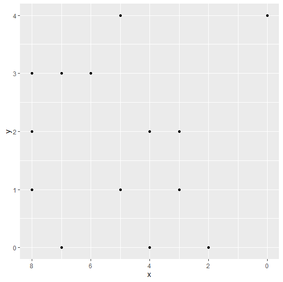
There exists a possibility that one of the variables is recorded in an opposite manner and we want to create a scatterplot using that variable. Therefore, we would need to reverse that variable while plotting. Suppose that variable is an independent variable, hence it will be plotted on X-axis. Thus, to reverse the X-axis labels we can use scale_x_reverse function of ggplot2 package.
Consider the below data frame −
Example
x<-rpois(20,5)
y<-rpois(20,2)
df<-data.frame(x,y)
df
Output
   x  y
1  5  1
2  7  0
3  5  1
4  7  3
5  3  1
6  3  2
7  0  4
8  8  1
9  7  3
10 8  3
11 3  2
12 5  4
13 8  2
14 2  0
15 3  1
16 6  3
17 4  0
18 4  2
19 3  1
20 8  3
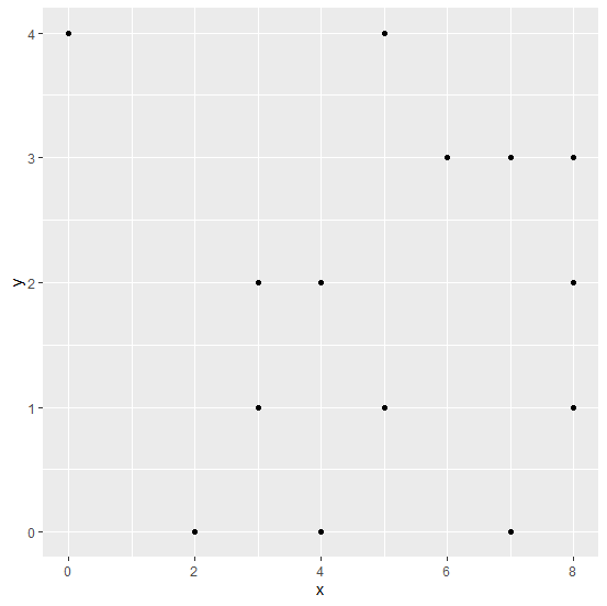
Loading ggplot2 package and creating scatterplot between x and y −
Example
library(ggplot2)
ggplot(df,aes(x,y))+geom_point()
Output
Creating scatterplot between x and y with reversed limits −
Example
ggplot(df,aes(x,y))+geom_point()+scale_x_reverse(lim=c(8,0))
Output

Published on 08-Sep-2020 15:28:11
Advertisements
No afiliado a Tutorialspoint
