Server-side options to deliver different page structure (HTML) to different mobile devices
 https://stackoverflow.com/questions/7085796
 italiano
 english
 français
 española
 中国
中国 日本の
日本の العربية
 Deutsch
 한국어
한국어 Português
 Russian
Pregunta
I am researching best practices for developing 'classic' style mobile sites, i.e., mobile sites that are delivered and experienced as mobile HTML pages vs. small JavaScript applications (jQuery Mobile, Sencha, etc.).
There are two prevailing approaches:
- Deliver the same page structure (HTML) to all mobile devices, then use CSS media queries or JavaScript to improve the experience for more capable devices.
- Deliver an entirely different page structure (and possibly content) to devices with enhanced capabilities.
I'm specifically interested in best practices for the second approach. Two good examples are:
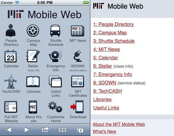
- MIT's mobile site: different for Blackberries and feature(less) phones than for iOS & Android devices, but available at the same URLs -- http://m.mit.edu/
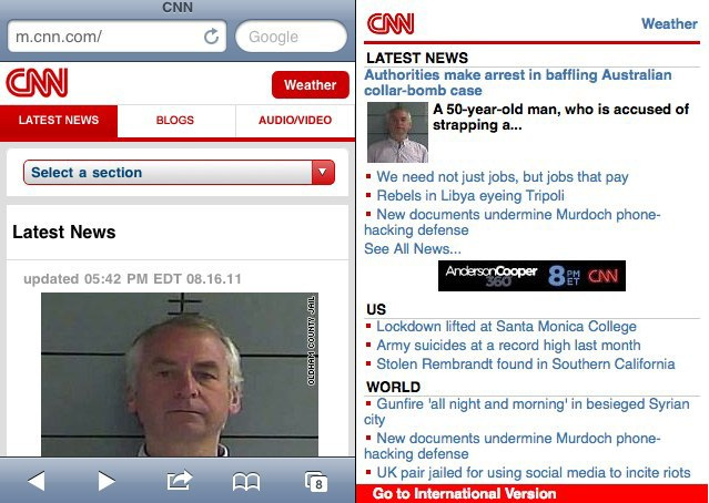
- CNN's mobile site: ditto -- http://m.cnn.com/
I'd like to hear from people here at SO have actually worked on something like this, and can explain what the best practices are for delivering this type of device-dependent structure/content/experience.
I don't need a primer on mobile user-agent detection, or WURFL, or any of the concepts covered in other (great) SO threads like this one. I've used jQuery Mobile and Sencha Touch and I'm familiar with most approaches for delivering the final mobile experience, so no pointers required there either thanks.
What I really would like to understand is: how these specific types of experiences are delivered in terms of server-side detection and delivery based on user-agent groups -- where there's one stripped down page structure (different HTML) delivered to one group of devices, and another richer type of HTML document delivered to newer devices, but both at the same sub-domain / URLs.
Hope that all makes sense. Many thanks in advance.
Solución
At NPR, we use a server side 'application' to serve up the correct html/css/etc depending on if the user is on a high-end device or a lower-tier phone.
So, when a mobile device pings an npr.org page, our servers use a user-agent detection method to point them to the corresponding m.npr.org. Once directed to the m.npr.org URL, the web app - which is written in groovy, but I think could potentially be a number of things - sends back either the touch version of the site or the more simple, stripped down content. The choice of the web app is made based at least somewhat on the WURFL data.
I don't have enough rep points to post a comparison with screenshots, so I'll have to point you to the sites themselves.
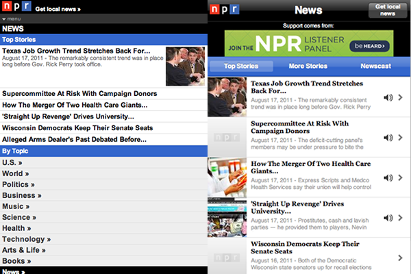
You can see this in your desktop browser by typing in m.npr.org to see the stripped down site. And you can override the default device detection by adding the parameter ?devicegate.client=iPhone_3_0 to see the touch version you would see if you just went to npr.org on your smartphone. If you view the source, you can see how different html & css is being served at the same subdomain.
Hope it helps seeing something like this in the wild. Does that make sense?
Otros consejos
A common way to detect which format a mobile device needs is the accept header:
application/xhtml+xml > xhtml text/vnd.wap.wml > Old wml wap pages . . .
On newer devices which can handle all the desktop html formats, you can use the user agent.
Then you have to ask yourself what you want to do:
Switch to another Stylesheet (only works with newer devices). Switch to another view logic, like building wml page templates. Switch to a complete other page.
I think the second approach is the best one. Many web frameworks make it easy to switch to another view logic without rewriting the rest (the mvc pattern in its glory).
I have two examples for you.
Read up on how facebook achieves this using XHP to give abstract different output for different markups: One Mobile Site to Serve Thousands of Phones
There will be a lot of good stuff in their actual implementation which I wish was available.
I use a framework called HawHaw, which let's you write your app once (in PHP Objects or XML files) and it outputs the correct markup to the device based on a few checks (accept header, agent string etc).
