 https://stackoverflow.com/questions/22177131
 italiano
 english
 français
 española
 中国
中国 日本の
日本の العربية
 Deutsch
 한국어
한국어 Português
 Russian
Look the answer here : Twitter Bootstrap 3: how to use media queries?
It's for Twitter's Bootstrap but it should work for you question as well.
Question
Currently I'm using the following media queries to target the general smartphone and mobile device audience:
@media only screen and (min-device-width : 320px) and (max-device-width : 480px){
.img-logo-main-page{
    display: none;
}
.img-tech-main{
    display: none;
}
.icon-message{
    display: none;
}
}
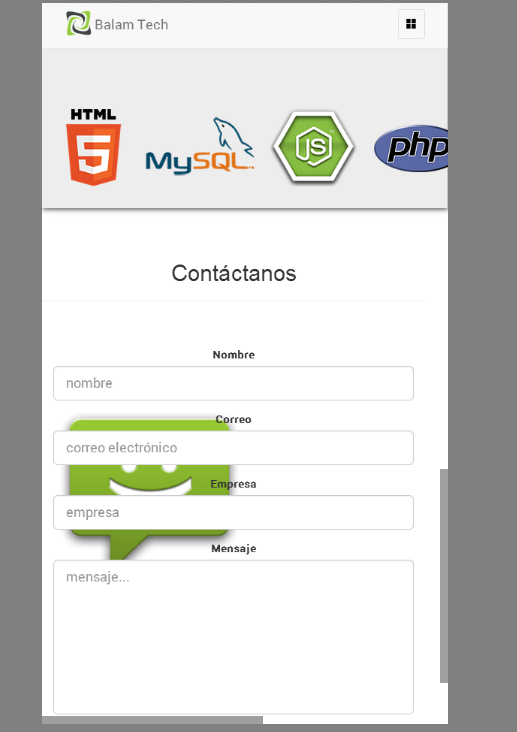
But for newer, bigger screen devices, this doesn't seem to work! This is how the website looks on a galaxy s3:

And this is how it looks on a galaxy note 3:
Is there a media query for bigger devices such as this one? I've been looking for css-tricks and other forums and websites like that one, but All I could find was the general media query for standard devices like this one: http://css-tricks.com/snippets/css/media-queries-for-standard-devices/
Any help will be appreciated!
La solution
Look the answer here : Twitter Bootstrap 3: how to use media queries?
It's for Twitter's Bootstrap but it should work for you question as well.
Autres conseils
You can set your own values for your media queries for min-device-width and max-device-width.
You need to adjust the pixel ratio from default. Try @media only screen and (device-width: 320px) and (device-height: 640px) and (-webkit-device-pixel-ratio: 2) for the Galaxy S3.
