Question

I've been pondering this ever since I started using Bootstrap 3 - which is a fantastic framework by the way. What I'm describing may be completely the wrong way to go about this or it may be a very common issue and I'm interested to see how other developers & designers handle this.

The image below contains a simple row (white box) in a container. The row has a col span of 10 with an offset of 1 and the blue box is then inside a nested row of the white box. When the designer does this they will simply be keeping everything matching up to the nice full width container grid (because they won't understand or need to know how nested rows work).

enter image description here

However, the reality in Bootstrap 3 is the 12 grid starts again inside the nested row. The result of this means I can no longer line up the blue box nicely as it doesn't fit the nested grid.

enter image description here

So my question is: how do others handle this? Am I actually using nested rows in a way I shouldn't be or is this something that the designer needs to be educated on? Or is there something much easier that I'm now aware of :)

Thoughts?

Était-ce utile?

La solution

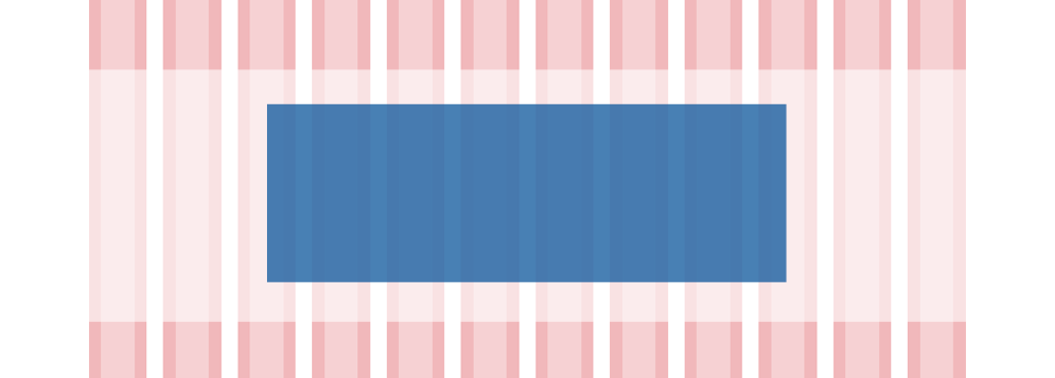
After doing some more investigation I have just realised that I don't think this is an issue at all. What my example above is ignoring is that the gutter remains the same width in nested rows as in the outer rows. When I did in above images (and with how I always thought about it) I simply resized the grid in Photoshop which also resized the gutters - which is incorrect.

I've tried now using this cool tool http://gridpak.com/, created the grid to the same width as my nested row and, lo and behold, it lined up perfectly.

The columns in the nested rows will be different still but the result will match up with the original design. In the example above, the blue box will actually be a col span of 8 with an offset of 2. The designer will look at the site and "think" it is actually a col span of 6 but we will all know better.

Thanks for the ideas and suggestions everyone - especially to royalsflush for the neat jQuery tool he developed as that might still come in handy.

Autres conseils

Indeed, the 12 grid system may cause difficulties in some cases when you have fixed directives from your designer, but there are all kind of tricks that you can do in order to succeed.

So if you want to align the blue block to be on center and a width of 6 cols, you can just use col-lg-offset-3 col-lg-6 classes and don't use it inside that white block, or if you use it inside that white block you can set this classes col-lg-offset-2 col-lg-8 and change the left and the right padding from 15px to 45pxlike you can see in this example (code here).

As you can see, everything is possible in bootstrap, you just have to change the left and right padding and you can create any type of layout you need.

I guess, it's because you did this whole thing in a <div class="container"> so the grid went according to this block. Just remove the <div class="container"> and the inner blocks will snap to the 'main' grid. Play a little with classes and offsets and it will look like in the first picture.

I found a couple of variations of your question, mainly because I had the same problem a while ago - maybe one of the answers to those can help you out:

Bootstrap 3 nested grid not reset to 12

Prevent bootstrap 3 from resetting nested grids / use master grid

Licencié sous: CC-BY-SA avec attribution
Non affilié à StackOverflow
scroll top