Fabric UI Module “Modal Dialog” in React Web Part integrated but nothing appear
 https://sharepoint.stackexchange.com/questions/288382
-
19-02-2021 - |
 italiano
 english
 français
 española
 中国
中国 日本の
日本の العربية
 Deutsch
 한국어
한국어 Português
 Russian
Question
I have used the standard yo creation method to create a new SharePoint Framework web part.
I replaced the content of default webpart/component with the proposed script from Fabric UI -> Modal Dialog.
After some adaption I get no more errors. But my web part doesn't show anything in my workbench. I pointed out that the "const" (isModalOpen, isDraggable, titleId) make the problems, maybe.
Has anybody any idea?
import * as React from 'react';
import styles from './ModalDialog.module.scss';
import { IModalDialogProps } from './IModalDialogProps';
import { useId, useBoolean } from '@uifabric/react-hooks';
import { } from '@microsoft/sp-lodash-subset';
import {
  getTheme,
  mergeStyleSets,
  FontWeights,
  ContextualMenu,
  Toggle,
  DefaultButton,
  Modal,
  IDragOptions,
  IconButton,
  IIconProps,
} from 'office-ui-fabric-react';

const dragOptions: IDragOptions = { moveMenuItemText: 'Move', closeMenuItemText: 'Close', menu: ContextualMenu, };
const cancelIcon: IIconProps = { iconName: 'Cancel' };

const theme = getTheme();
  const contentStyles = mergeStyleSets({
    container: {
      display: 'flex',
      flexFlow: 'column nowrap',
      alignItems: 'stretch',
    },
    header: [
      // eslint-disable-next-line deprecation/deprecation
      theme.fonts.xLargePlus,
      {
        flex: '1 1 auto',
        borderTop: `4px solid ${theme.palette.themePrimary}`,
        color: theme.palette.neutralPrimary,
        display: 'flex',
        alignItems: 'center',
        fontWeight: FontWeights.semibold,
        padding: '12px 12px 14px 24px',
      },
    ],
    body: {
      flex: '4 4 auto',
      padding: '0 24px 24px 24px',
      overflowY: 'hidden',
      selectors: {
        p: { margin: '14px 0' },
        'p:first-child': { marginTop: 0 },
        'p:last-child': { marginBottom: 0 },
      },
    },
  });
  const toggleStyles = { root: { marginBottom: '20px' } };
  const iconButtonStyles = {
    root: {
      color: theme.palette.neutralPrimary,
      marginLeft: 'auto',
      marginTop: '4px',
      marginRight: '2px',
    },
    rootHovered: {
      color: theme.palette.neutralDark,
    },
  };

export default class ModalDialog extends React.Component<IModalDialogProps, {}> {
  public render(): React.ReactElement<IModalDialogProps> {
    const [isModalOpen, { setTrue: showModal, setFalse: hideModal }] = useBoolean(false);
    const [isDraggable, { toggle: toggleIsDraggable }] = useBoolean(false);
    const titleId = useId('title');
    return (
      <div className={ styles.modalDialog }>
        <div className={ styles.container }>
          <div className={ styles.row }>
            <div className={ styles.column }>
              <div>
                <p>Test Text</p>
                <DefaultButton text={this.props.description} />
                <Toggle styles={toggleStyles} label="Is draggable" inlineLabel onChange={toggleIsDraggable} checked={isDraggable} />
                <Modal titleAriaId={titleId} isOpen={isModalOpen} onDismiss={hideModal} isBlocking={false} containerClassName={contentStyles.container} dragOptions={isDraggable ? dragOptions : undefined} >
                    <div className={contentStyles.header}>
                        <span id={titleId}>Lorem Ipsum</span>
                        <IconButton styles={iconButtonStyles} iconProps={cancelIcon} ariaLabel="Close popup modal" onClick={hideModal} />
                    </div>
                    <div className={contentStyles.body}>
                        <p>Lorem ipsum dolor sit amet</p>
                    </div>
                </Modal>
              </div>
            </div>
          </div>
        </div>
      </div>
    );
  }
}
La solution
Check whether this error is reported in the developer tools.
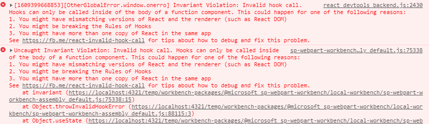 This is a problem with react hook. Since I am not familiar with react hook, I use react state directly.
import * as React from 'react';
import styles from './OfficeUispfx.module.scss';
import { IOfficeUispfxProps } from './IOfficeUispfxProps';
import { escape } from '@microsoft/sp-lodash-subset';
import * as MyScript from './myscript';
import { Callout } from 'office-ui-fabric-react/lib/Callout';
import { useId, useBoolean } from '@uifabric/react-hooks';
import { } from '@microsoft/sp-lodash-subset';
import {
  getTheme,
  mergeStyleSets,
  FontWeights,
  ContextualMenu,
  Toggle,
  DefaultButton,
  Modal,
  IDragOptions,
  IconButton,
  IIconProps,
} from 'office-ui-fabric-react';

export default class OfficeUispfx extends React.Component<IOfficeUispfxProps, any> {

  constructor(props){
    super(props);
    this.state={
      modalStaus:false
    };

  }


  public render(): React.ReactElement<IOfficeUispfxProps> {
    const dragOptions: IDragOptions = { moveMenuItemText: 'Move', closeMenuItemText: 'Close', menu: ContextualMenu, };
const cancelIcon: IIconProps = { iconName: 'Cancel' };

const theme = getTheme();
  const contentStyles = mergeStyleSets({
    container: {
      display: 'flex',
      flexFlow: 'column nowrap',
      alignItems: 'stretch',
    },
    header: [
      // eslint-disable-next-line deprecation/deprecation
      theme.fonts.xLargePlus,
      {
        flex: '1 1 auto',
        borderTop: `4px solid ${theme.palette.themePrimary}`,
        color: theme.palette.neutralPrimary,
        display: 'flex',
        alignItems: 'center',
        fontWeight: FontWeights.semibold,
        padding: '12px 12px 14px 24px',
      },
    ],
    body: {
      flex: '4 4 auto',
      padding: '0 24px 24px 24px',
      overflowY: 'hidden',
      selectors: {
        p: { margin: '14px 0' },
        'p:first-child': { marginTop: 0 },
        'p:last-child': { marginBottom: 0 },
      },
    },
  });
  const toggleStyles = { root: { marginBottom: '20px' } };
  const iconButtonStyles = {
    root: {
      color: theme.palette.neutralPrimary,
      marginLeft: 'auto',
      marginTop: '4px',
      marginRight: '2px',
    },
    rootHovered: {
      color: theme.palette.neutralDark,
    },
  };
    // const [isModalOpen, { setTrue: showModal, setFalse: hideModal }] = useBoolean(false);
     //const [isDraggable, { toggle: toggleIsDraggable }] = useBoolean(false);
    //const titleId = useId('title');

    return (
      <div className={ styles.officeUispfx }>
        <div className={ styles.container }>
          <div className={ styles.row }>
            <div className={ styles.column }>
              <span className={ styles.title }>Welcome to SharePoint!</span>
              <p className={ styles.subTitle }>Customize SharePoint experiences using Web Parts.</p>
              <p className={ styles.description }>{escape(this.props.description)}</p>
              <a href="https://aka.ms/spfx" className={ styles.button }>
                <span className={ styles.label }>Learn more</span>
              </a>
            </div>
            <a href="#" className={ styles.button } onClick={  MyScript.Greeting }  >
                <span className={ styles.label }>Greeting</span>
              </a>
          </div>
        </div>
        <div>
        <p>Test Text</p>
                <DefaultButton text={this.props.description} onClick={()=>this.setState({modalStaus:true})}/>

                <Modal  isOpen={this.isModalOpen()} isBlocking={false} containerClassName={contentStyles.container}  >
                    <div className={contentStyles.header}>
                        <span >Lorem Ipsum</span>
                        <IconButton styles={iconButtonStyles} iconProps={cancelIcon} ariaLabel="Close popup modal" onClick={()=>this.setState({modalStaus:false})} />
                    </div>
                    <div className={contentStyles.body}>
                        <p>Lorem ipsum dolor sit amet</p>
                    </div>
                </Modal>
    </div>
      </div>
    );

  }

 private isModalOpen():boolean{
  return this.state.modalStaus;
 }

}
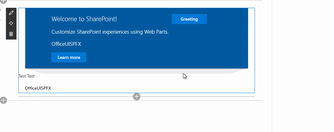
Test result:
Licencié sous: CC-BY-SA avec attribution
Non affilié à sharepoint.stackexchange
