Domanda

I would like to load javascript files only on Desktop version of my Google blogspot (blogger.com) since I need a light version of my blog for mobile.

I came through followings, but not working

<b:if cond != 'data:blog.isMobile'>;
<b:if cond = !'data:blog.isMobile'>;
<b:if cond = '!data:blog.isMobile'>;
<b:if cond='data:blog.pageType !== "data:blog.isMobile">

How can I write "is Not Mobile" conditional in Google blogspot? Thanks in advance for all answers.

================================================================================

Update: I'm using following code at the moment and it's working but better ideas are welcome

<b:if cond='data:blog.isMobile'>

<b:else/>
    //I include javascript files here and they only appear on desktop version
</b:if>
È stato utile?

Soluzione

You can use true or false statements in blogger conditional tags in this case. This is the best way ;)

<b:if cond='data:blog.isMobile == &quot;false&quot;'>
//Contents inside this, will only appear in Desktop version.
</b:if>

Edit #1:

This will work only if you have enabled mobile template, and set it to custom.

enter image description here

enter image description here

And it does work on Chrome's mobile emulator. (will be redirected to mobile version if visiting from a mobile device or with an emulator that reflects a mobile Browser User Agent. it will add ?m=1 at the end of the URL)

enter image description here

Hope this helps.

Altri suggerimenti

i've found a useful conditional tag to display only on mobile view recently. this conditional tag worked even i didn't activate mobile template.

<b:if cond='data:blog.isMobileRequest == &quot;true&quot;'>
<!-- showed only if browser request as a mobile -->
<b:else/>
<!-- showed if browser not requesting as a mobile device-->
</b:if>

Try use this with my example: in this example, thumbnail image removed when mobile request value is true and displaying thumbnail if not requested.

<b:if cond='data:blog.isMobileRequest == &quot;true&quot;'>
            <div>
              <div class='item-title'><a expr:href='data:post.href' expr:title='data:post.snippet'><data:post.title/></a></div>
            </div>
<b:else/>
            <div class='item-thumbnail-only'>
              <b:if cond='data:post.thumbnail'>
                <div class='item-thumbnail'>
                  <a expr:href='data:post.href' expr:title='data:post.snippet' target='_blank'>
                    <img border='0' expr:alt='data:post.title' expr:height='data:thumbnailSize' expr:src='data:post.thumbnail' expr:width='data:thumbnailSize'/>
                  </a>
                </div>
              </b:if>
              <div class='item-title'><a expr:href='data:post.href' expr:title='data:post.snippet'><data:post.title/></a></div>
            </div>
</b:if>

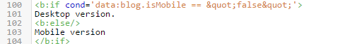
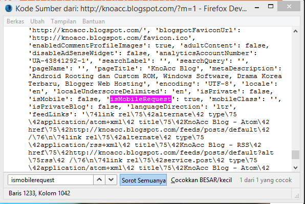
you can find this conditional tag value in view-source of your blogspot page.

data:blog.isMobileRequest is a condition wich listening value of m= query on address bar.

web address followed with m=1 it mean isMobileRequest: true;

image 1

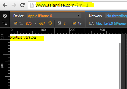
and if not followed with m=1 or followed with m=0 it mean isMobileRequest: false;

image 2

Blogger's own mobile data tag is enough i guess. but if still you are looking for alternate way, you can use some JS logic. I suppose you already knew that blogger redirects all mobile devices to http://yourdomain.blogspot.com/?m=1 Where the ?m=1 part enables the mobile version.

Now you can use that redirect to your favor.

Create a Javascript checkpoint which checks that if Request.QueryString has ?m=1 if it has then do nothing else load your's Javascript which you want.

--Hope this helps.

So far this is the best and updated conditional tag I've found. and it works fine weather the mobile template activated or not.

<b:if cond='data:blog.isMobileRequest == &quot;false&quot;'>
<!-- display 'something' if browser not requesting as a mobile device-->
<p>Something!</p>
</b:if>

You can use blogger's mobile platform along with media queries like this

<link expr:href='data:blog.url + &quot;?m=1&quot;' media='only screen and (max-width: 640px)' rel='alternate'/>

which will simply display the mobile version for your chosen media screen. similarly you can attach your js or css files using this method to display your stuff on mobile platforms.

If you are adding your extra HTML/Javascript as widget, there is another handy way to do this by setting the value of mobile attribution in widget elements.

To prevent your widget loading on mobile, <b:widget id='Attribution1' mobile='no' title='Attribution' type='Attribution'>

Or to make it only available in mobile. <b:widget id='Attribution1' mobile='only' title='Attribution' type='Attribution'>

For more details, you can see it here

To be honest, the term isMobile is too broad and may not be able to enable you to deliver expected result for all screen sizes -- this could be the limitation of Blogger in handling mobile responsiveness at the moment. To make your javascript conditionally work like CSS @media query, use this example:

<script type="text/javascript">
        if (window.matchMedia('(max-width: 950px)').matches) {
             // Do something for screen sizes not wider than 950px.
        }
        else { 
             // Do something for screen sizes wider than 950px,
             // which is pretty much what you're looking for,
             // that is (Not isMobile) equivalent.
        }

</script>

For my case, I disabled Blogger mobile template entirely and apply the following approach:

  1. Put the existing viewport meta tag outside the isMobile condition.
  2. Use CSS @media query to detect various screen sizes.
  3. Use the above javascript for various screen sizes.

But of course, you can still apply the approach listed above by enabling custom mobile template (with Custom option selected) provided it doesn't screw up much of your existing customized design when clicking on the Preview button.

Hope this helps.

You can use the old CSS method that's my case.

  1. Put meta tag after<head>:

Than:

HTML

<div class="mobile">
  Mobile Content
</div>
<div class='desktop'>
  Desktop Content
</div>

CSS

/* if you are using desktop first*/
.mobile{
  display:none;
}
@media (max-width: 960px){
  .desktop{
    display:none;
  }
  .mobile{
    display:block;
  }
}

HTML and CSS codes

Autorizzato sotto: CC-BY-SA insieme a attribuzione
Non affiliato a StackOverflow
scroll top