 https://stackoverflow.com/questions/22974428
 italiano
 english
 français
 española
 中国
中国 日本の
日本の العربية
 Deutsch
 한국어
한국어 Português
 Russian
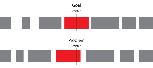
You need to modify your nav structure and start from 3 containers left, center and right. DEMO
HTML
left and right will hold a few links, center is a link.
<nav>
<span>
    <a href="#">aaa </a>
    <a href="#">aa </a>
    <a href="#">a </a>
    </span>
    <a href="#"> center </a>
    <span>
      <a href="#">bbbb </a>
      <a href="#">bbbbb </a>
      <a href="#">bbbbbb </a>
    </span>
</nav>
CSS
nav will take display:flex and justify-content:space-between, so will left and right.
nav, nav span {
    display:flex;
    justify-content:space-between;
    flex-wrap:wrap;/* so they do not overlap each other if space too short */
}
To generate a gap at edges of right and left towards center, we just add a pseudo element (or an empty element).
span:first-of-type:after,
span:last-of-type:before{
    content:'';
    display:inline-block;/* enough , no width needed , it will still generate a space between */
}
left and right can take a flex value higher than 1 , to avoid center to expand too much.
nav > span {
    flex:2; /* 2 is minimum but plenty enough here  */
}
lets draw our link boxes :
a {
    padding:0 0.25em;
    border:solid;
}
