Title has word broken when viewed in mobile [closed]
 https://wordpress.stackexchange.com/questions/329202
-
14-04-2021 - |
 italiano
 english
 français
 española
 中国
中国 日本の
日本の العربية
 Deutsch
 한국어
한국어 Português
 Russian
Domanda
I am designing a website using the Renden Free theme, and my problem is that some long titles, when viewed in mobile, have words broken in half. For example:
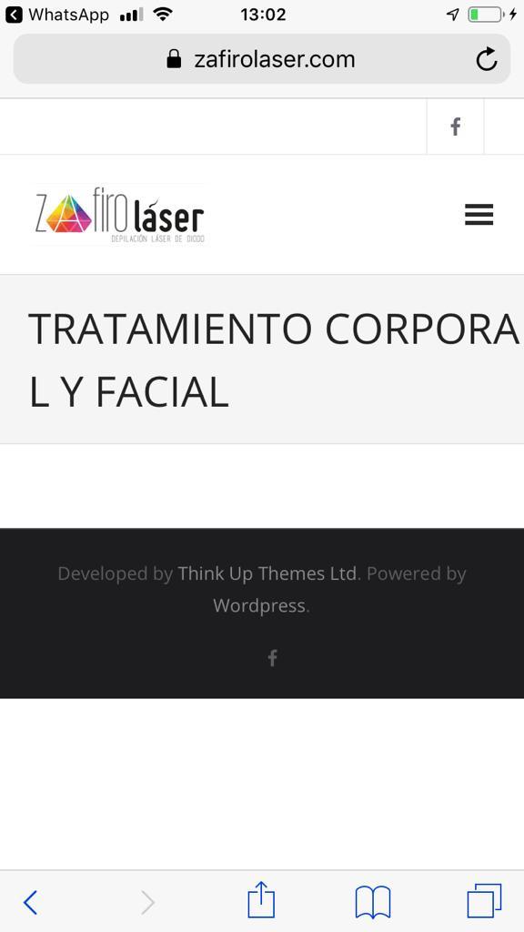
As you can see, the word "Corporal" gets broken and split in two lines.
Why is this? Is there any way to control where does Wordpress split the title?
Soluzione
It's possible that a word-break CSS rule could fix the problem. You could apply it globally with this
body {word-break:normal !important; }
Or maybe this:
body {overflow-wrap: normal;}
But it might be better to apply that to the specific class/id used by the title. And ever further tweak it to only apply that rule to smaller screens via the media query.
But you could add the above to 'additional CSS' in your theme customization to see if that will help.
Asking the theme developer support area is the best place for this question, though.
Altri suggerimenti
on your style-responsive.css file around line #127
#intro .page-title {
        font-size: 30px
    }
Change that to 20px or less, 30 is too big for small screens from a design standpoint.
Obviously "word-break: '';" will edit how the word responds to the end of the container. But, when responsive along with the word-break I sometimes calculate the font-size as a vw value.
Say you have a title with the font-size of 32px; when you hit the wall of container at say 480px, you can figure out the width of the text at keep it constant. The math would be:
Your width: 480. Divided by the width of the doc 100%.
480 / 100 = 4.8 (one percent of the width).
Then you need to work out how many of these are required to maintain the 32px size.
32 / 4.8 = 6.666666vw.
So you can then create a css rule like:
.title {
    font-size: 32px;
}
@media screen and (max-width: 479px) {
    .title {
        font-size: 6.666666vw;
    }
}
This will create text that can scale with the page.
