Android: Cannot style spinner divider
 https://stackoverflow.com/questions/10916658
-
13-06-2021 - |
 italiano
 english
 français
 española
 中国
中国 日本の
日本の العربية
 Deutsch
 한국어
한국어 Português
 Russian
Domanda
I'm trying to create a theme for my first Android app, and it is driving me round the bend. I finally managed to figure out how to style items in a dropdown list, but now I can't change the colour of the divider between list items. I have searched similar questions on stackoverflow, and tried dozens of combinations, but nothing seems to work.
Here is my styles.xml file (abbreviated for clarity):
<?xml version="1.0" encoding="utf-8"?>
<resources>
  <style name="MyTheme" parent="android:Theme.Light">
    <item name="android:spinnerStyle">@style/spinnerStyle</item>
    <item name="android:spinnerDropDownItemStyle">@style/spinnerDropDownItemStyle</item>
    <item name="android:dropDownListViewStyle">@style/spinnerListViewStyle</item>
  </style>

  <style name="spinnerStyle" parent="@android:style/Widget.Spinner">
      <item name="android:background">@drawable/my_theme_spinner</item>
  </style>

  <style name="spinnerDropDownItemStyle" parent="@android:style/Widget.DropDownItem.Spinner">
      <item name="android:background">@drawable/my_theme_spinner_item</item>
      <item name="android:paddingLeft">5dp</item>
      <item name="android:gravity">center_vertical</item>
  </style>

  <style name="spinnerListViewStyle" parent="@android:style/Widget.ListView.DropDown">
      <item name="android:height">3dp</item>
      <item name="android:dividerHeight">3dp</item>
      <item name="android:divider">@color/divider</item>
  </style>
</resources>
No matter what I do, I just get a 1dp light grey divider between items (which can barely be seen with my light coloured list item background) - neither the height nor colour of the divider is ever affected (I also tried setting it to a drawable, also with no effect). What am I doing wrong?
Soluzione
I have a very simple Activity with the Spinner and it works for the following. The only difference I see is that you have a <item name="android:height">3dp</item> and I don't have that at all.
<style name="TestSpinnerStyle" parent="android:style/Widget.ListView.DropDown">
    <item name="android:divider">#ff0000</item>
    <item name="android:dividerHeight">5dp</item>
</style>


<style name="SampleTheme" parent="@android:style/Theme.Holo.Light">
    <item name="android:dropDownListViewStyle">@style/TestSpinnerStyle</item>
</style>
and in my Activity I have:
    Spinner spinner = (Spinner) findViewById(R.id.spinner);
    List<String> list = new ArrayList<String>();
    list.add("list 1");
    list.add("list 2");
    list.add("list 3");
    ArrayAdapter<String> dataAdapter = new ArrayAdapter<String>(this,
            android.R.layout.simple_spinner_item, list);
    dataAdapter.setDropDownViewResource(android.R.layout.simple_dropdown_item_1line);
    spinner.setAdapter(dataAdapter);
and then for the main layout I have the following XML:
<LinearLayout xmlns:android="http://schemas.android.com/apk/res/android"
              android:orientation="vertical"
              android:layout_width="fill_parent"
              android:layout_height="fill_parent"
        >
    <TextView
            android:layout_width="fill_parent"
            android:layout_height="wrap_content"
            android:text="Hello World, StylingActivity"
            />
    <Spinner android:id="@+id/spinner"
             android:layout_width="250dp"
             android:layout_height="40dp"
             />
</LinearLayout>
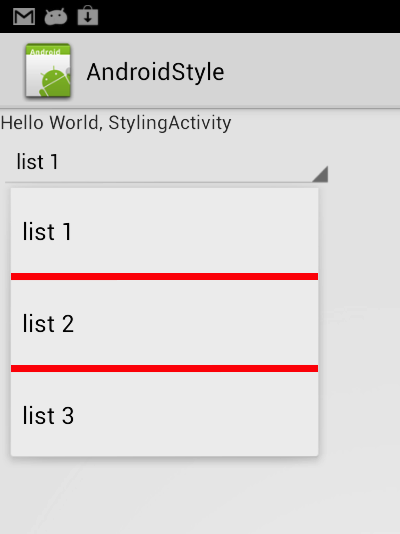
Here is the screenshot
If you can't get it to work from there, I can push up the entire thing to a github repo for you.
Altri suggerimenti
You could add a horizontal line to the dropdown layout you use, which would effectively create a divider.
EDIT
Some further searching found this:
Which basically says what you show you are trying to do above should work... although it mentions setting that style in your activity theme and you don't mention doing that.
You can do it in your layout.xml
     <Spinner
                android:id="@+id/sp_to_create"
                android:layout_width="match_parent"
                android:layout_height="32dp"
                android:layout_marginBottom="10dp"
                style="@style/spinner_style"
                android:prompt="@string/to_type_prompt" />
XML STYLES ADD it
 <style name="spinner_style" parent="Widget.AppCompat.ListView.DropDown">
    <item name="android:divider">#d1d1d1</item>
    <item name="android:dividerHeight">0.5dp</item>
</style>
Add to your Activity Theme
      <style name="AppTheme" parent="Theme.AppCompat.Light.DarkActionBar">
            <item name="android:dropDownListViewStyle">@style/spinner_style</item>
</style>
JAVA FILE
your_spinnerList.setAdapter(new ArrayAdapter<>(getActivity(), android.R.layout.simple_dropdown_item_1line, timeOff_type_list));
Let me know if it had been useful for you! Have a nice day!
The style method in the accepted answer works well until you need two spinners with different divider colors.
Here is what I found works as an alternative:
a) Set the popupBackgroundColor attribute on the spinner to the color you want for the divider. This will color the entire list item's background (including the space we think of as the divider).
b) Set the spinners adapters dropDownViewResource to be a CheckedTextView with it's background attribute set to some other color (or a selector if you want the selected items to have a different color). This will override the color we set in step a for everything but the divider. effectively giving us the desired result.
So you will have:
drawable/spinner_dropdown_background_selector:
<?xml version="1.0" encoding="utf-8"?>

<selector xmlns:android="http://schemas.android.com/apk/res/android">

    <item android:drawable="@color/your_unchecked_color" android:state_checked="false"/>
    <item android:drawable="@color/your_checked_color" android:state_checked="true"/>
    <item android:drawable="@color/your_unchecked_color"/>

</selector>
layout/drop_down_item.xml:
<?xml version="1.0" encoding="utf-8"?>
<CheckedTextView xmlns:android="http://schemas.android.com/apk/res/android"
             android:id="@android:id/text1"
             android:background="@drawable/spinner_dropdown_background_selector"
             android:textColor="@android:color/white"
             android:singleLine="true"
             android:layout_width="match_parent"
             android:layout_height="wrap_content"
             android:ellipsize="marquee" />
Your spinner definition:
<Spinner
        ...
        android:popupBackground="@color/your_divider_color"
        ...
        />
And finally your array adapter definition:
ArrayAdapter<String> dataAdapter = new ...
dataAdapter.setDropDownViewResource(android.R.layout.drop_down_item);
spinner.setAdapter(dataAdapter);
Please note that setting the popupBackgroundColor has no effect if the spinner is in dialog mode.
