 https://stackoverflow.com/questions/23602161
 italiano
 english
 français
 española
 中国
中国 日本の
日本の العربية
 Deutsch
 한국어
한국어 Português
 Russian
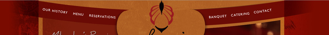
With only CSS or JavaScript you will have a hard time creating anything close to the design in the image. This is clearly a photoshop design, and it also supposed to look like a photoshop design. If you want to get as close as possible to the semi circle in the picture, here is a fiddle: http://jsfiddle.net/2QwmW/

<div class="container">
    <div class="circle"></div>
</div>

.container {
    width: 800px;
    height: 200px;
    overflow: hidden;
    position: relative;
    background: #ab632a;
}

.circle {
    position: absolute;
    z-index: 1;
    width: 2000px;
    height: 2000px;
    border: 50px solid rgba(80, 0, 0, .5);
    left: 50%;
    margin-left: -1050px;
    top: -1950px;
    border-radius: 50%;
}

.container:before,
.container:after {
    content: '';
    width: 100px;
    height: 100%;
    position: absolute;
    z-index: 100;
    top: 0;
}

.container:before {
    left: 0;
    background-image: linear-gradient(to right, #ab632a, rgba(170, 98, 43, 0));
}

.container:after {
    right: 0;
    background-image: linear-gradient(to left, #ab632a, rgba(170, 98, 43, 0));
}
But this is only the semi-circle, the rotated text can be inserted with absolute positions and -webkit-transform:rotate(XXdeg);
