 https://stackoverflow.com/questions/17510102
 italiano
 english
 français
 española
 中国
中国 日本の
日本の العربية
 Deutsch
 한국어
한국어 Português
 Russian
EDIT
See if this updated answer would work for you: http://jsfiddle.net/panchroma/HBhNt/
The HTML is exactly the same as what you posted, with the excetion that I added the class of logo to the logo div.
CSS in addition to what you posted is:
.navigation{
position:relative;
}

.logo{
height:60px;
}

@media only screen and (max-width: 767px) {
.logo{
 position:absolute;
    top:0;
    left:0;


}
.navigation{
   top:60px;
}

.navigation ul li a{
    width:100%;
}
}
==============================
Original answer below
One option would be to add a second logo at the head of your nav container and have it display only for mobile, while at the same time hiding your existing logo on mobile.
See below for a draft of how you would do this in the HTML and CSS.
You will likely need to play with the the @media settings to get the results you want, for example you may need to hide the logo in the middle of your navigation for landscape smartphones or even tablets.
Good luck!
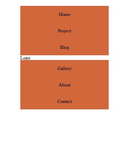
HTML
 <div class="container">
 <div id="nav-container">
 <div class="four columns display-mobile">
     <h1>Logo</h1>
 </div>
 <div class="six columns navigation">
 <ul>
     <li><a href="#" title="Home">Home</a></li>
     <li><a href="#" title="Home">Project</a></li>
     <li><a href="#" title="Home">Blog</a></li>

 </ul>
 </div>
 <div class="four columns hide-mobile">
     <h1>Logo</h1>
 </div>
 <div class="six columns navigation">
     <ul>
         <li><a href="#" title="Gallery">Gallery</a></li>
         <li><a href="#" title="Gallery">About</a></li>
         <li><a href="#" title="Gallery">Contact</a></li>
     </ul>
 </div>
 </div>
</div>
CSS
/* set defaults for display-mobile and hide-mobile */

.display-mobile{
display:none;
}

.hide-mobile{
display:inherit;
}

/* #Media Queries
================================================== */

/* Smaller than standard 960 (devices and browsers) */
@media only screen and (max-width: 959px) {}

/* Tablet Portrait size to standard 960 (devices and browsers) */
@media only screen and (min-width: 768px) and (max-width: 959px) {}

/* All Mobile Sizes (devices and browser) */
@media only screen and (max-width: 767px) {}

/* Mobile Landscape Size to Tablet Portrait (devices and browsers) */
@media only screen and (min-width: 480px) and (max-width: 767px) {}

/* Mobile Portrait Size to Mobile Landscape Size (devices and browsers) */
/* depending on the specifics of your site CSS, you may need to use !important with the following */

@media only screen and (max-width: 479px) {
.display-mobile{
display: inherit;
}
.hide-mobile{
display:none;
}
}
