문제

I want to create a photo gallery for one of my projets but I can't achieve it. What I want is something like that : http://i.imgur.com/mkncVTQ.png

I don't know how many photo there will be but basically what it does is: - Insert first photo in photo_div #1 - Insert 2nd in #2 - Goes to new line - Insert 3rd in #3 - Insert 4th in #4 - Go to next column and first line - Insert 5th in #5 - etc.

What I've made so far is the following code :

<div id="scroll_container">
  <div id="photo_0" class="div_photo">
    <!-- More content inside -->
  </div>
</div>

And the CSS code :

scroll_container{
  height:100%;
  width:550px;
  overflow-x:scroll;
  overflow-y:hidden;
}

.div_photo{
  float:left;
  width:250px;
  height:250px;
  border:1px solid black;
  margin:0 5px 5px 0;
  position:relative;
  display:inline-block;
}

But all I can achieve is a two columns gallery with 3 lines.

Could you help me to solve that ?

Thanks

도움이 되었습니까?

해결책

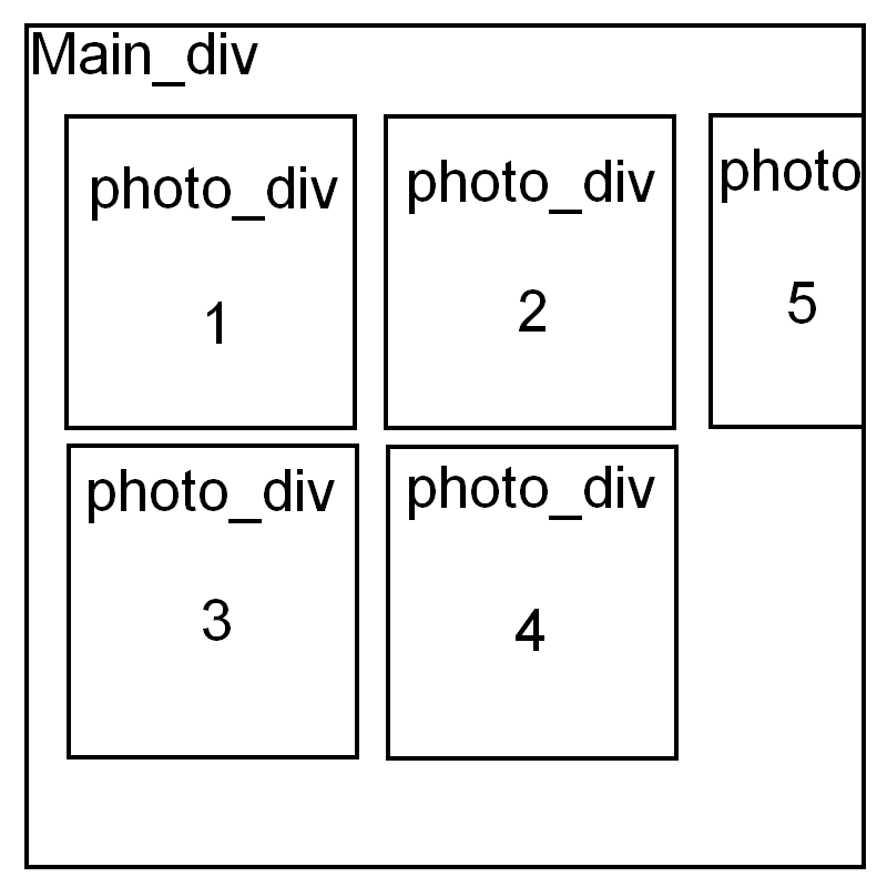
Looks like your images are always of the same size, and that your problem is just the special order that you want.

In that case, this could be a solution:

.test {
    width: 40px;
    height: 40px;
    border: solid 1px blue;
    float: left;
    margin: 2px;
}

.test:nth-child(4n+3) 
{
    border-color: red;
    position: relative;
    top: 44px;
    left: -92px;
    margin-right: -44px;
}

.test:nth-child(4n+4) 
{
    border-color: red;
    position: relative;
    top: 44px;
    left: -46px;
    margin-right: -44px;
}

fiddle

The idea is to float the first 2 elements, the 5 and 6, and so on. the 3rd and 4th (and 7th and 8th) are positioned relative to take them to the special positions

다른 팁

CSS

.div_photo{
      float:left;
      width:250px;
      height:250px;
      border:1px solid black;
      margin:0 5px 5px 0;
      position:relative;
      display:inline-block;
  }

  .div_photo_1{
      float:left;
      width:250px;
      height:250px;
      border:1px solid black;
      margin:0 5px 5px 0;
      position:relative;
      display:inline-block;
  }

  #scroll_container_1 {
      height:auto;
      width:257px;
      display:inline-block;

  }

  #scroll_container {
      height:auto;
      width:514px;
  }

  #scroll_container_parent {
      height:auto;
      width:771px;
      overflow-x:scroll;
      overflow-y:hidden;
  }

HTML

<div id="scroll_container_parent">
     <div id="scroll_container">
        <div id="photo_1" class="div_photo">1</div>
        <div id="photo_2" class="div_photo">2</div>
        <div id="photo_3" class="div_photo">3</div>
        <div id="photo_4" class="div_photo">4</div>
        <div id="photo_6" class="div_photo">6</div>
        <div id="photo_7" class="div_photo">7</div>
        <div id="photo_9" class="div_photo">9</div>
        <div id="photo_10" class="div_photo">10</div>
    </div>
    <div id="scroll_container_1">
        <div id="photo_5" class="div_photo_1">5</div>
        <div id="photo_8" class="div_photo_1">8</div>
        <div id="photo_11" class="div_photo_1">11</div>
    </div>
</div>

Modified HTML...may be this should be good

This way you can write your html:

<div id="scroll_container">
  <div id="photo_1" class="div_photo">
    <!-- More content inside -->1
  </div>
     <div id="photo_2" class="div_photo">
    <!-- More content inside -->2
  </div> <div id="photo_3" class="div_photo">
    <!-- More content inside -->3
  </div> <div id="photo_4" class="div_photo">
    <!-- More content inside -->4
  </div> <div id="photo_5" class="div_photo">
    <!-- More content inside -->5
  </div>
</div>

For the 5th one you can apply additional css with id as :

#photo_5 {
    display:inline-block;
    margin-left:520px;
    margin-top:-510px;
}

As you don't want to use table then you can achieve this with css.

Working Fiddle : jsFiddle Working Demo

라이센스 : CC-BY-SA ~와 함께 속성
제휴하지 않습니다 StackOverflow
scroll top