 https://stackoverflow.com/questions/13248357
 italiano
 english
 français
 española
 中国
中国 日本の
日本の العربية
 Deutsch
 한국어
한국어 Português
 Russian
Problem Description
The problem is caused by a combination of the CSS transformation and the overflow:hidden. The arrow is actually a square with width and height that is rotated 45o. The default origin point for the rotation is 50% 50% or center center which results in the "arrow" square being rotated around the middle which results in the edges being clipped by the overflow property.
It's best shown as an image or a demo (Webkit only), but the code used to demonstrate the problem is also below.
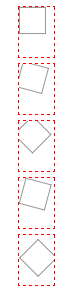
The 1st box shows the starting position of the "arrow" square, the 2nd box shows a small rotation around the center point. You can see that the edge is clipped already by the containing block's overflow:hidden. The 3rd shows a 45o rotation which demonstrates the problem you have. The 4th adds CSS to move the origin point to 0 25px, that is x=0, y=25px which is the bottom left corner, so you can see a small rotation around this point is looking better. The 5th pane shows a full 45o rotation around the modified origin. This looks much better and all that is left to do is reduce the width of the container to clip off the right hand side which leaves a left facing arrow. Then some simple CSS positioning to move it into place next to the tooltip content.
Solution
The modification needed to your CSS are small positioning changes on the container and the addition of an origin point for the rotation. I realise in the above description that I said an origin of 0 25px but in practice the arrow was still being clipped on the left side so I moved the origin out to 5px 25px instead.
.arrow_left_side {
    margin-top: -5px;
    left: -10px;
}
.arrow_left_side:after {
    -webkit-transform-origin: 5px 25px;
    /* for brevity, I have not added all the different browser prefix versions of transform-origin. If you need cross browser support, you will need to add these here */
}
See demo of the above changes
Demo Code
For completeness, here is the code to generate the above image. It's useful to interact with the demo by changing the rotation in the Chrome DevTools to see the square rotating in real time.
HTML
<div class="original"></div>
<div class="original-rotated-a-little"></div>
<div class="original-rotated-forty-five"></div>
<div class="original-with-transform-origin-rotated-a-little"></div>
<div class="original-with-transform-origin-rotated-forty-five"></div>
CSS
body {
    margin-left:50px
}
div {
    position:relative;
    height: 50px;
    width: 35px;
    overflow: hidden;
    top: 0px;
    margin-top: 5px;
    left: -8px;
    border:1px dashed red;
}
div:after {
    content: "";
    position: absolute;
    border: 1px solid #999;
    width: 25px;
    height: 25px;
}
div.original-rotated-a-little:after {
    -webkit-transform: rotate(15deg);
}
div.original-rotated-forty-five:after {
    -webkit-transform: rotate(45deg);
}
div.original-with-transform-origin-rotated-a-little:after {
    -webkit-transform-origin: 5px 25px;
    -webkit-transform: rotate(15deg);
}
div.original-with-transform-origin-rotated-forty-five:after {
    -webkit-transform-origin: 5px 25px;
    -webkit-transform: rotate(45deg);
}
Hope this helps :-)
