https://stackoverflow.com/questions/23069671
 italiano
 english
 français
 española
 中国
中国 日本の
日本の العربية
 Deutsch
 한국어
한국어 Português
 Russian

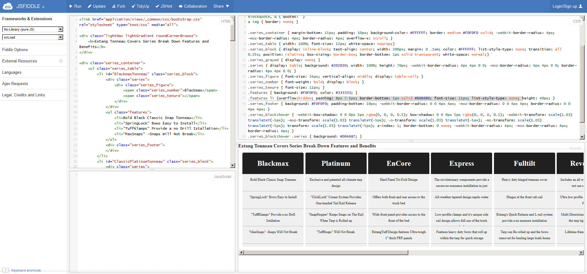
What's Going On
You can do with with pure CSS, using white-space and inline-block. I've got is 90% working, but I'm having an issue with certain boxes being pushed down. It's something to do with the last li inside each item li.
EDIT: When the final box only has a single line, it pushes the box down. Odd, and I'm not sure why. There should be a way to fix it though.
EDIT 2 Looks like the offender is different lengths of text inside the inline-block lis. To fix this, we need to control the extra overflowing text.
We can set overflow: hidden to the .feature lis, which will prevent any from overflowing onto three lines. Combined with this, I'd be careful with the text content and make sure it's all pretty similar length.
Code
Original CSS:
.series_table { width: 100%; font-size: 12px; }
.series_block { display: inline; text-align: center; width: 24.6%; margin: 0 .1em; color: #FFFFFF; float: left; list-style-type: none; transition: all 0.25s; position: relative; box-sizing: border-box; border-bottom: 1px solid transparent; }
...
.features li {padding: 8px 7.5px; border-bottom: 1px solid #B6B6B6; font-size: 11px; list-style-type: none; height: 40px; }
New CSS:
.series_table { width: 100%; font-size: 12px; white-space: nowrap;}
.series_block { display: inline-block; text-align: center; width: 200px; margin: 0 .1em; color: #FFFFFF; list-style-type: none; transition: all 0.25s; position: relative; box-sizing: border-box; border-bottom: 1px solid transparent; white-space: normal;}
...
.features li {overflow:hidden; padding: 8px 7.5px; border-bottom: 1px solid #B6B6B6; font-size: 11px; list-style-type: none; height: 40px; }
Key Changes:
Add white-space:nowrap to .series_table.
Add display:inline-block, and white-space:normal to .series_block, and remove the floating.
Add overflow:hidden to .features li.
Screenshot