 https://stackoverflow.com/questions/23688545
 italiano
 english
 français
 española
 中国
中国 日本の
日本の العربية
 Deutsch
 한국어
한국어 Português
 Russian
I'll try to explain it "in depth"

In the case of css, perspective value defines (in pixels) how far the camera(look at image above) is from the yellow plane(screen) This value is inversely proportional to the distortion : the closer - the wider pyramid. css3-transforms Working Draft
So here is translation matrix for the translate3d(0,0,100px);
      t
1 0 0 0   //x
0 1 0 0   //y
0 0 1 100 //z
0 0 0 1
Say we have 4 corners(points) of the element with the coordinates:
  p1 p2 p3 p4
X 0  1  0  1
Y 0  0  1  1
Z 1  1  1  1 // parallel to the screen.
  1  1  1  1
Let's apply translate3d(0,0,100px); to the p3:
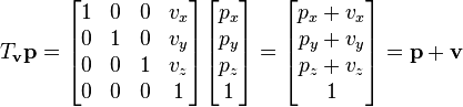
The final position p3' will be multiplication of the translation matrix and the position vector p3:
   translation     p3      p3'
    1 0 0 0        0       0
    0 1 0 0    X   1   =   1
    0 0 1 100      1       101
    0 0 0 1        1       1
The matrix for the css perspective projection with the identity matrix for perspective-origin(x and y position of the camera) will look like this:
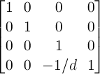
1 0  0              0
0 1  0              0
0 0  1              0
0 0 -1/perspective  1
Now multiply perspective projection matrix(with 1000px perspective) and p3' to apply perspective projection:
  perspective projection matrix     p3'
    1 0  0      0                   0        0
    0 1  0      0         X         1     =  1
    0 0  1      0                   101      101
    0 0 -0.001  1                   1        0.899 //w
w for the perspective projections serves as a scaling factor. And on screen position of the p3' will be x = x/w = 0 and y = y/w = 1.112 so we can repeat it for the other 3 point and finally calculate distance between them d = sqrt((x1 - x2)^2 + (y1 - y2)^2) to find new width and height or just scale original width and height in this case.
