Pergunta

Is there something like a GroupBox or TitledBorder available on JavaFX 2?

Thanks for any hint :-)

Foi útil?

Solução

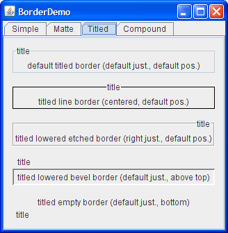
No such standard control, but it it is easy to create your own. Here is a sample implementation:

/** Places content in a bordered pane with a title. */
class BorderedTitledPane extends StackPane {
  BorderedTitledPane(String titleString, Node content) {
    Label title = new Label(" " + titleString + " ");
    title.getStyleClass().add("bordered-titled-title");
    StackPane.setAlignment(title, Pos.TOP_CENTER);

    StackPane contentPane = new StackPane();
    content.getStyleClass().add("bordered-titled-content");
    contentPane.getChildren().add(content);

    getStyleClass().add("bordered-titled-border");
    getChildren().addAll(title, contentPane);
  }
}

And the accompanying css for it:

.label {
  -fx-font: 28px Vivaldi;
}

.bordered-titled-title {
  -fx-background-color: white;
  -fx-translate-y: -16;
}

.bordered-titled-border {
  -fx-content-display: top;
  -fx-border-insets: 20 15 15 15;
  -fx-background-color: white;
  -fx-border-color: black;
  -fx-border-width: 2;
}

.bordered-titled-content {
  -fx-padding: 26 10 10 10;
}

The code is from a example I created in response to an Oracle JavaFX forum thread post "Equivalent to BorderFactory.createTitledBorder".

The output of the example program is as shown below.

gettysburg

Outras dicas

I used TitledPane with setCollapsible(false). It looks more consistent than using CSS styles. Here is result

enter image description here

FXML version of jewelsea's answer:

TitledBorder (I renamed the BorderedTitledPane to TitledBorder)

package com.example.controls;

import javafx.geometry.Pos;
import javafx.scene.Node;
import javafx.scene.control.Label;
import javafx.scene.layout.StackPane;

public class TitledBorder extends StackPane 
{
    private Label titleLabel = new Label();
    private StackPane contentPane = new StackPane();
    private Node content;


    public void setContent(Node content)
    {
        content.getStyleClass().add("bordered-titled-content");
        contentPane.getChildren().add(content);
    }


    public Node getContent()
    {
        return content;
    }


    public void setTitle(String title)
    {
    titleLabel.setText(" " + title + " ");
    }


    public String getTitle()
    {
        return titleLabel.getText();
    }


    public TitledBorder() 
    {
        titleLabel.setText("default title");
        titleLabel.getStyleClass().add("bordered-titled-title");
        StackPane.setAlignment(titleLabel, Pos.TOP_CENTER);

        getStyleClass().add("bordered-titled-border");
        getChildren().addAll(titleLabel, contentPane);
      }

}

FXML usage:

<?import com.example.controls.*?>

<TitledBorder title="title" >       
    <Label text="label with text" />        
</TitledBorder>   

Do no forget the Stylesheet!

Use this CSS for a normal font:

.bordered-titled-title {
  -fx-background-color: white;
  -fx-translate-y: -10; /* play around with this value when changing the title font to get a vertically centered title */
}

.bordered-titled-border {
  -fx-content-display: top;
  -fx-border-insets: 20 15 15 15;
  -fx-background-color: white;
  -fx-border-color: black;
  -fx-border-width: 2;
}

.bordered-titled-content {
  -fx-padding: 26 10 10 10;
}

Using this CSS it now looks like this:

enter image description here

Update: Problems when title is longer then content:

enter image description here Any hint to fix this problem?

Here is an FXML document that can be loaded into SceneBuilder which has similar functionality:

<?xml version="1.0" encoding="UTF-8"?>

<?import java.lang.*?>
<?import javafx.scene.control.*?>
<?import javafx.scene.layout.*?>

<AnchorPane style="-fx-border-insets: 8 0 0 0; -fx-background-color: #FFFFFF; -fx-border-color: black;">
    <children>
        <Label alignment="TOP_LEFT" layoutX="14.0" style="-fx-padding: 0 5; -fx-background-color: inherit;" text="Title" />
        <AnchorPane prefHeight="200.0" prefWidth="200.0" AnchorPane.bottomAnchor="1.0" AnchorPane.leftAnchor="1.0" AnchorPane.rightAnchor="1.0" AnchorPane.topAnchor="10.0" />
    </children>
</AnchorPane>

If you need to make the label text / border size larger you should only have to edit the CSS and the topAnchor of the child AnchorPane and the first argument of -fx-border-insets of the parent AnchorPane.

GroupBox - that is usual Group layout, as far as I see.

TitledBorder - looks like a TitledPane (which is usually a component of Accordion, but could be a separately existing control).

JavaFX-2 analogs looks different from yours (but not significantly), and as usual, you can use different ways of control appearance changing: css, control's skin replacing, etc

Here is a GroupBox implementation based on TitledPane. It provides three methods to set the title, content, and content padding of the GroupBox.

public final class GroupBox extends Parent {

    private StackPane _stackPane;
    private TitledPane _titledPane;

    public GroupBox() {
        _stackPane = new StackPane();
        _titledPane = new TitledPane();
        setContentPadding(new Insets(10));
        _titledPane.setCollapsible(false);
        _titledPane.setContent(_stackPane);
        super.getChildren().add(_titledPane);
    }

    public GroupBox(String title, Node content) {
        this();
        setText(title);
        setContent(content);
    }

    public GroupBox(String title, Node content, Insets contentPadding) {
        this(title, content);
        setContentPadding(contentPadding);
    }

    public void setText(String value) {
        _titledPane.setText(value);
    }

    public void setContent(Node node) {
        _stackPane.getChildren().add(node);
    }

    public void setContentPadding(Insets value) {
        _stackPane.setPadding(value);
    }
}
Licenciado em: CC-BY-SA com atribuição
Não afiliado a StackOverflow
scroll top