 https://stackoverflow.com/questions/21198390
 italiano
 english
 français
 española
 中国
中国 日本の
日本の العربية
 Deutsch
 한국어
한국어 Português
 Russian
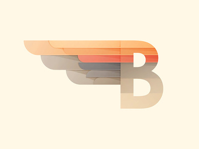
Well, I couldn't leave that question open ...
I haven't been able to solve it using your approach. Making the inclined shadows was doable, making it clipped under the circular borders, not (at least I haven't find the way).
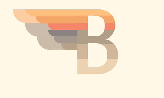
Alternative: using a huge amount of backgrounds:
.B:before {
    content:'';
    position:absolute;
    left: -237px;
    height:135px;
    width: 258px;
    background-image: linear-gradient(0deg,#898481,#898481),
            radial-gradient(circle at bottom right, #898481 22px, transparent 22px),
            linear-gradient(0deg,#898481,#898481),
            radial-gradient(circle at bottom right, #898481 22px, transparent 22px),
            linear-gradient(196deg,rgba(0, 0, 0, 0.97) -21px,transparent 27px),
            radial-gradient(circle at top right, #ccbcac 44px, transparent 30px),
            linear-gradient(0deg,#ccbcac,#ccbcac),
            linear-gradient(0deg,#898481,#898481),
            radial-gradient(circle at top right, #898481 22px, transparent 22px),
            linear-gradient(187deg,#B46550 2px,#f38669 24px),
            radial-gradient(circle at top right, #f38669 22px, transparent 22px),
            linear-gradient(196deg,rgba(60, 60, 60, 0.97) -21px,transparent 27px),
            radial-gradient(circle at top right, #ccbcac 44px, transparent 30px),
            linear-gradient(0deg,#ccbcac,#ccbcac),
            linear-gradient(190deg,#AC6D3B -11px,#f4a668 28px),
            radial-gradient(circle at top right, #f4a668 22px, transparent 22px),
            linear-gradient(0deg,#ffbf7f,#ffbf7f),
            radial-gradient(circle at top right, #ffbf7f 22px, transparent 22px),
            radial-gradient(circle at top right, #fccda1 44px, transparent 30px),
            linear-gradient(0deg,#FCCDA1,#fccda1);
    background-position:
          185px 110px, 163px 110px, 163px 88px, 144px 88px, 106px 88px,
          41px 88px, 137px 88px,
          142px 66px, 120px 66px,
          142px 44px, 120px 44px,
           64px 44px,42px 44px,
78px 44px,   97px 22px, 76px 22px, 65px 0px, 43px -1px, 0px 0px, 44px 0px;
    background-size: 198px 22px, 22px 22px,198px 22px, 22px 22px, 76px 22px, 96px 44px, 200px 44px,198px 22px, 22px 22px,198px 22px, 22px 22px, 96px 44px, 44px 44px, 200px 44px, 198px 22px, 22px 22px, 198px 22px, 22px 22px, 44px 44px, 200px 44px;
    background-repeat: no-repeat;
}
Most of the backgrounds are used to reproduce the part of the design that you already had. To get the shape, you need a rectangular background with a circular one at the left.
For the shadows, there are 2 techniques used.
The easy one is when you have all the shadow contained in a rectangular region. Then you can get it using the same linear gradient that is making the rectangular region,just giving it a darker shade.
The more difficult are those that overlap the circle part. Here I needed to use another separate background image for the shadow.
result
I have only validated the result in Chrome.
Of course this technique can be used in the letter:
updated CSS for the letter
.B {
    position:absolute;
    top: 200px;
    left: 300px;
    margin-top:-150px;
    line-height:236px;
    font-size:225pt;
    font-weight:bold;
    font-family:'Carrois Gothic SC', sans-serif;
    background-image:
         linear-gradient(187deg,#FFBF7F,#FFBF7F),
         linear-gradient(187deg,#cc8650,#F4A668),
         linear-gradient(195deg,#B46550,#F38669),
         linear-gradient(187deg,#8A7668 25px,#AF9F88 35px),
         linear-gradient(187deg,#af9678,#cfb698),
         linear-gradient(187deg,#dcc2a1,#ecd2b1);
    background-position:
          0px 0px, 0px 9%, 0px 20%, 0px 30%, 0px 60%, 0px 100%;
    background-size: 200px 9%, 200px 11%, 200px 10%, 200px 30%, 200px 30%, 200px 30%, 200px 40%;
    background-repeat: no-repeat;
    color: transparent;
    -webkit-background-clip: text;
}
commented backgrounds CSS
background-image: linear-gradient(0deg,#898481,#898481),   /* second small bar in last big bar */
    radial-gradient(circle at bottom right, #898481 22px, transparent 22px),
    linear-gradient(0deg,#898481,#898481),                 /* first small bar in last big bar */
    radial-gradient(circle at bottom right, #898481 22px, transparent 22px),
    linear-gradient(196deg,rgba(0, 0, 0, 0.97) -21px,transparent 27px),        /* shadow */
    radial-gradient(circle at top right, #ccbcac 44px, transparent 30px),    /* last big bar */
    linear-gradient(0deg,#ccbcac,#ccbcac),
    linear-gradient(0deg,#898481,#898481),          /* second small bar in second big bar */
    radial-gradient(circle at top right, #898481 22px, transparent 22px),
    linear-gradient(187deg,#B46550 2px,#f38669 24px),  /* first small bar in 2nd big bar (shadowed) */
    radial-gradient(circle at top right, #f38669 22px, transparent 22px),
    linear-gradient(196deg,rgba(60, 60, 60, 0.97) -21px,transparent 27px),   /* shadow on second big bar */
    radial-gradient(circle at top right, #ccbcac 44px, transparent 30px),   /* second big bar */
    linear-gradient(0deg,#ccbcac,#ccbcac),
    linear-gradient(190deg,#AC6D3B -11px,#f4a668 28px),  /* second small bar on top (shadowed) */
    radial-gradient(circle at top right, #f4a668 22px, transparent 22px),
    linear-gradient(0deg,#ffbf7f,#ffbf7f),                        /* first small bar on top */
    radial-gradient(circle at top right, #ffbf7f 22px, transparent 22px),
    radial-gradient(circle at top right, #fccda1 44px, transparent 30px), /* big bar on top */
    linear-gradient(0deg,#FCCDA1,#fccda1);
Not perfect, but you can get some shadow in the circles with another step in the radial gradient:
radial-gradient(circle at top right, #fccda1 42px, #AC8D70 44px, transparent 45px)
The limit is that the shadow in that case must be concentric to the border. The alternative would be to set another background, may be an elliptical one.
