R:lattice.qq How do I do a multi-panel plot of treatment[x] vs control?
 https://stackoverflow.com/questions/3120468
 italiano
 english
 français
 española
 中国
中国 日本の
日本の العربية
 Deutsch
 한국어
한국어 Português
 Russian
Question
I have a dataframe that looks like this:
str(Data)
'data.frame':   11520 obs. of  29 variables:
 $ groupname  : Factor w/ 8 levels "Control","Treatment1",..: 1 1 1 1 1 1 1 1 1 1 ...
 $ fCycle     : Factor w/ 2 levels "Dark","Light": 2 2 2 2 2 2 2 2 2 2 ...
 $ totdist    : num  0 67.5 89.8 109.1 58.3 ...
 #etc.
I can do a single plot of Treatment1 vs Control like this:
qq(groupname~totdist|fCycle, data=Data,
 subset=(groupname=='Control'|groupname=='Treatment1'))
It looks like this:
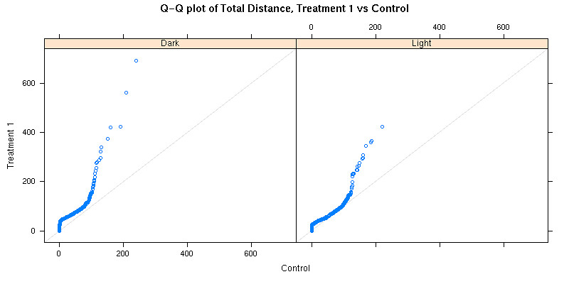
I'd like to automatically make similar plots of Treatment2 vs Control ...TreatmentX vs Control. Is this the place for a loop or does lattice have a better way?
Solution
To do this on a single panel takes some re-arranging. First, I'll generate a sample data set with the same kind of structure as yours
library(lattice)
Data <- data.frame(groupname = factor(rep(c('Control',paste('Treatment',1:7,sep='')),each = 100)),
                   fCycle = factor(rep(rep(c('Dark','Light'),each = 50),8)),
                   totdist = sample(unlist(iris),800,replace = TRUE))
Next, add a variable to distinguish between treatment and control (i.e. "Treatment2" is recoded as "Treatment", etc.)
Data$groupname2 <- factor(gsub('[1-9]','',as.character(Data$groupname)))
Then rearrange the data-set so that each treatment group is given a copy of the control data
Data2 <- NULL
for(treat in paste('Treatment',1:7,sep='')){
  Data2 <- rbind(Data2,
                 cbind(rbind(Data[Data$groupname == treat,],Data[Data$groupname == 'Control',]),
                       treat))
}
Finally we can make the desired graph
qq(groupname2~totdist|fCycle*treat, data=Data2)
If you want separate plots for each treatment, then a loop would be better
pdf('treatVsContQq.pdf')
for(treat in paste('Treatment',1:7,sep='')){
  print(qq(groupname~totdist|fCycle, data=Data,
     subset=(groupname=='Control'|groupname==treat)))
}
dev.off()
