using R.zoo to plot multiple series with error bars
 https://stackoverflow.com/questions/3025347
-
26-09-2019 - |
 italiano
 english
 français
 española
 中国
中国 日本の
日本の العربية
 Deutsch
 한국어
한국어 Português
 Russian
Question
I have data that looks like this:
   > head(data)
             groupname ob_time dist.mean  dist.sd dur.mean   dur.sd   ct.mean    ct.sd
      1      rowA     0.3  61.67500 39.76515 43.67500 26.35027  8.666667 11.29226
      2      rowA    60.0  45.49167 38.30301 37.58333 27.98207  8.750000 12.46176
      3      rowA   120.0  50.22500 35.89708 40.40000 24.93399  8.000000 10.23363
      4      rowA   180.0  54.05000 41.43919 37.98333 28.03562  8.750000 11.97061
      5      rowA   240.0  51.97500 41.75498 35.60000 25.68243 28.583333 46.14692
      6      rowA   300.0  45.50833 43.10160 32.20833 27.37990 12.833333 14.21800
Each groupname is a data series. Since I want to plot each series separately, I've separated them like this:
> A <- zoo(data[which(groupname=='rowA'),3:8],data[which(groupname=='rowA'),2])
> B <- zoo(data[which(groupname=='rowB'),3:8],data[which(groupname=='rowB'),2])
> C <- zoo(data[which(groupname=='rowC'),3:8],data[which(groupname=='rowC'),2])
ETA:
Thanks to gd047: Now I'm using this:

    z <- dlply(data,.(groupname),function(x) zoo(x[,3:8],x[,2]))
The resulting zoo objects look like this:
> head(z$rowA)
          dist.mean  dist.sd dur.mean   dur.sd   ct.mean    ct.sd
     0.3  61.67500 39.76515 43.67500 26.35027  8.666667 11.29226
     60   45.49167 38.30301 37.58333 27.98207  8.750000 12.46176
     120  50.22500 35.89708 40.40000 24.93399  8.000000 10.23363
     180  54.05000 41.43919 37.98333 28.03562  8.750000 11.97061
     240  51.97500 41.75498 35.60000 25.68243 28.583333 46.14692
     300  45.50833 43.10160 32.20833 27.37990 12.833333 14.21800
So if I want to plot dist.mean against time and include error bars equal to +/- dist.sd for each series:
- how do I combine A,B,C dist.mean and dist.sd?
- how do I make a bar plot, or perhaps better, a line graph of the resulting object?
Solution
I don't see the point of breaking up the data into three pieces only to have to combine it together for a plot. Here is a plot using the ggplot2 library:
library(ggplot2)
qplot(ob_time, dist.mean, data=data, colour=groupname, geom=c("line","point")) +
  geom_errorbar(aes(ymin=dist.mean-dist.sd, ymax=dist.mean+dist.sd))
This spaces the time values along the natural scale, you can use scale_x_continuous to define the tickmarks at the actual time values. Having them equally spaced is trickier: you can convert ob_time to a factor, but then qplot refuses to connect the points with a line.
Solution 1 - bar graph:
qplot(factor(ob_time), dist.mean, data=data, geom=c("bar"), fill=groupname,
      colour=groupname, position="dodge") +
geom_errorbar(aes(ymin=dist.mean-dist.sd, ymax=dist.mean+dist.sd), position="dodge")
Solution 2 - add lines manually using the 1,2,... recoding of the factor:
qplot(factor(ob_time), dist.mean, data=data, geom=c("line","point"), colour=groupname) +
  geom_errorbar(aes(ymin=dist.mean-dist.sd, ymax=dist.mean+dist.sd)) +
  geom_line(aes(x=as.numeric(factor(ob_time))))
OTHER TIPS
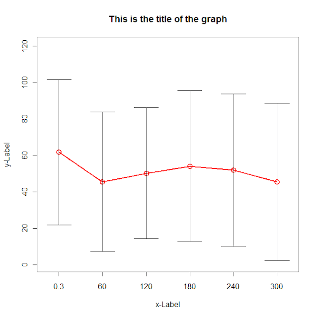
This is a hint of the way I would try to do it. I have ignored grouping, so you'll have to modify it to include more than one series. Also I haven't used zoo cause I don't know much.
g <- (nrow(data)-1)/(3*nrow(data))

plot(data[,"dist.mean"],col=2, type='o',lwd=2,cex=1.5, main="This is the title of the graph",
 xlab="x-Label", ylab="y-Label", xaxt="n",
 ylim=c(0,max(data[,"dist.mean"])+max(data[,"dist.sd"])),
 xlim=c(1-g,nrow(data)+g))
axis(side=1,at=c(1:nrow(data)),labels=data[,"ob_time"])

for (i in 1:nrow(data)) {
lines(c(i,i),c(data[i,"dist.mean"]+data[i,"dist.sd"],data[i,"dist.mean"]-data[i,"dist.sd"]))
lines(c(i-g,i+g),c(data[i,"dist.mean"]+data[i,"dist.sd"], data[i,"dist.mean"]+data[i,"dist.sd"]))
lines(c(i-g,i+g),c(data[i,"dist.mean"]-data[i,"dist.sd"], data[i,"dist.mean"]-data[i,"dist.sd"]))
}
Read the data in using read.zoo with the split= argument to split it by groupname. Then bind together the dist, lower and upper lines. Finally plot them.
Lines <- "groupname ob_time dist.mean  dist.sd dur.mean   dur.sd   ct.mean    ct.sd
rowA     0.3  61.67500 39.76515 43.67500 26.35027  8.666667 11.29226
rowA    60.0  45.49167 38.30301 37.58333 27.98207  8.750000 12.46176
rowA   120.0  50.22500 35.89708 40.40000 24.93399  8.000000 10.23363
rowA   180.0  54.05000 41.43919 37.98333 28.03562  8.750000 11.97061
rowB   240.0  51.97500 41.75498 35.60000 25.68243 28.583333 46.14692
rowB   300.0  45.50833 43.10160 32.20833 27.37990 12.833333 14.21800"

library(zoo)
# next line is only needed until next version of zoo is released
source("http://r-forge.r-project.org/scm/viewvc.php/*checkout*/pkg/zoo/R/read.zoo.R?revision=719&root=zoo")
z <- read.zoo(textConnection(Lines), header = TRUE, split = 1, index = 2)

# pick out the dist and sd columns binding dist with lower & upper
z.dist <- z[, grep("dist.mean", colnames(z))]
z.sd <- z[, grep("dist.sd", colnames(z))]
zz <- cbind(z = z.dist, lower = z.dist - z.sd, upper = z.dist + z.sd)

# plot using N panels
N <- ncol(z.dist)
ylab <- sub("dist.mean.", "", colnames(z.dist))
plot(zz, screen = 1:N, type = "l", lty = rep(1:2, N*1:2), ylab = ylab)
I don't think you need to create zoo objects for this type of plot, I would do it directly from the data frame. Of course, there may be other reasons to use zoo objects, such a smart merging, aggregation, etc.
One option is the segplot function from latticeExtra
library(latticeExtra)
segplot(ob_time ~ (dist.mean + dist.sd) + (dist.mean - dist.sd) | groupname,
    data = data, centers = dist.mean, horizontal = FALSE)
## and with the latest version of latticeExtra (from R-forge):
trellis.last.object(segments.fun = panel.arrows, ends = "both", angle = 90, length = .1) +
    xyplot(dist.mean ~ ob_time | groupname, data, col = "black", type = "l")
Using Gabor's nicely-reproducible dataset this produces:

